
MVRV Heatmap
onchainmind.io
© 2025 On-Chain Mind. All rights reserved.
Description:
Premium Indicator
Premium Indicator
Indicator Overview
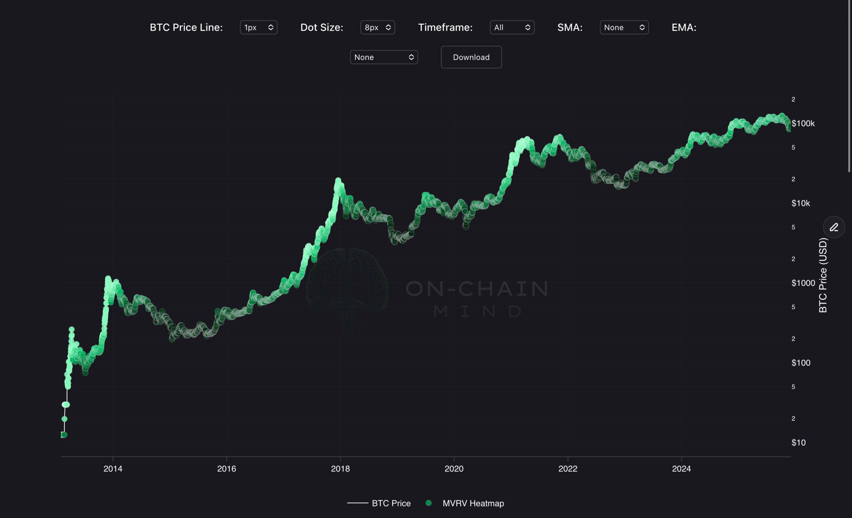
The MVRV Heatmap visually represents the Market Value to Realised Value (MVRV) ratio directly onto the asset's logarithmic price chart. The MVRV ratio compares the current Market Price to the asset's aggregate cost basis (Realised Price).
The indicator is presented as a series of colour-coded points overlaid on the price path, where the colour intensity represents the level of overall market profitability. A deep rust colour indicates the market is near break-even or slightly underwater, transitioning to a blazing orange/yellow to denote significant aggregate profit. This unique view links the current price action to the collective financial state of all holders.
How To Use
This heatmap is best used for identifying macro-market cycles and areas of extreme stress or euphoria. Clusters of deep coloured dots, particularly when the price is near the Realised Price, often coincide with capitulation events or macro bottoms. This signals periods where the majority of the market is holding unrealised losses, presenting long-term value opportunities. Dense groupings of brighter coloured dots typically mark parabolic run-ups and market tops. This suggests maximum aggregate profit-taking pressure and alerts traders to potential cycle peaks, as the incentive for selling profitable coins is at its highest.