

ON-CHAIN METRIC
Advance / Decline
How many assets rose against how many fell, accumulated day after day.
Open the Relative Performance dashboard
A price chart shows what the market did and cannot show how many assets took part in doing it. This counts the risers against the fallers each day and accumulates the result, which answers a question no price line can.
The reason to bother is participation. A move carried by the whole field and a move carried by two names look identical on a price chart and have behaved very differently afterwards.
What it actually measures
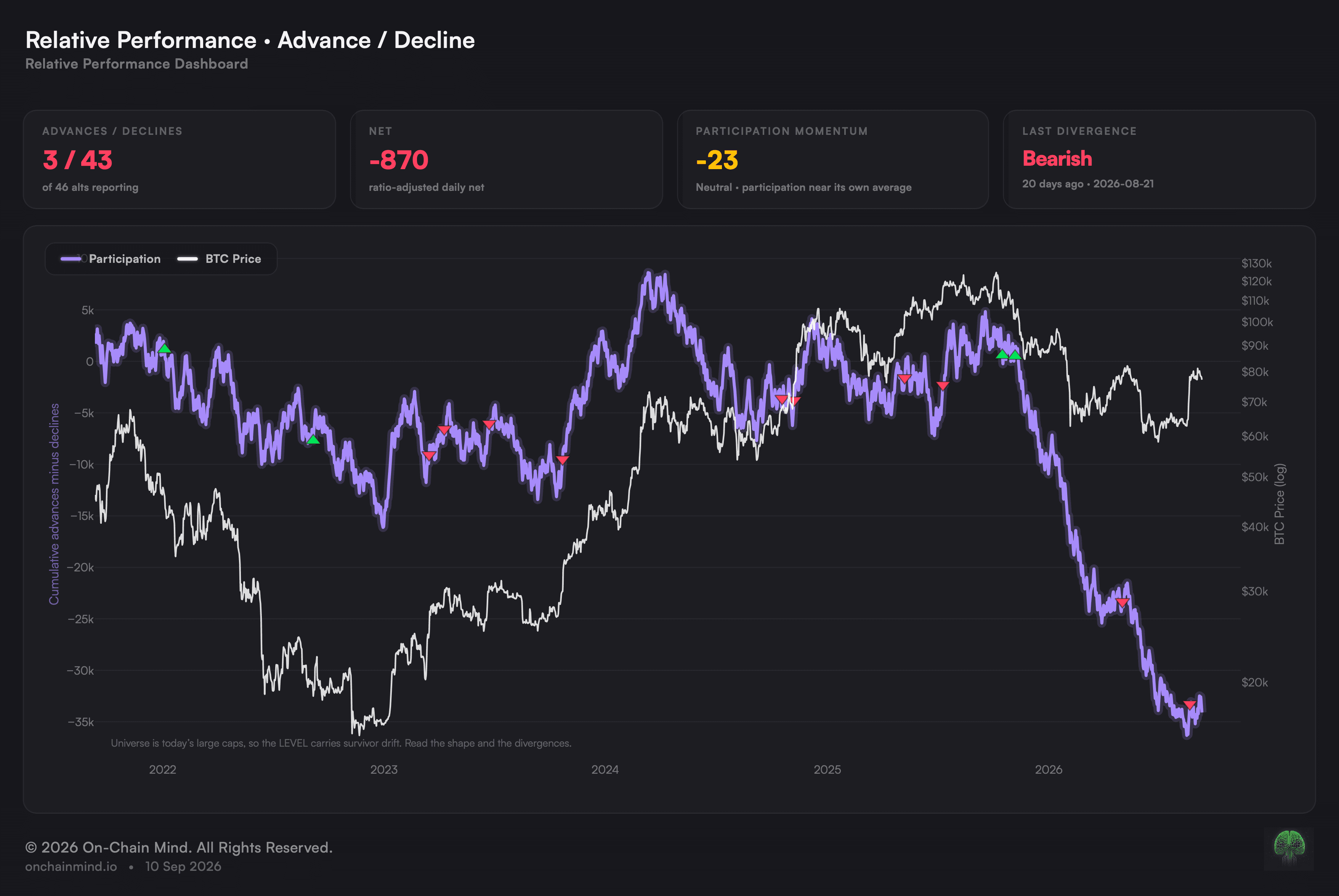
The divergences are the reason the view exists at all. Price setting a new high that the participation line will not match means the advance is being carried by fewer and fewer names, and the markers put every instance of it directly on the chart.
The daily count is expressed against the names that actually moved, so the reading does not step whenever coverage changes rather than when the market does.
Many days are near-unanimous, and that is genuine. This market is far more correlated than equities, which is precisely why the accumulated shape carries more than any single day’s count.
The height of the line is the least trustworthy part of it
A running total invites being read as a level: high is good, low is bad. Here that reading is close to worthless.
Everything counted here is an asset that is large now, which is another way of saying everything counted got through. That selection lifts a running total for reasons entirely unconnected to how many names took part, so what can be trusted is the outline and the disagreements, never the number the line has reached.
What it does not tell you
Survivorship distorts the level permanently and in one direction only, which is why the height of the line carries so much less than its shape does.
It counts names and not size. A day where fifty small assets rose and the largest fell reads as broad participation.
Divergences resolve both ways. A narrowing advance has preceded turns and has also simply broadened again a few weeks later.
It is blind to size of move. An asset up a fraction of a per cent counts exactly as much as one up a third.
How to read it
Broad advance. Very nearly every name is joining in.
Improving. Participation is widening: more names in than out.
Neutral. The tape is neither broadening nor thinning.
Deteriorating. Participation is thinning out, leaving fewer names doing the work.
Broad decline. Virtually nothing is joining in, a state that at this depth has tended to mark the end of a fall rather than its beginning.
Look for Advance / Decline on the Relative Performance dashboard, beside Altcoin Breadth, BTC vs Field and Top 10 Table.
Common questions
What is a disagreement and why mark it?
Price reaching a fresh high or low while this line declines to follow. A rise being carried by an ever smaller group is the standard warning sign, and each occurrence is flagged directly on the chart so none of them has to be spotted by eye.
Why keep this and a breadth reading?
One is a snapshot and this is a tally. Breadth counts how much of the field sits under its own long trend at this moment; this adds up what each day did. They separate around turning points, since daily participation picks up long before any asset climbs back over a slow average.
Why does the height of the line not mean much?
Because everything counted is an asset that is large now, so everything counted survived. That drags a running total upward for reasons unconnected to participation, leaving the outline reliable and the level not.
Why is the daily count adjusted?
Because how many assets report varies between one day and the next. Left raw, the figure would jump whenever coverage shifted rather than whenever the market did.
Why do so many sessions land nearly all one way?
Because these assets move together far more tightly than shares do, so a great many sessions come in nearly all one way. It is real rather than an artefact, and it is why the accumulated outline carries so much more than any single day.
ON-CHAIN METRIC
Advance / Decline
How many assets rose against how many fell, accumulated day after day.
Open the Relative Performance dashboard
A price chart shows what the market did and cannot show how many assets took part in doing it. This counts the risers against the fallers each day and accumulates the result, which answers a question no price line can.
The reason to bother is participation. A move carried by the whole field and a move carried by two names look identical on a price chart and have behaved very differently afterwards.
What it actually measures
The divergences are the reason the view exists at all. Price setting a new high that the participation line will not match means the advance is being carried by fewer and fewer names, and the markers put every instance of it directly on the chart.
The daily count is expressed against the names that actually moved, so the reading does not step whenever coverage changes rather than when the market does.
Many days are near-unanimous, and that is genuine. This market is far more correlated than equities, which is precisely why the accumulated shape carries more than any single day’s count.
The height of the line is the least trustworthy part of it
A running total invites being read as a level: high is good, low is bad. Here that reading is close to worthless.
Everything counted here is an asset that is large now, which is another way of saying everything counted got through. That selection lifts a running total for reasons entirely unconnected to how many names took part, so what can be trusted is the outline and the disagreements, never the number the line has reached.
What it does not tell you
Survivorship distorts the level permanently and in one direction only, which is why the height of the line carries so much less than its shape does.
It counts names and not size. A day where fifty small assets rose and the largest fell reads as broad participation.
Divergences resolve both ways. A narrowing advance has preceded turns and has also simply broadened again a few weeks later.
It is blind to size of move. An asset up a fraction of a per cent counts exactly as much as one up a third.
How to read it
Broad advance. Very nearly every name is joining in.
Improving. Participation is widening: more names in than out.
Neutral. The tape is neither broadening nor thinning.
Deteriorating. Participation is thinning out, leaving fewer names doing the work.
Broad decline. Virtually nothing is joining in, a state that at this depth has tended to mark the end of a fall rather than its beginning.
Look for Advance / Decline on the Relative Performance dashboard, beside Altcoin Breadth, BTC vs Field and Top 10 Table.
Common questions
What is a disagreement and why mark it?
Price reaching a fresh high or low while this line declines to follow. A rise being carried by an ever smaller group is the standard warning sign, and each occurrence is flagged directly on the chart so none of them has to be spotted by eye.
Why keep this and a breadth reading?
One is a snapshot and this is a tally. Breadth counts how much of the field sits under its own long trend at this moment; this adds up what each day did. They separate around turning points, since daily participation picks up long before any asset climbs back over a slow average.
Why does the height of the line not mean much?
Because everything counted is an asset that is large now, so everything counted survived. That drags a running total upward for reasons unconnected to participation, leaving the outline reliable and the level not.
Why is the daily count adjusted?
Because how many assets report varies between one day and the next. Left raw, the figure would jump whenever coverage shifted rather than whenever the market did.
Why do so many sessions land nearly all one way?
Because these assets move together far more tightly than shares do, so a great many sessions come in nearly all one way. It is real rather than an artefact, and it is why the accumulated outline carries so much more than any single day.