

ON-CHAIN METRIC
Total Flow
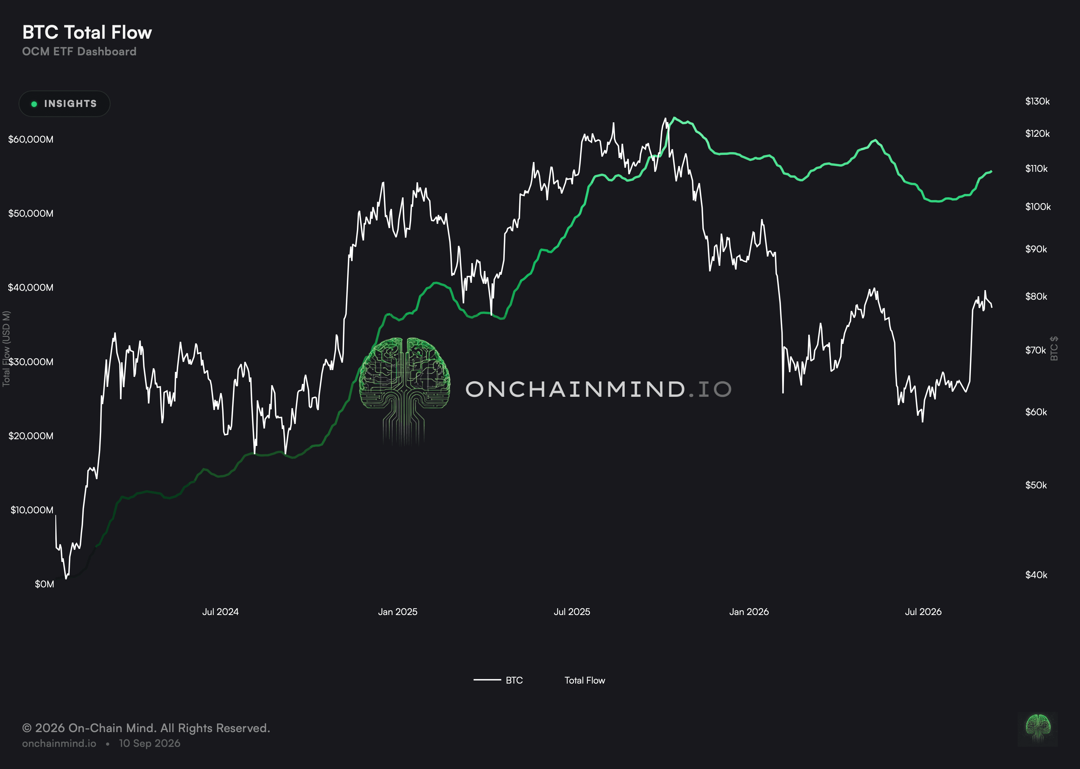
The running total of money committed since launch, rather than the daily rate.
Open the ETF dashboard
Daily flow figures are volatile and are quoted constantly for exactly that reason. The running total is what says how much money is genuinely committed, and it moves a great deal more slowly than the headlines around it suggest.
It is the stock where the daily figure is the flow. Reading the two together is the difference between knowing what happened yesterday and knowing where the complex actually stands, and only one of those is worth acting on.
What it actually measures
The line rarely falls, which is informative rather than dull. Sustained outflows large enough to reduce a running total have been the exception on the record so far rather than anything like the rule.
Being at the high says something modest but real. It means no more has ever been committed to this complex than is committed now.
The slope matters more than the level does. Money arriving quickly and money arriving slowly describe different conditions even when the running total is identical.
Flat stretches are readings in their own right. A total that has not moved for weeks says the complex is neither attracting nor losing capital, which is a real state rather than an absence of one.
Committed capital is the slower and harder of the two numbers
Daily flow is where attention goes, because it changes every day and produces a headline. It is also the noisiest reading on this dashboard.
The running total moves slowly, which makes it a poor source of news and a good description of the position. Capital that has been committed and not withdrawn is a stronger fact about this holder base than any single session’s figure.
Combined Flows: asking the wide question first prevents the specific answer misleading
Complex-wide direction separates two situations that look identical on any single asset’s chart. Money leaving one fund for another is not remotely the same event as money leaving these structures altogether.
A single asset’s fund seeing outflows reads as that asset falling out of favour. Sometimes it is; sometimes every complex is seeing the same thing and the reason has nothing to do with the asset at all.
Checking the aggregate first settles which of those it is in a few seconds. It is a cheap habit and it prevents plenty of unnecessary explanation.
Weekly Flows: weekly is where an order becomes a decision
The average drawn over the bars is what separates a run from a single week. One strong week set against a fading average is a very different picture from four consecutive strong weeks pulling it upward.
A daily flow figure mostly records the day on which paperwork settled. The decision behind it was taken earlier, by somebody working to a schedule that has nothing whatever to do with which day the money finally appeared.
Aggregating to a week absorbs most of that timing noise without concealing a genuine change of pace. It is the resolution at which this chart stops describing settlement and starts describing allocation.
Monthly Flows: the unfinished bar is the one people misread
Consecutive months pointing the same way are the reading worth having here. A single month is one allocation cycle and says remarkably little on its own, whatever its size.
A part-completed month sitting beside finished ones invites a comparison that cannot honestly be made. Halfway through, a strong month looks weak and a weak one looks close to catastrophic.
Marking it is a small thing that prevents a specific and very common error. It is worth noticing that this chart bothers, because a great many charts elsewhere do not and their readers pay for it.
What it does not tell you
It is denominated in money rather than in coin, so an identical commitment made at two different prices contributes two different amounts to the running total.
Reported flows are revised, and the running total carries every revision forward.
It says nothing about who committed the money or on what horizon, and those would change what the total implies.
A running total carries every past decision inside it, so money committed years ago counts fully today whatever has happened since.
It cannot distinguish new capital from money that left and came back. Both add to the same total in the same way.
How to read it
At the high. More money is committed than at any previous point.
Expansion. The total is climbing without being at a record.
Drawdown. The total sits below its previous peak.
You will find Total Flow on the ETF dashboard, next to Flow Drawdown, Assets Under Management and Combined Flows.
Common questions
Why keep this and the daily figure?
Because this is the stock where that is the rate. The daily figure reports what happened yesterday; this reports how much money has actually been committed over the whole history and not since taken back out.
Why does the line rarely fall?
Because sustained outflows large enough to reduce a running total have been the exception rather than the rule. It is a real finding about this complex, not a quirk of the chart.
What does being at the high mean?
That no more money has ever been committed to these funds than is committed at this moment. It is a modest statement, and unlike a good deal of what gets said about these funds it is a precise one.
Is the slope more useful than the level?
Generally, yes. Money arriving quickly and money arriving slowly describe different conditions even when the running total is identical.
Is this measured in coin?
No, in money. The same commitment made at two different prices contributes two different amounts to this total, which is exactly why the holdings view exists alongside it.
Why aggregate across assets at all?
So that the widest question gets asked before the narrow one. Whether money is arriving in these funds at all comes logically before which of them it happens to be arriving in.
Why sum by week?
Because a daily figure mostly records when paperwork settled rather than when anybody decided anything. Aggregating to a week absorbs most of that timing while still leaving a genuine change of pace visible.
Why sum by calendar month?
Because allocation decisions are frequently made on a monthly cycle, so this aggregation lines up with how money is actually committed rather than with whichever day it happened to settle on.
ON-CHAIN METRIC
Total Flow
The running total of money committed since launch, rather than the daily rate.
Open the ETF dashboard
Daily flow figures are volatile and are quoted constantly for exactly that reason. The running total is what says how much money is genuinely committed, and it moves a great deal more slowly than the headlines around it suggest.
It is the stock where the daily figure is the flow. Reading the two together is the difference between knowing what happened yesterday and knowing where the complex actually stands, and only one of those is worth acting on.
What it actually measures
The line rarely falls, which is informative rather than dull. Sustained outflows large enough to reduce a running total have been the exception on the record so far rather than anything like the rule.
Being at the high says something modest but real. It means no more has ever been committed to this complex than is committed now.
The slope matters more than the level does. Money arriving quickly and money arriving slowly describe different conditions even when the running total is identical.
Flat stretches are readings in their own right. A total that has not moved for weeks says the complex is neither attracting nor losing capital, which is a real state rather than an absence of one.
Committed capital is the slower and harder of the two numbers
Daily flow is where attention goes, because it changes every day and produces a headline. It is also the noisiest reading on this dashboard.
The running total moves slowly, which makes it a poor source of news and a good description of the position. Capital that has been committed and not withdrawn is a stronger fact about this holder base than any single session’s figure.
Combined Flows: asking the wide question first prevents the specific answer misleading
Complex-wide direction separates two situations that look identical on any single asset’s chart. Money leaving one fund for another is not remotely the same event as money leaving these structures altogether.
A single asset’s fund seeing outflows reads as that asset falling out of favour. Sometimes it is; sometimes every complex is seeing the same thing and the reason has nothing to do with the asset at all.
Checking the aggregate first settles which of those it is in a few seconds. It is a cheap habit and it prevents plenty of unnecessary explanation.
Weekly Flows: weekly is where an order becomes a decision
The average drawn over the bars is what separates a run from a single week. One strong week set against a fading average is a very different picture from four consecutive strong weeks pulling it upward.
A daily flow figure mostly records the day on which paperwork settled. The decision behind it was taken earlier, by somebody working to a schedule that has nothing whatever to do with which day the money finally appeared.
Aggregating to a week absorbs most of that timing noise without concealing a genuine change of pace. It is the resolution at which this chart stops describing settlement and starts describing allocation.
Monthly Flows: the unfinished bar is the one people misread
Consecutive months pointing the same way are the reading worth having here. A single month is one allocation cycle and says remarkably little on its own, whatever its size.
A part-completed month sitting beside finished ones invites a comparison that cannot honestly be made. Halfway through, a strong month looks weak and a weak one looks close to catastrophic.
Marking it is a small thing that prevents a specific and very common error. It is worth noticing that this chart bothers, because a great many charts elsewhere do not and their readers pay for it.
What it does not tell you
It is denominated in money rather than in coin, so an identical commitment made at two different prices contributes two different amounts to the running total.
Reported flows are revised, and the running total carries every revision forward.
It says nothing about who committed the money or on what horizon, and those would change what the total implies.
A running total carries every past decision inside it, so money committed years ago counts fully today whatever has happened since.
It cannot distinguish new capital from money that left and came back. Both add to the same total in the same way.
How to read it
At the high. More money is committed than at any previous point.
Expansion. The total is climbing without being at a record.
Drawdown. The total sits below its previous peak.
You will find Total Flow on the ETF dashboard, next to Flow Drawdown, Assets Under Management and Combined Flows.
Common questions
Why keep this and the daily figure?
Because this is the stock where that is the rate. The daily figure reports what happened yesterday; this reports how much money has actually been committed over the whole history and not since taken back out.
Why does the line rarely fall?
Because sustained outflows large enough to reduce a running total have been the exception rather than the rule. It is a real finding about this complex, not a quirk of the chart.
What does being at the high mean?
That no more money has ever been committed to these funds than is committed at this moment. It is a modest statement, and unlike a good deal of what gets said about these funds it is a precise one.
Is the slope more useful than the level?
Generally, yes. Money arriving quickly and money arriving slowly describe different conditions even when the running total is identical.
Is this measured in coin?
No, in money. The same commitment made at two different prices contributes two different amounts to this total, which is exactly why the holdings view exists alongside it.
Why aggregate across assets at all?
So that the widest question gets asked before the narrow one. Whether money is arriving in these funds at all comes logically before which of them it happens to be arriving in.
Why sum by week?
Because a daily figure mostly records when paperwork settled rather than when anybody decided anything. Aggregating to a week absorbs most of that timing while still leaving a genuine change of pace visible.
Why sum by calendar month?
Because allocation decisions are frequently made on a monthly cycle, so this aggregation lines up with how money is actually committed rather than with whichever day it happened to settle on.