

ON-CHAIN METRIC
Hashprice
What one unit of mining work earns, rather than what the whole industry takes in.
Open the Mining & Network dashboard
Hashprice reports what a given quantity of mining work brings in, which makes it the income of one operator rather than the takings of the entire industry. Competition is already baked into it, so eras separated by years can be set beside one another honestly.
That is the whole reason it exists. Industry-wide income tells you how large the business has become and nothing at all about whether anybody in it is making money.
What it actually measures
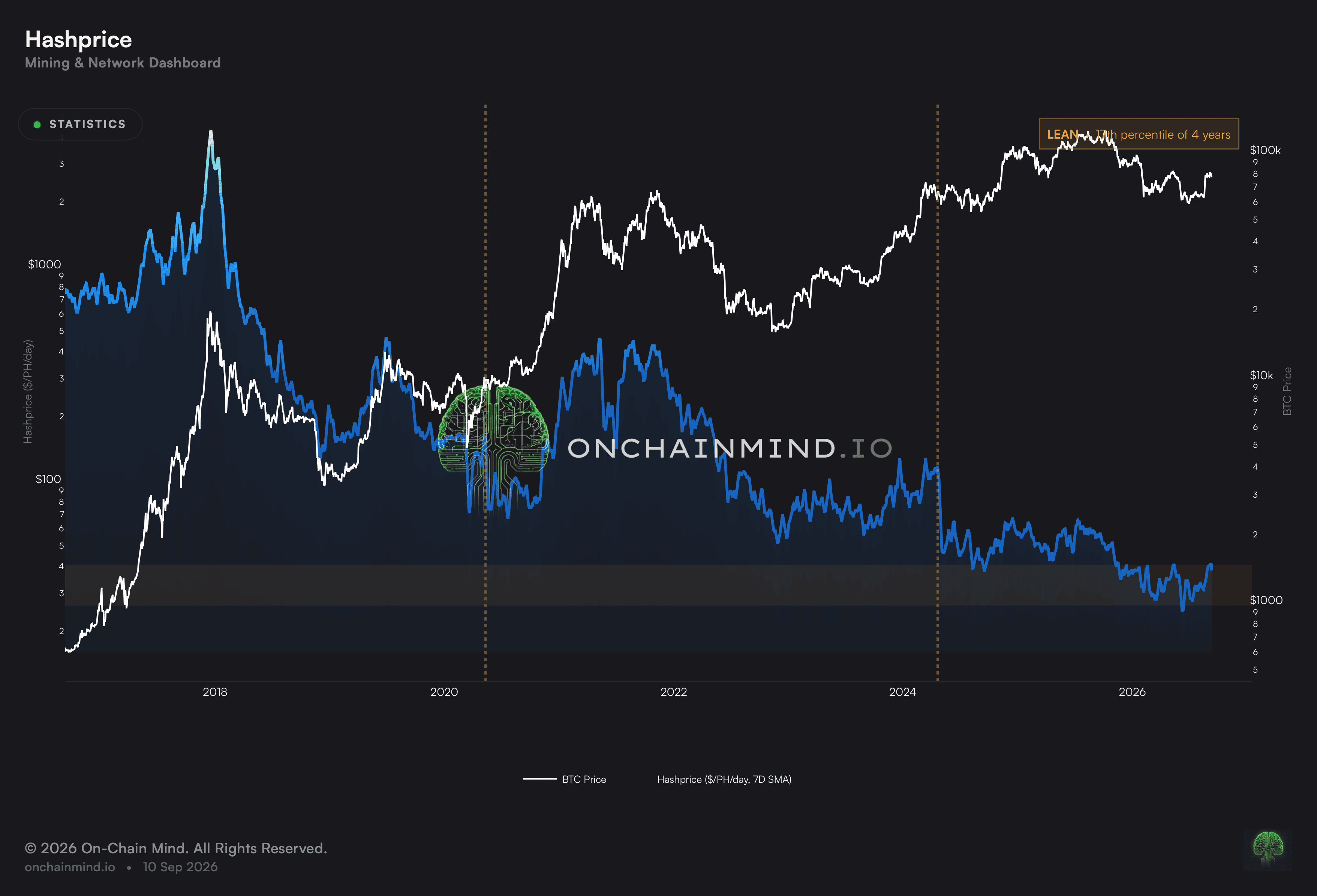
The reading falls as more machines join, because the same reward is being shared among more of them. It falls again at each halving, when the reward itself is cut. Only a higher price or a burst of fee demand pushes it back the other way.
That downward drift is structural rather than a verdict on conditions. A figure that would have been comfortable a decade ago can be punishing today, which is exactly why the number is read against its own recent range instead of in isolation.
The shaded band supplies that context. It places today against several years of its own history so an unfamiliar figure becomes legible as high, low or unremarkable for the market as it currently stands.
Total income says nothing about individual survival
An industry can be taking in record sums while every participant in it is losing money, and mining reaches that condition regularly. More machines arriving means the same pot divided more ways, so the headline grows while each share shrinks.
Scaling income to the work done removes the illusion. What emerges is what an operator actually collects, which is the figure that decides whether the machines stay switched on, and no total ever answers that.
What it does not tell you
Income is only half of an economic question and this half has no costs in it. An operator with cheap electricity and one paying retail rates read the same here while living in completely different circumstances.
The falling trend also makes long comparisons awkward. Two figures decades apart are not describing equivalent conditions, which is why the historical band matters more than the number sitting on top of it.
It reports what the network pays rather than what anybody keeps. Contracts, hedges and deals struck with power suppliers all sit between this figure and an operator’s actual position.
How to read it
Distressed Hashprice. Earnings for a given quantity of work sit at the bottom of the range, where only the leanest fleets cover their costs.
Lean Hashprice. Margins have narrowed and the older machines are approaching the point of being switched off.
Normal Hashprice. Earnings for a given quantity of work sit in the band this market usually occupies.
Hashprice belongs to the Mining & Network dashboard, along with Production Cost, Fleet X-ray and Hashrate.
Common questions
Why is this better than total revenue?
Because total income is shared across every machine running. Scaling it to the work done says what one operator actually collects, rather than what the industry collects between them.
Why does it drift downward?
Two things push it down. Reward cuts arrive on schedule, and more machines joining shares the same reward more ways. Only a higher price or a burst of fee demand lifts it back.
What is the shaded band for?
Context. It places today against several years of its own history, so an unfamiliar figure becomes legible as high, low or unremarkable for this market as it currently stands.
Does it account for costs?
Not at all, and that is its main gap. An operator on cheap power and one paying retail rates produce identical readings while living in completely different circumstances.
Can two eras be compared directly?
Only through the band. The underlying trend falls over time, so figures decades apart describe different worlds and the historical position matters more than the number.
ON-CHAIN METRIC
Hashprice
What one unit of mining work earns, rather than what the whole industry takes in.
Open the Mining & Network dashboard
Hashprice reports what a given quantity of mining work brings in, which makes it the income of one operator rather than the takings of the entire industry. Competition is already baked into it, so eras separated by years can be set beside one another honestly.
That is the whole reason it exists. Industry-wide income tells you how large the business has become and nothing at all about whether anybody in it is making money.
What it actually measures
The reading falls as more machines join, because the same reward is being shared among more of them. It falls again at each halving, when the reward itself is cut. Only a higher price or a burst of fee demand pushes it back the other way.
That downward drift is structural rather than a verdict on conditions. A figure that would have been comfortable a decade ago can be punishing today, which is exactly why the number is read against its own recent range instead of in isolation.
The shaded band supplies that context. It places today against several years of its own history so an unfamiliar figure becomes legible as high, low or unremarkable for the market as it currently stands.
Total income says nothing about individual survival
An industry can be taking in record sums while every participant in it is losing money, and mining reaches that condition regularly. More machines arriving means the same pot divided more ways, so the headline grows while each share shrinks.
Scaling income to the work done removes the illusion. What emerges is what an operator actually collects, which is the figure that decides whether the machines stay switched on, and no total ever answers that.
What it does not tell you
Income is only half of an economic question and this half has no costs in it. An operator with cheap electricity and one paying retail rates read the same here while living in completely different circumstances.
The falling trend also makes long comparisons awkward. Two figures decades apart are not describing equivalent conditions, which is why the historical band matters more than the number sitting on top of it.
It reports what the network pays rather than what anybody keeps. Contracts, hedges and deals struck with power suppliers all sit between this figure and an operator’s actual position.
How to read it
Distressed Hashprice. Earnings for a given quantity of work sit at the bottom of the range, where only the leanest fleets cover their costs.
Lean Hashprice. Margins have narrowed and the older machines are approaching the point of being switched off.
Normal Hashprice. Earnings for a given quantity of work sit in the band this market usually occupies.
Hashprice belongs to the Mining & Network dashboard, along with Production Cost, Fleet X-ray and Hashrate.
Common questions
Why is this better than total revenue?
Because total income is shared across every machine running. Scaling it to the work done says what one operator actually collects, rather than what the industry collects between them.
Why does it drift downward?
Two things push it down. Reward cuts arrive on schedule, and more machines joining shares the same reward more ways. Only a higher price or a burst of fee demand lifts it back.
What is the shaded band for?
Context. It places today against several years of its own history, so an unfamiliar figure becomes legible as high, low or unremarkable for this market as it currently stands.
Does it account for costs?
Not at all, and that is its main gap. An operator on cheap power and one paying retail rates produce identical readings while living in completely different circumstances.
Can two eras be compared directly?
Only through the band. The underlying trend falls over time, so figures decades apart describe different worlds and the historical position matters more than the number.