

ON-CHAIN METRIC
LTH Realised Price
What aged supply collectively paid, and why price rarely gets anywhere near it.
Open the Cost Bases dashboard
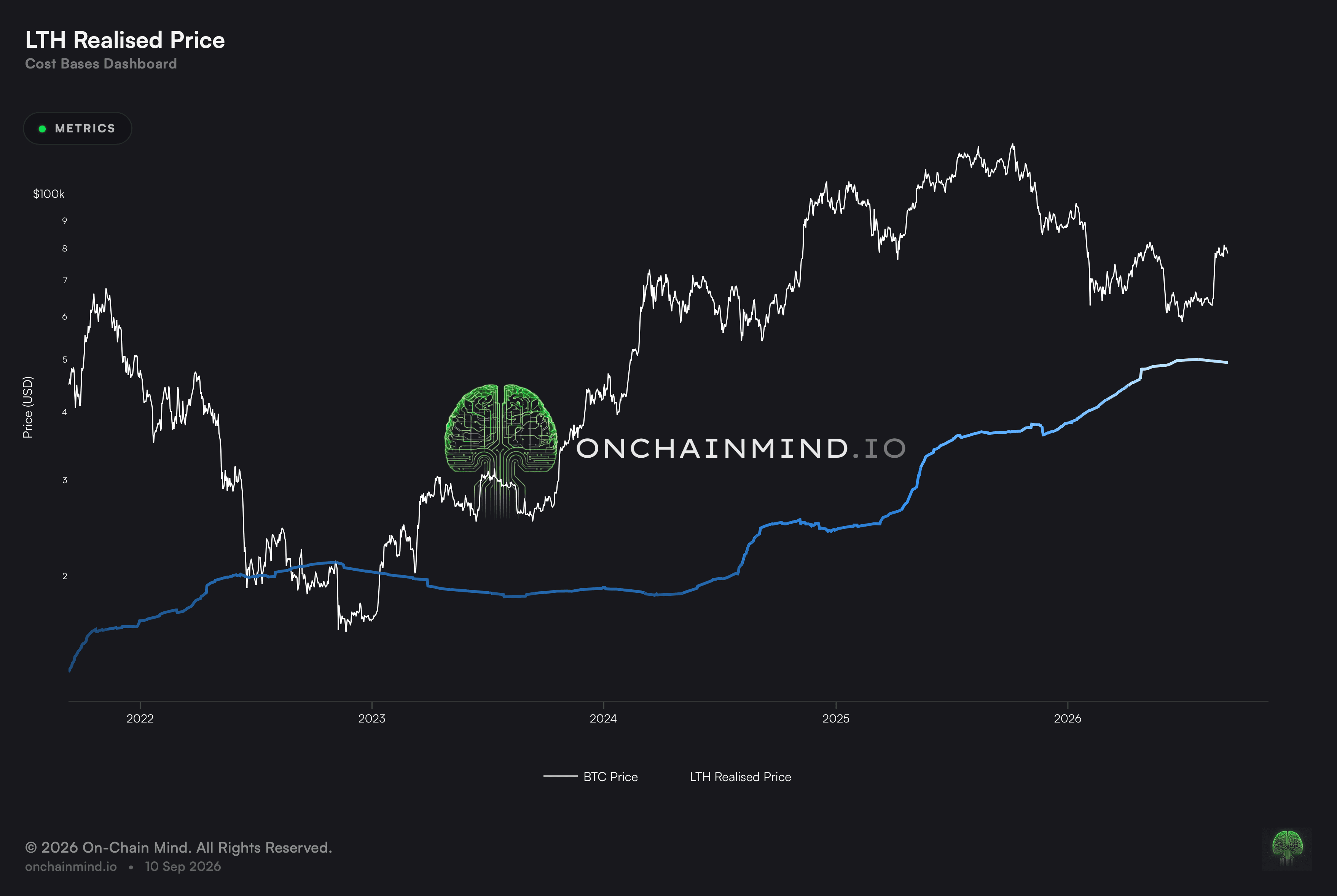
LTH Realised Price tracks what the seasoned owners of the supply handed over, taken across the whole Long-Term Holder cohort. The market seldom trades under it, and the occasions it has done so are the ones later described as once-a-cycle opportunities, because at that point even the stubborn money is showing a loss.
Long-term holders very rarely sell at a loss. Price reaching their basis is therefore the point at which the strongest hands on the network are tested, and so the touches have clustered at cycle bottoms rather than anywhere in between.
What it actually measures
The level tracks what the patient cohort paid, and through most of a cycle it sits far below spot. That distance is the cushion those holders are sitting on, and it is what makes them so difficult to shake out.
Because the cohort accumulates slowly and sells reluctantly, the line moves slowly too. It rises as cheaper coins are spent and dearer ones age into the cohort, and it falls when the reverse happens.
Read against the short-term cohort’s level, it also answers a structural question. Which of the two sits higher describes whether recent buyers are paying more than patient holders did, and that relationship has changed hands around cycle turns rather than mid-trend.
The level is most useful when price is nowhere near it
Waiting for a touch is not a strategy. The market has spent the overwhelming majority of its history well above this level, and someone who only acts when it is reached will do nothing for years at a time and then have to act during the worst conditions the market produces.
The distance carries the information instead. A wide gap says patient holders have a deep cushion and are unlikely to be forced out. A narrowing gap says that cushion is being eroded, and it says it long before any touch, which is the part worth watching.
What it does not tell you
The sample of touches is tiny. A handful of events across the network’s whole history is not enough to call the level reliable, and each of those events happened under different market structure with different holder composition.
The cohort boundary is also a convention rather than a fact. Where the line between short-term and long-term is drawn changes the level, so figures from different providers will not match and none of them is the true one.
How to read it
Far above LTH Realised Price. The ordinary state through most of a cycle. Patient holders sit on a deep cushion.
Above LTH Realised Price. Long-term holders remain in profit, which is the normal condition.
Near LTH Realised Price. Rare. Price has fallen to where the most patient cohort breaks even.
Below LTH Realised Price. Even patient holders are underwater, a condition that has appeared only at generational lows.
LTH Realised Price is drawn on the Cost Bases dashboard, beside STH Realised Price, Investor Price and Balanced Price.
Common questions
Why is a touch so significant?
Because that cohort almost never sells into a loss. Price arriving at what they paid is where the most patient money gets tested, and those touches have clustered at the deepest lows on record.
How often has it happened?
Very seldom. The market spends almost all of its history above this level, which is what makes the sample too small to lean on heavily.
What should I read instead of waiting for a touch?
The distance. A wide gap means patient holders have a deep cushion, and a narrowing one says that cushion is eroding well before any touch.
Why do providers disagree on the level?
Because the boundary between short-term and long-term is a convention. Move it and the level moves with it.
What does it mean when the two cohort levels cross?
That the two cohorts have swapped places on who paid more. Events of that kind have tended to arrive at the hinges of a cycle instead of partway through a trend.
ON-CHAIN METRIC
LTH Realised Price
What aged supply collectively paid, and why price rarely gets anywhere near it.
Open the Cost Bases dashboard
LTH Realised Price tracks what the seasoned owners of the supply handed over, taken across the whole Long-Term Holder cohort. The market seldom trades under it, and the occasions it has done so are the ones later described as once-a-cycle opportunities, because at that point even the stubborn money is showing a loss.
Long-term holders very rarely sell at a loss. Price reaching their basis is therefore the point at which the strongest hands on the network are tested, and so the touches have clustered at cycle bottoms rather than anywhere in between.
What it actually measures
The level tracks what the patient cohort paid, and through most of a cycle it sits far below spot. That distance is the cushion those holders are sitting on, and it is what makes them so difficult to shake out.
Because the cohort accumulates slowly and sells reluctantly, the line moves slowly too. It rises as cheaper coins are spent and dearer ones age into the cohort, and it falls when the reverse happens.
Read against the short-term cohort’s level, it also answers a structural question. Which of the two sits higher describes whether recent buyers are paying more than patient holders did, and that relationship has changed hands around cycle turns rather than mid-trend.
The level is most useful when price is nowhere near it
Waiting for a touch is not a strategy. The market has spent the overwhelming majority of its history well above this level, and someone who only acts when it is reached will do nothing for years at a time and then have to act during the worst conditions the market produces.
The distance carries the information instead. A wide gap says patient holders have a deep cushion and are unlikely to be forced out. A narrowing gap says that cushion is being eroded, and it says it long before any touch, which is the part worth watching.
What it does not tell you
The sample of touches is tiny. A handful of events across the network’s whole history is not enough to call the level reliable, and each of those events happened under different market structure with different holder composition.
The cohort boundary is also a convention rather than a fact. Where the line between short-term and long-term is drawn changes the level, so figures from different providers will not match and none of them is the true one.
How to read it
Far above LTH Realised Price. The ordinary state through most of a cycle. Patient holders sit on a deep cushion.
Above LTH Realised Price. Long-term holders remain in profit, which is the normal condition.
Near LTH Realised Price. Rare. Price has fallen to where the most patient cohort breaks even.
Below LTH Realised Price. Even patient holders are underwater, a condition that has appeared only at generational lows.
LTH Realised Price is drawn on the Cost Bases dashboard, beside STH Realised Price, Investor Price and Balanced Price.
Common questions
Why is a touch so significant?
Because that cohort almost never sells into a loss. Price arriving at what they paid is where the most patient money gets tested, and those touches have clustered at the deepest lows on record.
How often has it happened?
Very seldom. The market spends almost all of its history above this level, which is what makes the sample too small to lean on heavily.
What should I read instead of waiting for a touch?
The distance. A wide gap means patient holders have a deep cushion, and a narrowing one says that cushion is eroding well before any touch.
Why do providers disagree on the level?
Because the boundary between short-term and long-term is a convention. Move it and the level moves with it.
What does it mean when the two cohort levels cross?
That the two cohorts have swapped places on who paid more. Events of that kind have tended to arrive at the hinges of a cycle instead of partway through a trend.