

ON-CHAIN METRIC
Z-Score Probability Waves
Price restated as distance from its own average, on a scale that travels across assets.
Open the Z-Score Probability Waves dashboard
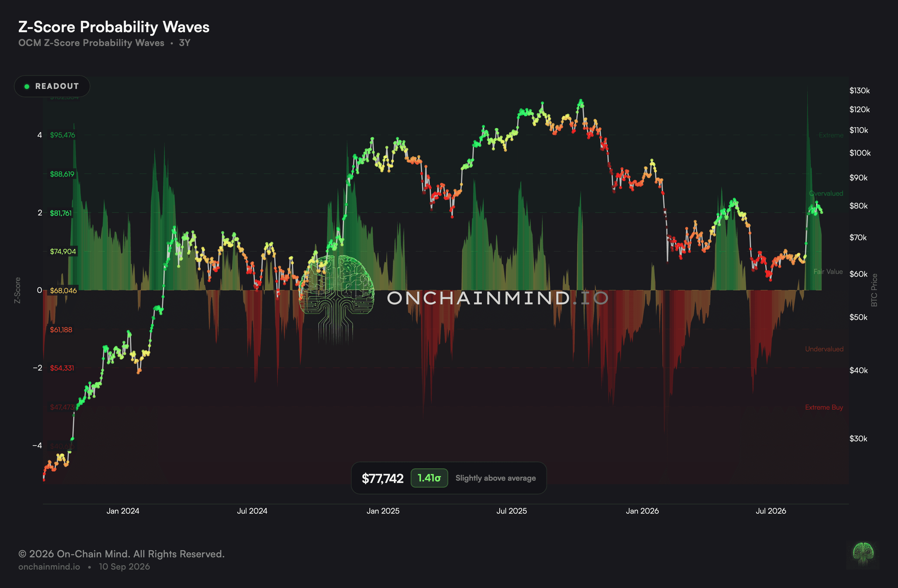
Z-Score Probability Waves restates price as a distance rather than as an amount. Instead of dollars it reports how far the asset sits from its own statistical centre, which turns any market into one comparable scale.
That comparability is the point. The same reading means the same thing on Bitcoin, on a large alternative asset and on an equity, because each is being measured against itself rather than against a shared yardstick.
What it actually measures
The bands widen and narrow as the market does. They are not fixed lines drawn once, so the price required to reach any given band moves with conditions and is re-priced as those conditions change underneath it.
Every band is converted back into a live price. That is what makes the view usable rather than abstract: a reader can see what a move to a stated band would cost in the currency they actually think in.
Around the middle the reading is close to silent. Sitting near the centre is simply the ordinary state of any market, and this view is deliberately built so that what it has to say lives at the two extremes instead.
A comparable scale is worth more than a precise one
Comparing two markets by price is meaningless. Comparing them by percentage move is only slightly better, because a move of the same size means very different things in a calm market and in a violent one.
Measuring each against its own dispersion fixes that. A reading of the same magnitude describes the same degree of unusualness wherever it appears, which is what lets one number be read across a portfolio.
Probability Model: precedent is not prediction, and the difference is the sample
The hit rate is only interesting against the asset’s own baseline. A market that has risen most of the time will produce a flattering figure from any band, so the comparison is what carries the meaning.
Every figure here is a record of what has already happened. Reading it as a forecast requires assuming the future resembles a past that, for this asset, amounts to only a handful of complete cycles.
That is why the count sits next to each number rather than in a footnote. It is the single fact that decides whether a figure describes a pattern or an accident, and burying it would make the whole view misleading.
What it does not tell you
Stretched is not the same as due. A market can hold an extreme reading for a very long time, and the strongest trends on record are precisely the episodes that did.
The scale assumes the past describes the future well enough to be a reference. Where a market genuinely changes character, the centre it is being measured against is the wrong one for a while.
It carries no timing. The reading says where price sits in its own distribution and offers nothing about when, or whether, it returns.
How to read it
Extremely stretched. A statistically rare reading, though a parabolic move can hold one far longer than seems reasonable.
Overvalued. An elevated premium, and more often a transition than a top.
Fair value. Price sits around its own centre, where the reading carries the least information.
Undervalued. Under the centre, and every further step down has historically tilted the balance a little more.
Extremely cheap. Among the sturdiest accumulation readings anywhere in the record.
On the Z-Score dashboard, Probability Waves runs next to Probability Model.
Common questions
Why measure price this way?
Because dollars cannot be compared across assets and percentages cannot be compared across conditions. Distance from an asset’s own centre can be compared with both.
Why do the band prices keep moving?
Because the bands adapt as the market’s dispersion changes. The price needed to reach a given band is recalculated as conditions shift, which is why it is quoted live.
Can a market hold an extreme?
It can, and this is the warning worth taking seriously. Rare values have been sustained right through the most powerful trends, which is precisely when trading the number by itself has cost the most.
Is a high reading an instruction to sell?
No. All it establishes is that price sits far from where this asset usually trades and that such distances have closed before. There is no clock attached, and the furthest a trend runs is generally from here.
What changes in pair mode?
The subject entirely. Choose a second asset and the line becomes the relationship between the pair, so a large value says the two have drifted apart from their usual footing and says nothing about either being expensive.
What is actually being computed?
The current reading is matched against every earlier occurrence in the record, and the realised outcomes over several horizons are reported. It is a record of precedent, not a projection.
Why report the worst path?
Because a middle outcome hides it completely. The largest loss suffered on the way is usually what determines whether a position lasts long enough to reach the destination.
ON-CHAIN METRIC
Z-Score Probability Waves
Price restated as distance from its own average, on a scale that travels across assets.
Open the Z-Score Probability Waves dashboard
Z-Score Probability Waves restates price as a distance rather than as an amount. Instead of dollars it reports how far the asset sits from its own statistical centre, which turns any market into one comparable scale.
That comparability is the point. The same reading means the same thing on Bitcoin, on a large alternative asset and on an equity, because each is being measured against itself rather than against a shared yardstick.
What it actually measures
The bands widen and narrow as the market does. They are not fixed lines drawn once, so the price required to reach any given band moves with conditions and is re-priced as those conditions change underneath it.
Every band is converted back into a live price. That is what makes the view usable rather than abstract: a reader can see what a move to a stated band would cost in the currency they actually think in.
Around the middle the reading is close to silent. Sitting near the centre is simply the ordinary state of any market, and this view is deliberately built so that what it has to say lives at the two extremes instead.
A comparable scale is worth more than a precise one
Comparing two markets by price is meaningless. Comparing them by percentage move is only slightly better, because a move of the same size means very different things in a calm market and in a violent one.
Measuring each against its own dispersion fixes that. A reading of the same magnitude describes the same degree of unusualness wherever it appears, which is what lets one number be read across a portfolio.
Probability Model: precedent is not prediction, and the difference is the sample
The hit rate is only interesting against the asset’s own baseline. A market that has risen most of the time will produce a flattering figure from any band, so the comparison is what carries the meaning.
Every figure here is a record of what has already happened. Reading it as a forecast requires assuming the future resembles a past that, for this asset, amounts to only a handful of complete cycles.
That is why the count sits next to each number rather than in a footnote. It is the single fact that decides whether a figure describes a pattern or an accident, and burying it would make the whole view misleading.
What it does not tell you
Stretched is not the same as due. A market can hold an extreme reading for a very long time, and the strongest trends on record are precisely the episodes that did.
The scale assumes the past describes the future well enough to be a reference. Where a market genuinely changes character, the centre it is being measured against is the wrong one for a while.
It carries no timing. The reading says where price sits in its own distribution and offers nothing about when, or whether, it returns.
How to read it
Extremely stretched. A statistically rare reading, though a parabolic move can hold one far longer than seems reasonable.
Overvalued. An elevated premium, and more often a transition than a top.
Fair value. Price sits around its own centre, where the reading carries the least information.
Undervalued. Under the centre, and every further step down has historically tilted the balance a little more.
Extremely cheap. Among the sturdiest accumulation readings anywhere in the record.
On the Z-Score dashboard, Probability Waves runs next to Probability Model.
Common questions
Why measure price this way?
Because dollars cannot be compared across assets and percentages cannot be compared across conditions. Distance from an asset’s own centre can be compared with both.
Why do the band prices keep moving?
Because the bands adapt as the market’s dispersion changes. The price needed to reach a given band is recalculated as conditions shift, which is why it is quoted live.
Can a market hold an extreme?
It can, and this is the warning worth taking seriously. Rare values have been sustained right through the most powerful trends, which is precisely when trading the number by itself has cost the most.
Is a high reading an instruction to sell?
No. All it establishes is that price sits far from where this asset usually trades and that such distances have closed before. There is no clock attached, and the furthest a trend runs is generally from here.
What changes in pair mode?
The subject entirely. Choose a second asset and the line becomes the relationship between the pair, so a large value says the two have drifted apart from their usual footing and says nothing about either being expensive.
What is actually being computed?
The current reading is matched against every earlier occurrence in the record, and the realised outcomes over several horizons are reported. It is a record of precedent, not a projection.
Why report the worst path?
Because a middle outcome hides it completely. The largest loss suffered on the way is usually what determines whether a position lasts long enough to reach the destination.