

ON-CHAIN METRIC
Volume Momentum
Whether participation is building or draining, measured against this market’s own baseline.
Open the Volume dashboard
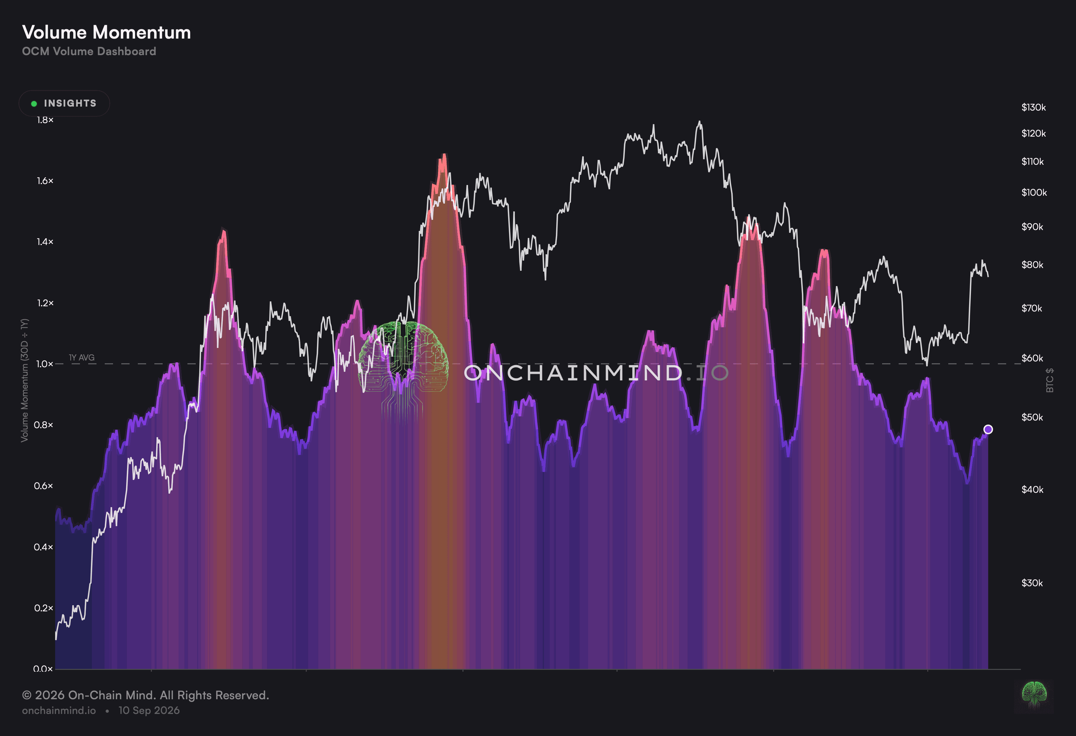
Volume Momentum sets recent trading against the level this market has run at over a far longer stretch. It says whether the crowd is arriving or leaving, which no single day’s figure can show.
One busy session is noise. A run of busy sessions against a quiet year is a change in the market’s character, and that is the difference this view exists to make visible.
What it actually measures
The line sits above its pivot when recent trading has been heavier than the long run and below it when lighter. The pivot is the level worth watching, because crossing it is a statement about direction of travel.
Because the reading is a comparison rather than a level, the growth of the market drops out of it. Readings from very different eras can be set side by side and mean the same thing.
The units control genuinely changes the curve here. A comparison built on currency and one built on coins are two different questions, not the same shape drawn at another scale. It is worth deciding which of the two is being asked before reading the line.
Attention arrives before conviction does
Participation tends to build before a market goes anywhere, and to drain away long before anyone announces a trend has ended. A daily figure is too noisy to show either, and a comparison against a long baseline is not.
That makes this a view about who is in the room rather than about what they are doing. It sets the backdrop against which the rest of the dashboard should be read.
Vol Surge: most days on this chart are meant to be empty
The score combines how much traded with how far the market travelled, so a day registers only when both were unusual. Heavy trading that went nowhere and a large move on nothing each fail to qualify.
A view that flags something every week is not flagging anything. This one is scaled so ordinary participation produces an ordinary reading, which is what makes an extreme reading mean something when it arrives.
The cost is that it stays silent most of the time. That silence is the feature, since it is what stops the view manufacturing events out of a market going about its business.
What it does not tell you
It is directionless by design. Building participation accompanies advances and declines alike, so nothing here says which way the interest is pointed, and reading it as bullish because the line is rising is the common mistake.
The baseline itself moves. A market that has been quiet for a long stretch lowers its own bar, so a reading can climb without a great deal genuinely happening.
It reacts slowly at turns. The comparison needs a run of days to shift, which means it confirms a change in participation rather than announcing one.
How to read it
Surging. Recent trading sits far above the level this market has run at across the long stretch.
Elevated. More trading than the long-run level, without being extreme.
Average. Participation is ordinary for this market.
Cooling. Interest is draining relative to the longer run.
Fading. Participation has dropped well beneath its own long-run level.
Volume Momentum is one of the views on the Volume dashboard, along with Daily Volume, Vol Surge and Liquidity Correlation.
Common questions
Why set a short stretch against a long one?
Because it takes the market’s growth out of the picture. A single fixed threshold would have described a different market in every era, and a comparison against its own baseline does not.
Do the units genuinely change this line?
Yes, and meaningfully. Since the reading is a comparison, a currency-weighted version is a genuinely different curve rather than the same one rescaled.
What does fading participation mean?
That fewer people are in the market, which tends to go with range-bound stretches. It is a statement about attention, not about where price goes next.
Where does the pivot sit?
At the point where recent trading and the long-run level are the same. Above it the market is busier than it has been used to, below it quieter.
Is this a timing tool?
No. It moves too slowly to mark an entry and it carries no direction, so it belongs in the background of a decision rather than at the front of one.
Why not just read Daily Volume?
Because Daily Volume places a session against the recent run. This one places it against the entire record, which is why it stays quiet through stretches the other treats as busy.
Why are most readings near the middle?
Because the scale is set against the full record. Ordinary participation is supposed to produce an ordinary reading, and that is what leaves room for an extreme to stand out.
ON-CHAIN METRIC
Volume Momentum
Whether participation is building or draining, measured against this market’s own baseline.
Open the Volume dashboard
Volume Momentum sets recent trading against the level this market has run at over a far longer stretch. It says whether the crowd is arriving or leaving, which no single day’s figure can show.
One busy session is noise. A run of busy sessions against a quiet year is a change in the market’s character, and that is the difference this view exists to make visible.
What it actually measures
The line sits above its pivot when recent trading has been heavier than the long run and below it when lighter. The pivot is the level worth watching, because crossing it is a statement about direction of travel.
Because the reading is a comparison rather than a level, the growth of the market drops out of it. Readings from very different eras can be set side by side and mean the same thing.
The units control genuinely changes the curve here. A comparison built on currency and one built on coins are two different questions, not the same shape drawn at another scale. It is worth deciding which of the two is being asked before reading the line.
Attention arrives before conviction does
Participation tends to build before a market goes anywhere, and to drain away long before anyone announces a trend has ended. A daily figure is too noisy to show either, and a comparison against a long baseline is not.
That makes this a view about who is in the room rather than about what they are doing. It sets the backdrop against which the rest of the dashboard should be read.
Vol Surge: most days on this chart are meant to be empty
The score combines how much traded with how far the market travelled, so a day registers only when both were unusual. Heavy trading that went nowhere and a large move on nothing each fail to qualify.
A view that flags something every week is not flagging anything. This one is scaled so ordinary participation produces an ordinary reading, which is what makes an extreme reading mean something when it arrives.
The cost is that it stays silent most of the time. That silence is the feature, since it is what stops the view manufacturing events out of a market going about its business.
What it does not tell you
It is directionless by design. Building participation accompanies advances and declines alike, so nothing here says which way the interest is pointed, and reading it as bullish because the line is rising is the common mistake.
The baseline itself moves. A market that has been quiet for a long stretch lowers its own bar, so a reading can climb without a great deal genuinely happening.
It reacts slowly at turns. The comparison needs a run of days to shift, which means it confirms a change in participation rather than announcing one.
How to read it
Surging. Recent trading sits far above the level this market has run at across the long stretch.
Elevated. More trading than the long-run level, without being extreme.
Average. Participation is ordinary for this market.
Cooling. Interest is draining relative to the longer run.
Fading. Participation has dropped well beneath its own long-run level.
Volume Momentum is one of the views on the Volume dashboard, along with Daily Volume, Vol Surge and Liquidity Correlation.
Common questions
Why set a short stretch against a long one?
Because it takes the market’s growth out of the picture. A single fixed threshold would have described a different market in every era, and a comparison against its own baseline does not.
Do the units genuinely change this line?
Yes, and meaningfully. Since the reading is a comparison, a currency-weighted version is a genuinely different curve rather than the same one rescaled.
What does fading participation mean?
That fewer people are in the market, which tends to go with range-bound stretches. It is a statement about attention, not about where price goes next.
Where does the pivot sit?
At the point where recent trading and the long-run level are the same. Above it the market is busier than it has been used to, below it quieter.
Is this a timing tool?
No. It moves too slowly to mark an entry and it carries no direction, so it belongs in the background of a decision rather than at the front of one.
Why not just read Daily Volume?
Because Daily Volume places a session against the recent run. This one places it against the entire record, which is why it stays quiet through stretches the other treats as busy.
Why are most readings near the middle?
Because the scale is set against the full record. Ordinary participation is supposed to produce an ordinary reading, and that is what leaves room for an extreme to stand out.