
Bitcoin has changed beyond all recognition since 2010. The supply has grown tenfold, the holders are completely different people, ETFs now sit on the order book.
And yet, through every one of those changes, the market keeps bottoming at the exact same point of human pain, and we are sitting right on top of it today.
Which is why the mega-bears calling for $30,000, or even $20,000, have it so wrong. I get the fear, the price action is ugly. But the on-chain data says those numbers are mathematically implausible, and let me show you why.
Let’s get into it.
Key insights
The 50/50 Capitulation Line: Half the supply now sits in profit and half in loss, a reading reached on only 7% of all trading days.
Long-Term Pain: Over 40% of long-term holders are now underwater, an extraordinary figure for this stage of Bitcoin’s maturity.
Profit-Taking Exhaustion: Realised cash extraction has completely collapsed from $55 billion to just $3 billion. Textbook bottoming behaviour.
Why Sub-$40K Is Implausible: The URPD shows a $20k print would push over 70% of the network into loss, something never witnessed in history.
The Line That Has Marked Every Bottom
Every coin on the network carries a cost basis, the price it last moved at on-chain. Value the whole supply against spot, and you can see precisely what fraction is above water and what fraction is drowning.
Today that split is a perfect 50/50.
Here’s what makes this so striking. Supply has ballooned from roughly 3.5 million coins in 2010 to over 20 million today. The holder base has changed beyond recognition. And yet this one level, where half the network slips into loss, has flagged every single bear market low we have on record: 2011, 2015, 2019, the 2020 flush, and the 2022 bottom.
For me, it tells us something deep about human behaviour.
No matter how large this thing becomes, roughly half the network being underwater is about the threshold of pain the market can absorb before sellers are exhausted.
And this is rare air. Bitcoin spends around 93% of its days with most of the supply in profit, so this 50% reading lands us in the bottom 7% of all readings ever. These are not ordinary days. They are the rare, uncomfortable moments that have historically lined up with the best entry opportunities of an entire cycle, the days nobody wants to buy precisely because they feel so bleak.
The move here has been violent too, surging from 34% in loss a month ago to over 50% now, and that rapid expansion in unrealised pain is exactly what leans me towards the capitulation floor.
But Bitcoin rarely taps these levels and immediately launches into a new bull market. That is why I continue to lean towards a time-based capitulation rather than a purely price-based one.
Pain by boredom, not just pain by price.

View live in OCM Studio: Supply in Profit and Loss %
The Long-Term Holder Tell
The long-term holder version of this adds real nuance. The metric does not simply ask who is underwater. It requires coins to age into the cohort first (> 5 months), which makes it a slower, more deliberate read on conviction.
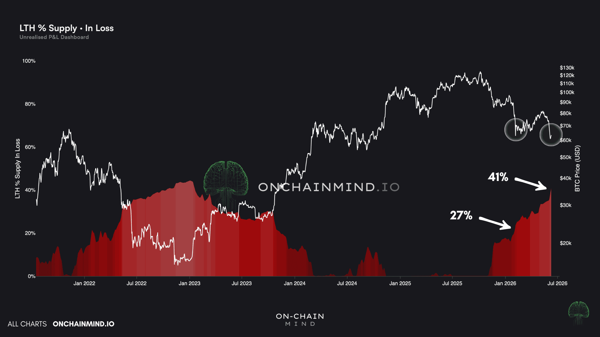
When we touched the low $60,000s back in February, only 27% of long-term holder supply sat in loss. At the very same price today, over 40% are underwater.
So why the gap at an identical price? Because the people who bought the last cycle top have now held long enough to graduate into long-term holder status, and they drag the figure up as they age into the data. The cohort itself is maturing in real time.
Crucially, the bottoming threshold has fallen with each cycle, from over 50% in 2015, to roughly 45% in 2019, to just above 40% in 2022.
That decline is mechanical, not coincidental, and it is the part most people miss. It becomes harder and harder to push old, deeply profitable coins into a loss as price grinds higher over the years. Coins bought in 2015 or 2019 are so far in the green that nothing short of catastrophe touches them. So the metric naturally trends lower as Bitcoin matures, which is exactly why sitting near 41% today is a genuinely high reading for where we are.
View live in OCM Studio: LTH Supply in Loss %
When Profit-Taking Falls Off a Cliff
Everything above is the unrealised side, the paper gains and losses holders are sitting on. But it tells you nothing about what they are actually doing. For that we turn to the realised side, the cash genuinely extracted from the ecosystem, and this is where the picture sharpens.
On a cumulative basis, holders have pulled nearly a trillion dollars of realised profit out of Bitcoin over its lifetime. That number is staggering, but it is also the wrong thing to fixate on. The figure that matters is the slope, the rate at which cash is leaving the system right now, and that slope has flattened off a cliff.
On a 30-day rolling basis we are looking at around $3 billion extracted. Set that against the cycle peak, when more than $55 billion left the system over the very same window, and you are staring at almost a tenfold collapse in profit-taking. That is enormous.
A bottom is not formed when buyers rush in, it is formed when sellers run out of conviction and stop ringing the till. When the cash being pulled from the network drains away like this, it is a sign the heavy distribution is already behind us, not ahead.
A collapse in realised profit on this scale is textbook bottoming behaviour, and it lines up neatly with everything the unrealised metrics are telling us.

View live in OCM Studio: Cash Extracted
Why the Mega Bears Have Missed the Point
This is where the URPD comes in, the UTXO Realised Price Distribution. The name is a mouthful, but the idea is beautifully simple.
It plots every coin at the exact price it last moved, showing how much supply changed hands at each level. Right now there are hundreds of thousands of coins clustered around our current level, most of them held for between 1-5 years, and that is the wall of support beneath us.
The reason it works is, as always, psychology.
Approach a heavy cluster from above and those holders are near breakeven, motivated to sell and get their money back, which creates resistance. Approach the same level from below and they refuse to sell at a loss, which creates support.
The bigger the cluster, the stronger the effect.
We are sitting on one of the largest waves in the entire network, which is why the low $60,000s have held so stubbornly.

View live in OCM Studio: URPD - Density
But here is the predictive payoff. Because we know where every coin last moved, we can model exactly how much supply would be underwater at any hypothetical price:
Drop to $50,000 and 57% of supply falls into loss, already worse than anything in history.
Fall to $43,000 and you are near 60%.
A move to $20,000 would shove over 3.5 million more coins into the red, pushing more than 70% of the market underwater.
That last figure is simply off the scale. It has never happened, not even close, so calling for it is mathematically unsound. So yes, there is more pain possible from here, but I would far rather anchor to what the data has actually done than to a number plucked from fear.
Where I Currently Stand
At this stage, you have to look at the objective mathematics rather than letting your inner monkey brain dictate your market outlook.
The weakness we are seeing across the board is very real, and the recent price action is undeniably ugly. We tend to chop around these capitulation levels rather than ricochet off them. Anyone telling you we bounce cleanly from here in a neat V is, in my view, ignoring how these bottoms actually form.
Because of this, my base case has not changed. I still expect a time-based capitulation for the remainder of this year rather than a purely price-based one. Pain by boredom, not just pain by price dropping like a stone.
Which brings me to the mega-bears. The crowd calling for a drop back to $20,000 have completely missed the point of on-chain maturity. A drop to those levels would put more of the network underwater than any point in history, and “never seen before” is a fragile thing to bet on. Basing decisions on statistics rather than fear is the only logical path forward.
What I keep coming back to is the difference between a market that is weak and a market that is broken.
Right now, Bitcoin looks weak. On-chain, though, this is precisely the structure that has formed near every major bear market low we have data for. The 50/50 profit line, the >40% of long-term holders underwater, the collapse in cash extracted, and that enormous wall of supply in the low $60,000s all point to the same place.
It’s impossible to call the bottom by the day or wick. But are we back in that bottoming zone? Almost certainly.
So sit with the discomfort, trust the maths over the monkey, and remember that the best entries in this asset’s history have always felt exactly like this.