
After 4 gruelling months of sideways chop, Bitcoin appears trapped in a frustrating limbo. The recent price seems chaotic, random, and disorganised — but beneath that apparent mess, a subtle reorganisation is taking place. The market is resetting its internal structure, and the indicators are beginning to align once again.
In this article, I’ll break down the underlying forces that are shaping Bitcoin’s consolidation structure and what they mean for the next move of the cycle.
Key insights
Equilibrium in Action: Bulls and bears are evenly matched, creating indecision that often precedes decisive breakouts.
Key Levels to Watch: $117,000 emerges as a pivotal resistance; reclaiming it could signal renewed bullish momentum.
Entropy’s Decline: High market disorder is easing, hinting at a resumption of the prevailing uptrend rather than a reversal.
Structural Resilience: Long-term supports remain intact, with downside risks limited unless critical thresholds are breached.
Sideways Market Psychology
If you’ve felt mentally drained by Bitcoin’s recent price action, you’re not alone. Prolonged consolidation phases often test conviction more than sharp drawdowns ever do. The market chops around, liquidity dries up, and even Bitcoin OGs begin to doubt their strategy.
But beneath that emotional frustration lies an important truth: consolidation is a structural reset. It’s how markets breathe before expanding again. What feels like indecision is often the process of redistributing supply between strong and weak hands.
The key is to look beyond price and into the underlying metrics to identify when chaos is quietly transforming into order.
Who’s in Control?
The Polyfactor SuperTrend is an advanced adaptation of the traditional SuperTrend indicator. Rather than relying on a single Average True Range (ATR) factor, it layers multiple ATR bands with increasing multipliers, creating a multi-dimensional view of price deviation and trend control.
Green-dominant regions: represent bullish dominance.
Red-dominant regions: show bearish control.
Mixed regions: highlight market indecision.
At the moment, this indicator is showing an almost perfect 50/50 balance between the two forces. There’s no clear dominance, no runaway move, just equilibrium.
Historically, when we reach this kind of symmetry, it’s followed by major volatility. Why? Because equilibrium is unsustainable in a market like Bitcoin. Eventually, one side overwhelms the other, and the resulting impulse often defines the next leg of the market cycle.
This balance, though uncomfortable, is exactly what precedes expansion.
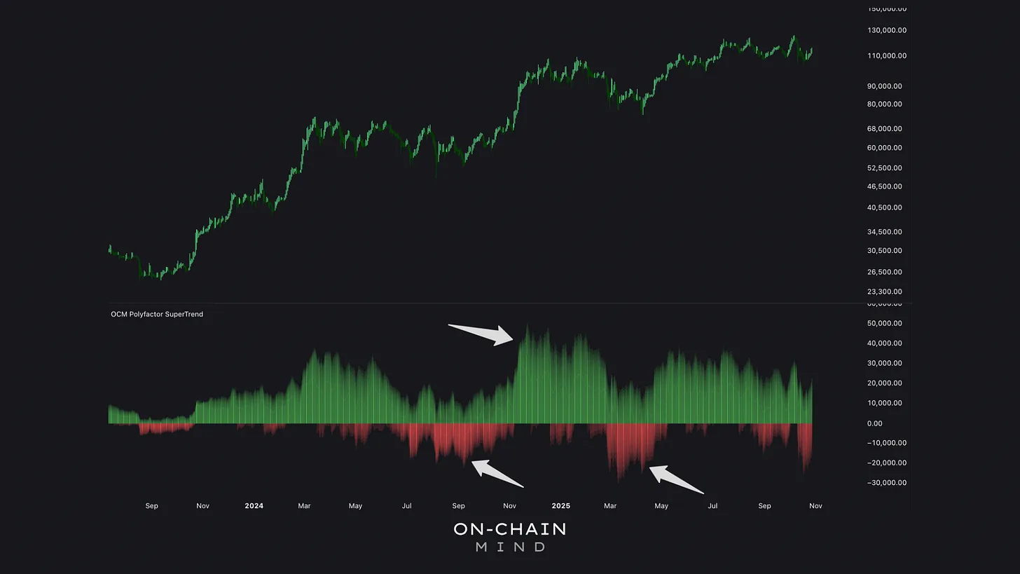
In bullish phases, green dominates the chart, reflecting strong buyer control. Bearish periods turn red, but only major downturns fully erase the green. Currently, a near-even green-red balance signals rare equilibrium, historically a coiled spring poised for sharp directional moves.
The Moving Structure Beneath the Noise
Next up: the Flow Ribbons, which are a layered set of exponential moving averages (EMAs) that represent dynamically moving zones of support and resistance.
Despite the choppy price action, these ribbons are still holding strong. The second-lowest ribbon, sitting around $105K, recently acted as a springboard for local support. Historically, touches on this ribbon during uptrends often precede sharp recoveries.
The bottom ribbon (now just shy of $100K) forms a crucial structural boundary. Losing this would mark a true shift in market character. But as of now, the Flow Ribbonsremain upward-sloping, signalling that the macro trend is still predominantly bullish.
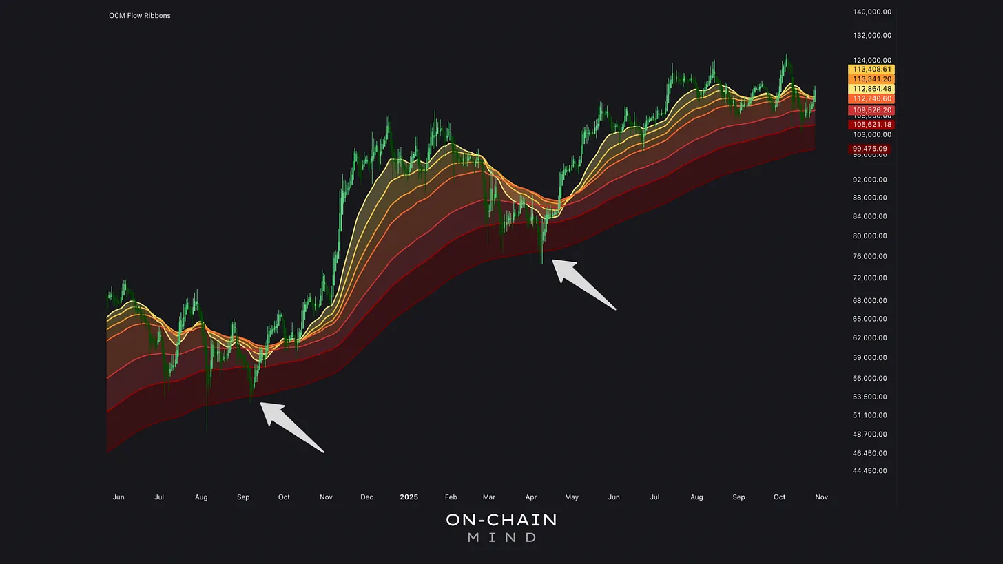
Despite recent dips that flirted with negativity, the ribbons have proven resilient. Bitcoin briefly touched the penultimate ribbon near $105,000, sparking a small panic, but it rebounded, which is a pattern echoed in many previous uptrends.
Quantifying the Chaos
Entropy is a concept borrowed from thermodynamics. It’s a measure of disorder within a system. In market terms, entropy quantifies how unpredictable price movements are.
Here’s how it works: Bitcoin’s price changes (log returns) are binned by size, their frequencies measured, and Shannon entropy applied to quantify how “spread out” these movements are.
High entropy: maximum unpredictability — typically seen during sideways chop or consolidation.
Low entropy: increased order — indicating trending or directional markets.
Currently, Bitcoin’s entropy readings have been among the highest in its history, which is a clear reflection of recent choppy action. But what’s fascinating is that entropy is now declining rapidly.
This means disorder is subsiding, at least in the short-term. The market is reorganising itself into a more predictable state, which historically precedes trend continuation.
In simple terms: the chaos seems to be cooling off. And when markets cool off after extreme disorder, they often resume the prior macro trend — which, in Bitcoin’s current case, is up.
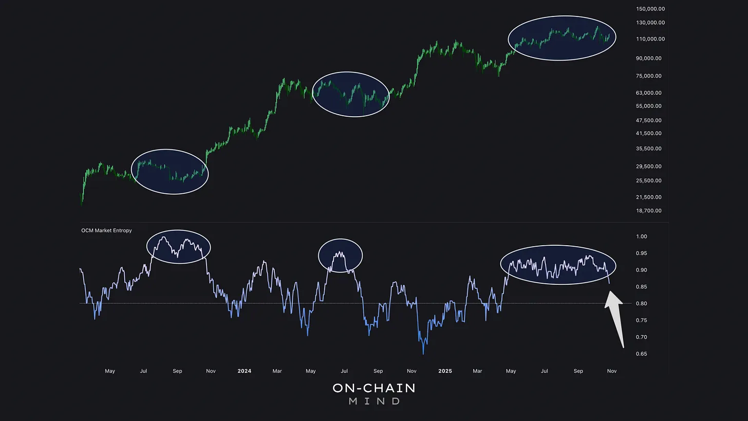
Bitcoin’s entropy has hit near-historic highs, confirming the recent trading’s messiness. Yet, extreme entropy often precedes trend resumptions, as markets revert to the existing trend. A sharp entropy decline now hints at subtle bullish momentum.
Mapping the Battlefield
Technically, Bitcoin is confined to a $20,000 range, with the tighter battlefield sitting between $106K support and $117Kresistance.
Reclaiming $117K would confirm bullish momentum returning.
Losing $105K would indicate that bears are gaining serious traction.
Beyond that, secondary levels at $102K and $122K act as outer boundary zones where liquidity tends to cluster and where aggressive trading behaviour is most visible.
What’s clear is that $117K keeps appearing across multiple frameworks, which is rarely a coincidence. When several independent indicators converge on the same level, it becomes a magnet for market action.
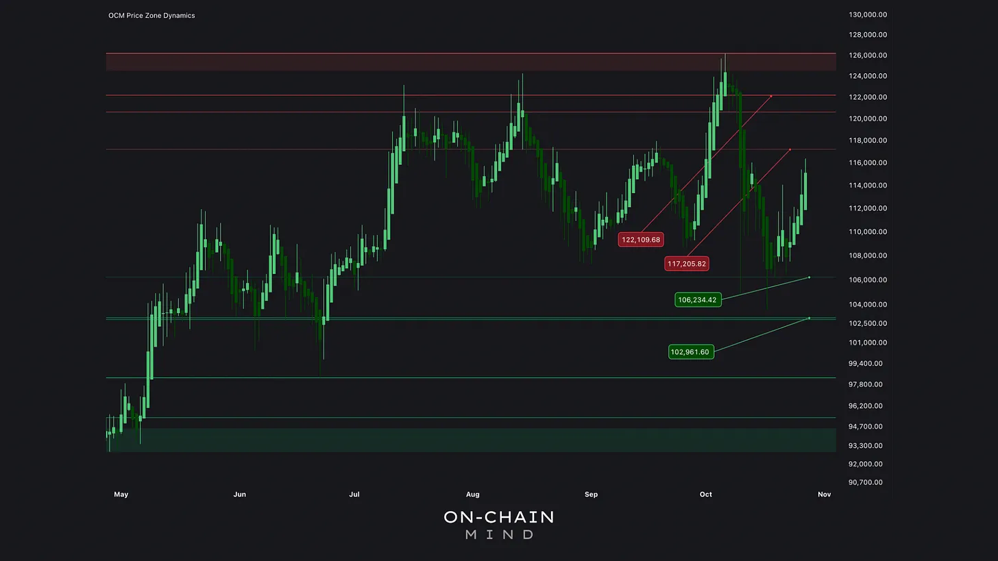
Breaking $117,000 would reclaim momentum and counter any bearish views. Key levels of $102,000 (secondary support) and $122,000 (secondary resistance) show volume clusters of heightened market activity.
Where The Local Liquidity Lives
The Local Volume Profile visualises traded volume across different price levels during this consolidation. Each price point has a horizontal bar showing how much volume occurred there.
The Point of Control (PoC), which is the level with the highest traded volume, currently sits at $117,000.
That’s significant for two reasons:
Structural: It’s the most accepted price during this consolidation. Breaking above it signals that the majority of market participants are willing to transact at higher levels, which is a bullish sign.
Psychological: It marks the line where conviction shifts. Traders who’ve been selling resistance may flip bias once the market holds above this line.
In essence, $117K isn’t just resistance — it’s a psychological pivot. It’s where the majority of traders “agree” on value, and once broken, that agreement resets higher.
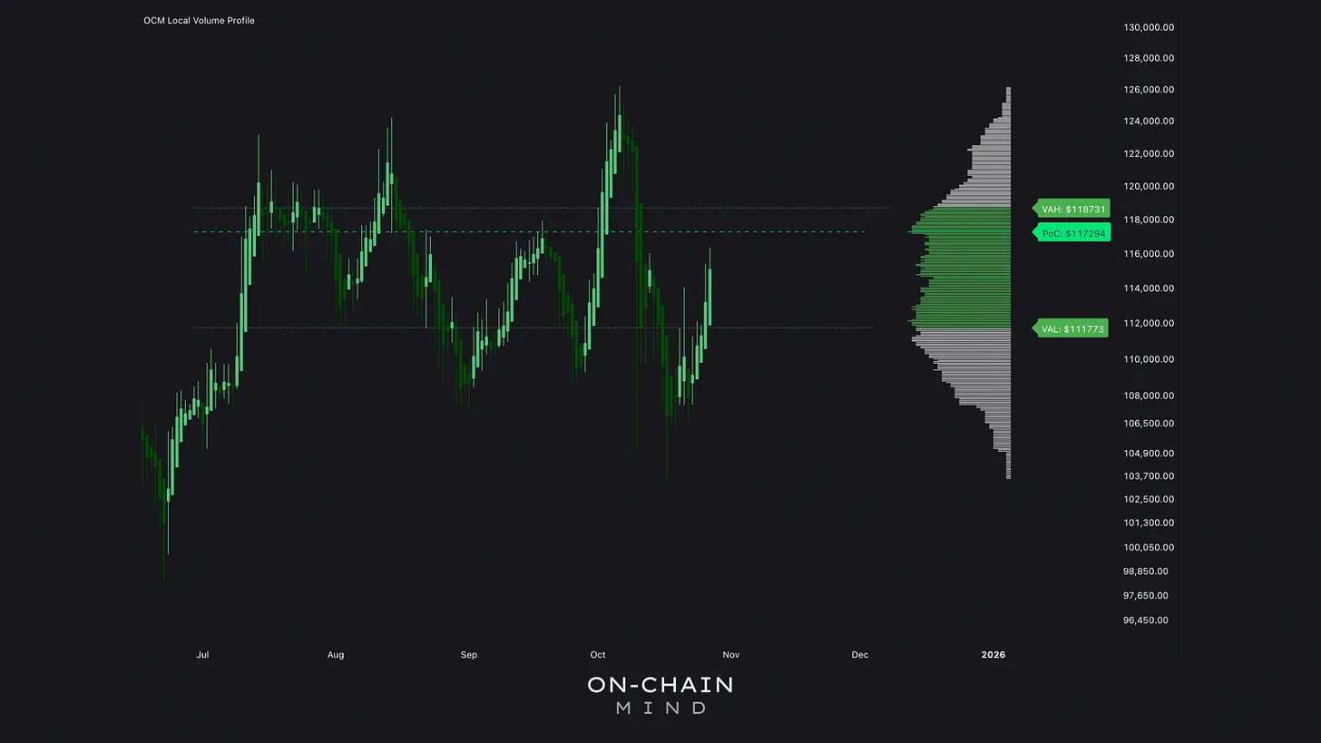
The PoC acts as a gravitational centre, attracting price due to embedded liquidity. Overcoming the PoC structurally validates bullish intent, as it implies absorption of overhead supply.
The Statistical Edge
Watch the video walkthrough on YouTube
Continue reading with OCM Premium
You have been reading the free preview of this article. The rest of it (about 350 more words and 1 more chart) is for OCM Premium members. See OCM Premium plans.