
If you think Bitcoin spends most of its time making new highs, you have the entire asset backwards.
It spends about 96% of its life stuck somewhere below its own record high. The all-time highs you remember are the rare exception, not the rule.
In this article, I pulled every drawdown in its history to show you exactly what tends to happen from a moment that feels like this one.
Let’s get into it.
Key insights
The 96% Rule: Bitcoin spends almost its entire life below a prior all-time high, with gains arriving in rare, violent bursts.
Pain in Context: Today’s drawdown is shallower than roughly 58% of every day Bitcoin has ever traded through.
The 400-Day Gravity: Cycle bottoms tend to cluster near 400 days from the top, and we are only 238 days in.
Time Beats Timing: Hold for 3 years and history shows a near-certain chance of finishing in profit.
A Life Spent Underwater
We can actually learn a lot by studying Bitcoin’s drawdown from the previous all-time high chart. Every time the line touches zero, that is a fresh record. Everything below it, is how far underwater we are.
Currently, we are roughly 43% underwater, which means the round trip back to that $126K high demands a 76% rally. To a newcomer that gap looks terrifying. To anyone who has sat through a few of these, it is a normal Tuesday.
Bitcoin manufactures 76% moves the way other markets manufacture 5% ones. None of which means I expect an overnight sprint to new highs, and I will not pretend otherwise to make you feel better.
Now, here is the part that rearranges how you might see this whole asset. Add up every day Bitcoin has ever traded and roughly 96% of them sit below an old record.
Let that land. The single greatest performer in financial history is, on almost any day you check, technically in a slump.
A new high is not Bitcoin’s natural state; it is a brief event it visits and then leaves. The reason is how those gains arrive. For long stretches the price does very little, drifting and sagging and testing the patience of everyone who owns it.
Then a switch flips, and in a few weeks it jumps to an entirely different altitude, prints its records, and goes quiet again. Almost the whole return is packed into that thin 4% sliver of explosive time.
Miss it and you have essentially missed Bitcoin.
And if you think it never used to be this hard, history says otherwise. The longest stretch Bitcoin ever spent underwater was not recent.
From its 2013 high through to 2017, it sat over 1,184 days below its record. 3 years in the wilderness. The discomfort you feel now is not new. It is the price of admission.

View live in OCM Studio: Bitcoin ATH Drawdown
How Long the Recovery Really Takes
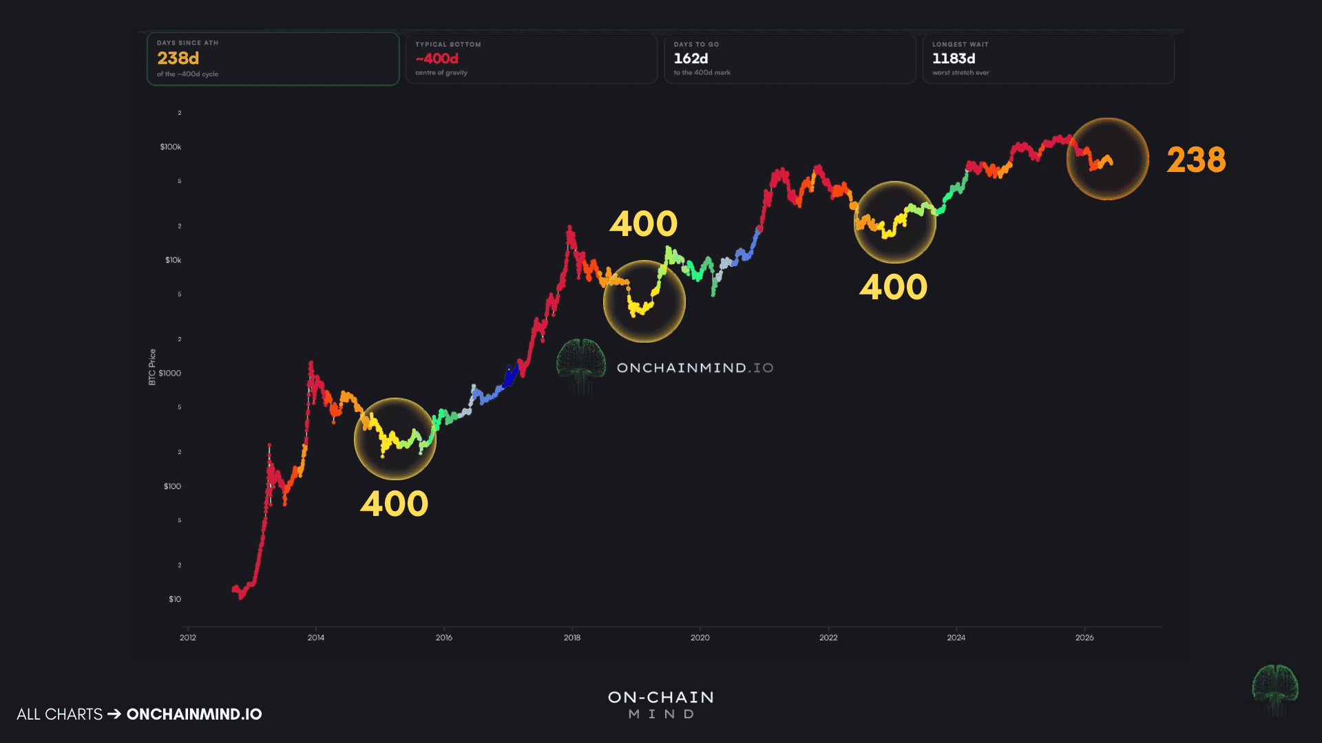
So how long does the climb back actually take? The Days Since ATH chart helps answer this question. It shades the price by how many days have passed since the last all-time high, and it reframes the whole question of “how long”.
Past recoveries have been long affairs, anywhere from 847 to 1,184 days from peak back to a new peak. That’s about 2-3 years for a full round trip.
But the detail worth your attention is the clustering of the yellow dots. They gather around the 400-day mark, each time at a historic cycle low. Let’s be clear, this is less a precise date than a centre of gravity.
Currently, we are at day 238.
And there is human wiring behind that number. The dip starts as denial, the instinctive belief that new highs are just around the corner, and denial dies slowly. As the months drag on it hardens into frustration, then the quiet surrender of everyone who was never really convinced.
A bottom, to me, is not a price at all. It is the moment the last willing seller has finally sold. And yet nothing obliges this cycle to copy the old ones. The holder base is older and steadier, the ETFs have soaked up selling that once caused chaos, and the last top never hit a classic delirious blow-off.
History rhymes; but it does not run on a stopwatch.
View live in OCM Studio: Days Since ATH
A Normal Kind of Pain
Before we wrap up, a couple of charts to set our current pain against everything that came before, because perspective is the first thing you lose in a bear market.
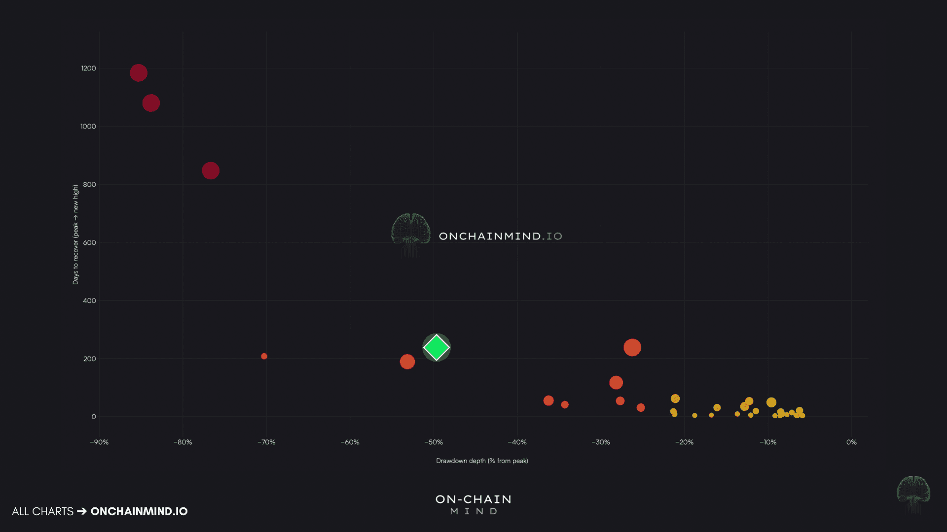
Below is the Recovery Atlas, which plots every drawdown Bitcoin has ever suffered on a single canvas.
Each dot is one episode: the further left it sits, the deeper the crash, and the higher up, the longer it took to heal. The trick is to ignore any individual dot and simply ask where today’s sits.
The answer is reassuring: squarely in the crowd, shoulder to shoulder with the ordinary bear markets this asset shook off before going on to beat. We are nowhere near the far corner reserved for the genuinely catastrophic, near-fatal crashes.
Measured against its own history, what we are enduring is thoroughly unremarkable.
View live in OCM Studio: Recovery Atlas
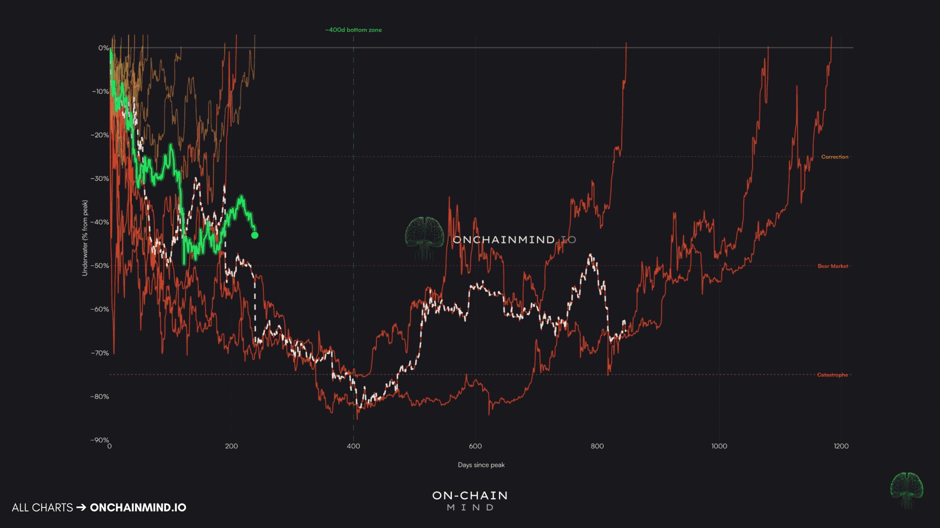
Then there is the Recovery Paths chart, which is one of my personal favourites.
Rather than reducing each drawdown to a single point, it traces the entire journey from the day of the peak, so you see the shape of the road rather than just where it ended.
One thing stands out. There is no tidy route home; the typical path wanders, and ours currently leans toward more discomfort as it drifts toward that 400-day zone.
Yet every line on the chart, however deep it plunged, eventually clawed its way back to zero and beyond.
The pain was always real. So was the reward.
View live in OCM Studio: Recovery Paths
A Coin Flip to a Near Certainty
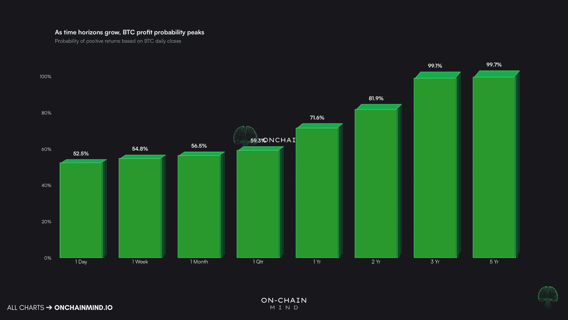
So why hold through all of this? One chart answers it more plainly than I ever could: your odds of being in profit, mapped against how long you hold.
1 day, week, or month: just over 50%. Essentially a coin toss
1 year: over 72%
2 years: around 82%
3 years: over 99%
View live in OCM Studio: Probability of Positive Returns
That last figure is the one to sit with. Stretch your horizon to 3 years and Bitcoin has, so far, never once sent a HODLer home at a loss.
Buy the literal top of a prior cycle, wait it out, and history still hands you a gain.
This is simply the 96% statistic wearing different clothes. Short timeframes are a coin flip because the asset spends most of its life grinding below its highs.
Long timeframes approach certainty because, sooner or later, it always moves, and when it moves it does not do it quietly. Time is what converts luck into structure.
So here is where I land. We are 42% down, more than half our history has felt worse, and the clock may still owe us months. None of that is comfortable, and I will not pretend it is.
But the discomfort is not a flaw in Bitcoin. It is the engine. The asset does not reward patience because patience is easy; it rewards it precisely because it is so hard that most people quit first.
So when the next obituary drops, and it will, remember this: you do not need to be early or clever. You only need to still be holding when it moves.