
Bitcoin is already deep into a bearish regime. But most people still don’t realise where real bottoms are actually built.
In this article, we’re going to walk through the hard technical and on-chain evidence to map where downside risk is realistically capped, where probability begins to flip, and why this phase matters far more than trying to catch the exact low.
This is not about predictions. It’s about probabilities.
Key insights
The Resistance Trifecta: Bitcoin is currently rejected by 3 critical trend filters, confirming a statistically honest bearish regime.
Volume Profile Voids: A massive liquidity gap below $90,000 made the swift drop to $70,000 mathematically predictable.
Statistical Floor Signals: The Z-Score has hit a -3σ deviation, an extreme level that historically caps extreme downside swings.
On-Chain Profit Thresholds: Historical bottoms typically form when only 40% to 50% of the total Bitcoin supply remains in profit.
The Statistical Reality of the Bearish Regime
At this stage, it’s very clear that Bitcoin is in a bearish regime. The recent price dip has sent many investors psychologically sideways. Confusion is high, conviction is low, and noise is everywhere.
But to me, this is starting to look a lot less like a threat and a lot more like a once-in-a-cycle invitation.
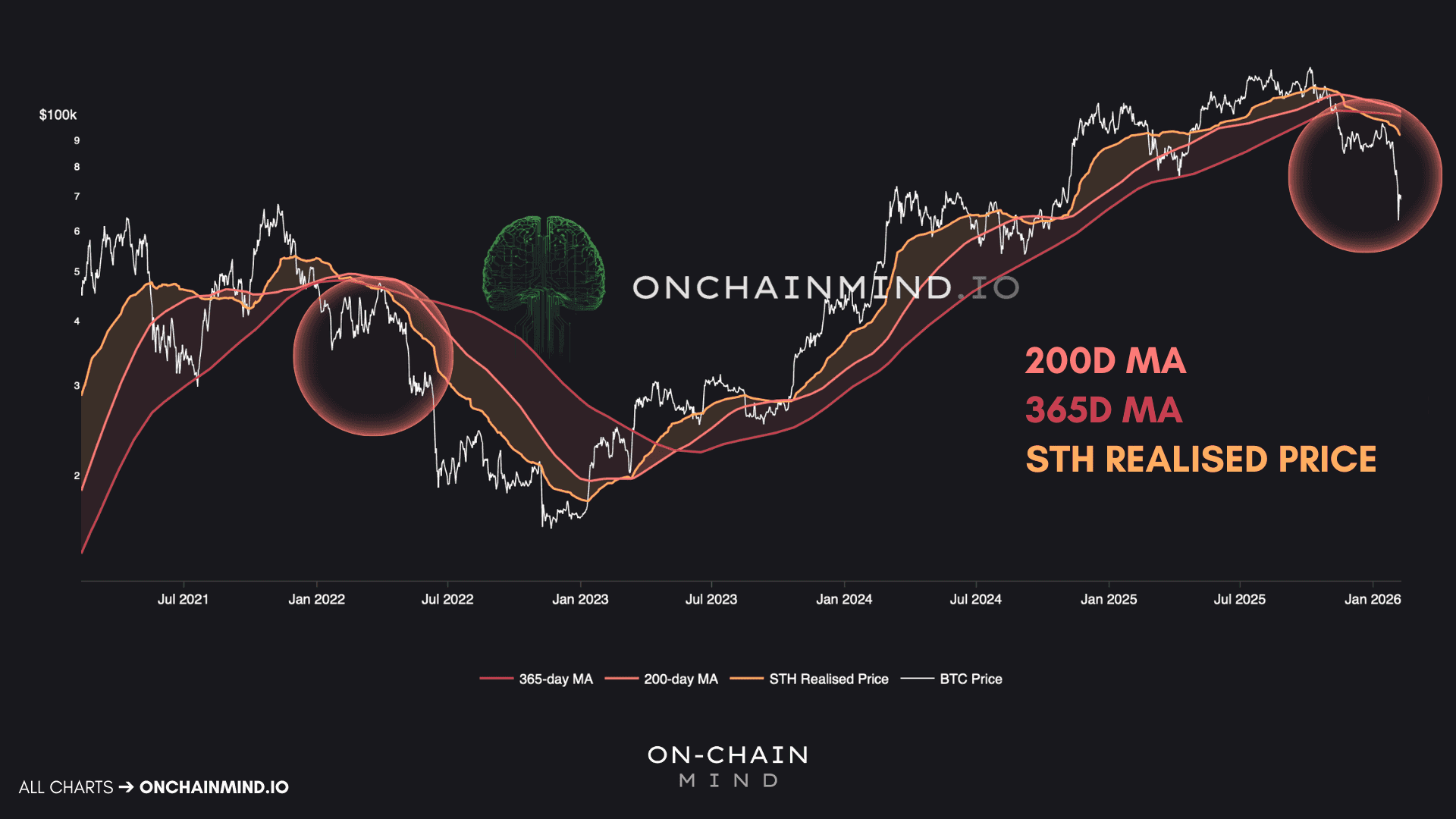
When we step back and look at Bitcoin through its key pricing lenses, a familiar picture emerges. One that should feel uncomfortably similar. We are mirroring the 2022 bear market almost step for step.
In that cycle, Bitcoin repeatedly attempted to reclaim these levels, failed, and then rolled over. Today, we are seeing the same behaviour. Each of these levels has acted as resistance, not support.
These 3 levels are not arbitrary:
The 200-day moving average acts as a global trend filter across all risk assets.
The 365-day moving average smooths price across an entire macro cycle.
The short-term holder realised price reveals when newer participants are underwater or in profit.
When price sits below all 3 simultaneously, history is unambiguous: the path of least resistance is down. That doesn’t mean continued vertical collapse, but it does mean that assuming further bearish action is the most statistically honest position to take.
Ignoring that structure is how investors get chopped to pieces.
With that regime clearly defined, the next step is not asking whether price can go lower, but asking where downside realistically exhausts.
Where Bitcoin Has Actually Traded
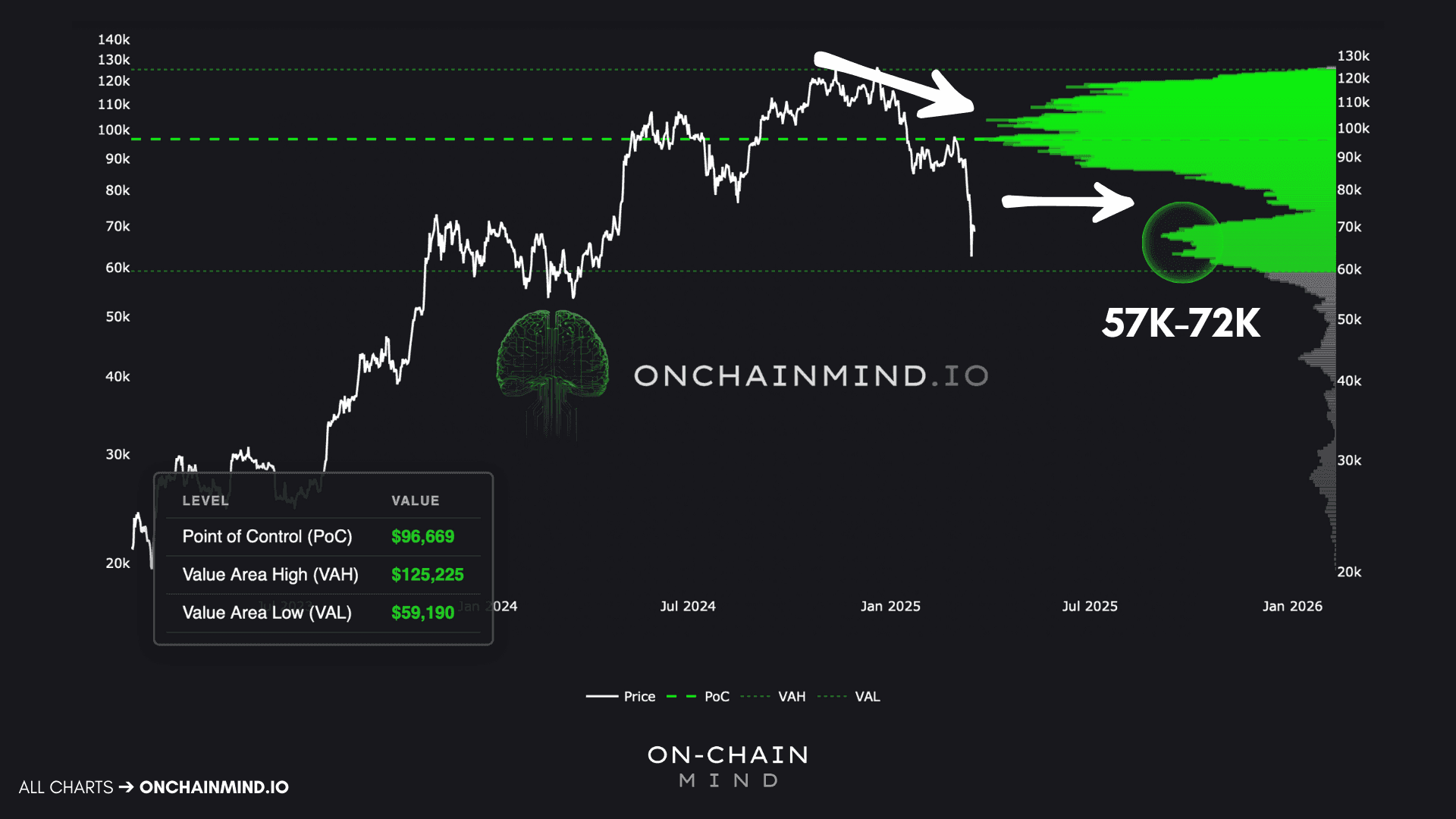
One of the most useful tools for understanding market behaviour is the Local Volume Profile. Unlike indicators that rely on derivatives of price, this shows something far more tangible: where Bitcoin has actually traded.
It visualises the distribution of historical trading volume across price levels. The larger the spike, the more Bitcoin has changed hands there. That’s where buyers and sellers have historically disagreed the most, and where liquidity lives.
What immediately stands out is what happened once Bitcoin lost the $90,000 level.
Below it sat a massive void in historical trading activity. For nearly 3 years, Bitcoin had done very little business in that entire region. By using the Volume Profile, we can see that the recent volatility was actually quite logical. Once price dropped below that level, it was never likely to drift lower slowly. The absence of liquidity made a fast move almost inevitable.
And that’s exactly what happened. Price moved rapidly into the next major volume cluster around $70,000.
This is how markets behave. These voids act like vacuum tubes; price tends to slide through them rapidly until it hits a high-volume node. We have now landed in a massive cluster of historical interest spanning from $57,000 to $72,000. This is where the market has found acceptance before, and it is where I expect volatility to compress as a floor is hammered out.
Even after rebounding from the low $60,000s, it would not be surprising to see Bitcoin return to this region and chop sideways. Breaking cleanly below that region, however, is a different claim entirely, and one that requires statistical justification.
Measuring Statistical Extremes
Quantifying statistical deviation is one of the most powerful tools in market analysis. By tracking how far Bitcoin’s price stretches relative to its own historical behaviour, we can identify moves that are statistically rare. Not impossible, but historically exhausted.
Recently, Bitcoin printed the most extreme downside deviation ever observed on the Z-Score Probability Waves: a short, sharp -3σ event, down to around $60,000.
Bitcoin has never, in its entire trading history, experienced a more extreme downside deviation relative to its recent history. While price can always overshoot marginally, sharp, sustained breakdowns beyond this level are historically unprecedented.
Betting on another sharp capitulation-style wick from this point is not just bearish, it is a bet against the entire historical dataset.
What typically follows an event like this is far less dramatic. Price begins to chop, volatility compresses, and downside momentum fades. Time (not price) does the heavy lifting.
This is how bottoms usually form: quietly and frustratingly, over months rather than days. That’s my base case for now.

Risk Is Falling Faster Than Price
To reinforce this view, we can look at Bitcoin’s long-term risk environment. By measuring price relative to a time-weighted logarithmic average, we can determine how attractive or unattractive it is to allocate capital. This Logarithmic Risk model has historically captured both cycle tops and cycle bottoms with remarkable consistency.
What matters right now is that the first low-risk lighter dots have begun to print.
Historically, these signals mark the start of a bear market bottoming phase. Not the end of downside volatility, but the beginning of asymmetry.
In previous cycles, these phases have lasted 3 to 5 months. They are slow, uncomfortable periods where sentiment remains poor but risk-reward quietly improves.
Numerically, risk has dropped from roughly 31% to 18% in a very short time. That is a substantial shift in asymmetry.
Could risk fall further? Yes. Single-digit risk levels have occurred before. But even at current levels, long-term positioning becomes increasingly attractive.
The model’s theoretical minimum risk, a level that is actually designed to never be reached, currently maps to around $48,000.
That makes a $50,000 floor not just possible, but statistically coherent.

Where All Holders Feel the Pain
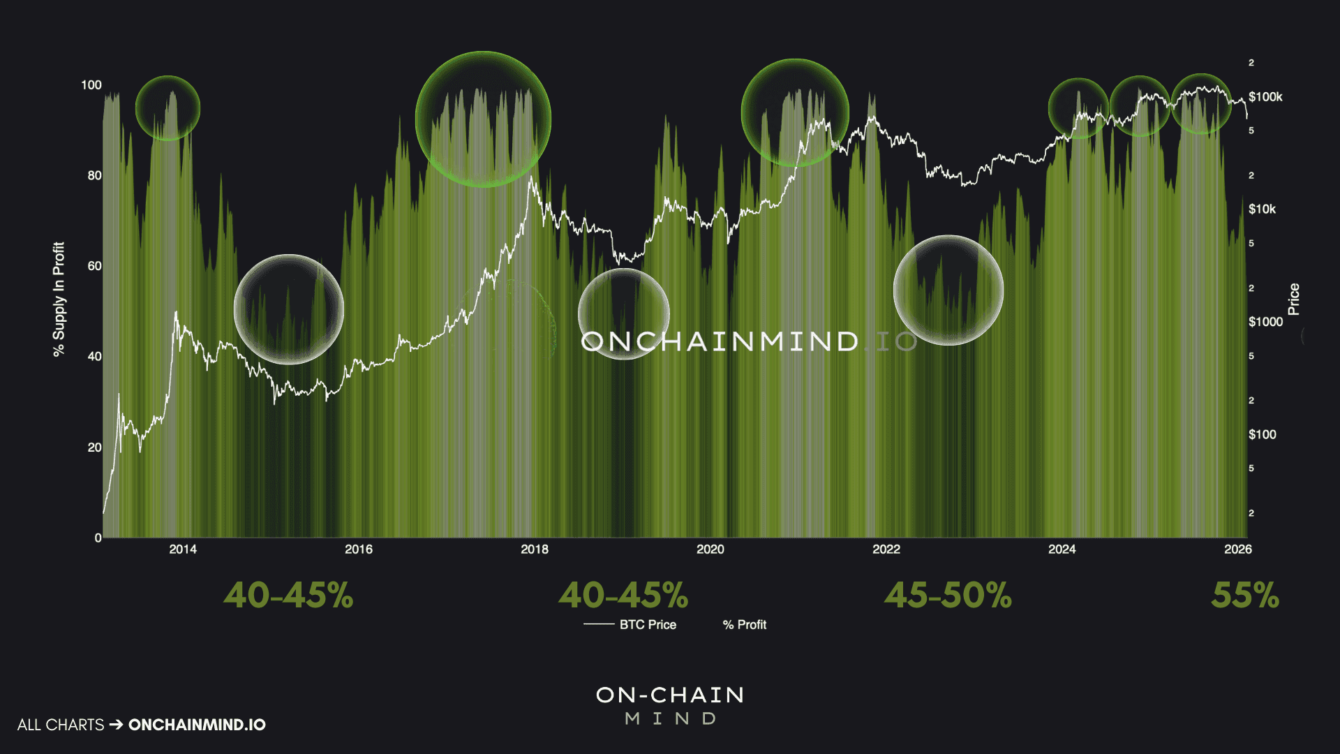
While technical levels show us where people traded, on-chain data shows us how the average Bitcoin investor is feeling. One of the most reliable indicators of a macro bottom is the percentage of circulating supply in profit. Markets typically don't bottom when everyone is happy; they bottom when the pain is widespread.
Historically, the “capitulation zone” is reached when only 40% to 50% of the supply is in an unrealised profit. And you’ll find this pattern has been remarkably consistent:
In 2015, Bitcoin bottomed when roughly 40-45% of supply was in profit.
In 2018-2019, the same 40-45% range marked the bottom.
In 2022, the market was slightly more optimistic, but once again bottomed near 45-50%.
Right now, approximately 55% of the total Bitcoin supply is in profit. That means 45% is underwater. This suggests that while we are close to the bottoming zone, there is definitely still some room for a final wash-out.
If we project these percentages onto the current price, we find a remarkable convergence:
An optimistic floor (45-50% in profit) sits between $53,000 and $60,000.
A pessimistic floor (40-45% in profit) aligns with $47,000 to $53,000.
Interestingly, the theoretical minimum Logarithmic Risk level around $48,000 aligns almost perfectly with the pessimistic on-chain floor. When independent models — one derived from investor profitability, the other from logarithmic price structure — converge on the same region, that’s not coincidence. That’s confluence.
How I’m Trading the Probabilities
Watch the video walkthrough on YouTube
Continue reading with OCM Premium
You have been reading the free preview of this article. The rest of it (about 400 more words) is for OCM Premium members. See OCM Premium plans.