
The spot ETFs have pulled in more than $55 billion of net capital since they launched in early 2024. That figure gets quoted constantly, usually as evidence that institutions have arrived and the game has changed forever.
What almost nobody does is put a price on it.
If a billion dollars walks into these products in a week, what is Bitcoin supposed to do about it? 2%? 10%? Nothing at all? That question sits underneath every ETF flow headline you have ever read, and the answer is that most people repeating those headlines have never checked.
So let me show you the work. What the flows actually own, where the popular supply squeeze argument breaks down, and roughly what a dollar of net inflow has historically been worth in percentage terms.
Let's get into it.
Key insights
The Stickiest Cohort: Cumulative ETF flows are down just 12% from their peak while price is down 37%.
6.4% Of Supply: The complex holds around 1.28 million coins and is absorbing 3.6 times daily miner issuance.
The Impact Curve: Roughly 300 million dollars of net inflow has accompanied each 1% move up in price.
Correlation Is Not Direction: The scatter is tight, but the plumbing suggests flows follow price as much as lead it.
What $55B Actually Buys You
The Bitcoin ETF net flow is $55B.
Net is the word doing the heavy lifting in that headline number. This is not gross buying. It is inflows minus outflows, money that went in and stayed in. Every panicked exit and every profit take along the way, all of it is already deducted. What you are left with is the residue.
Translate it out of dollars and it becomes far more useful. That $55B is approximately 1.28 million BTC, which is a staggering 6.4% of the circulating supply.
A meaningful portion of every coin in existence now lives inside a wrapper that did not exist 2 years ago. It isn’t locked away forever, of course. Shares still get redeemed, coins get sold, and these products can bleed just like anything else.
But the coins are held differently, and that matters more than the size of the number. They sit with a custodian rather than a hardware wallet. They move through authorised participants rather than an exchange withdrawal. And they are likely owned by people who see Bitcoin as a line on a brokerage statement, sat next to the equities and the bond fund, rebalanced on a schedule by someone paid to be unemotional about it.
A different type of buyer, through a different pipe, with materially different behaviour to the coins that sat in self custody through previous cycles.
And the behaviour is, as always, the interesting part.
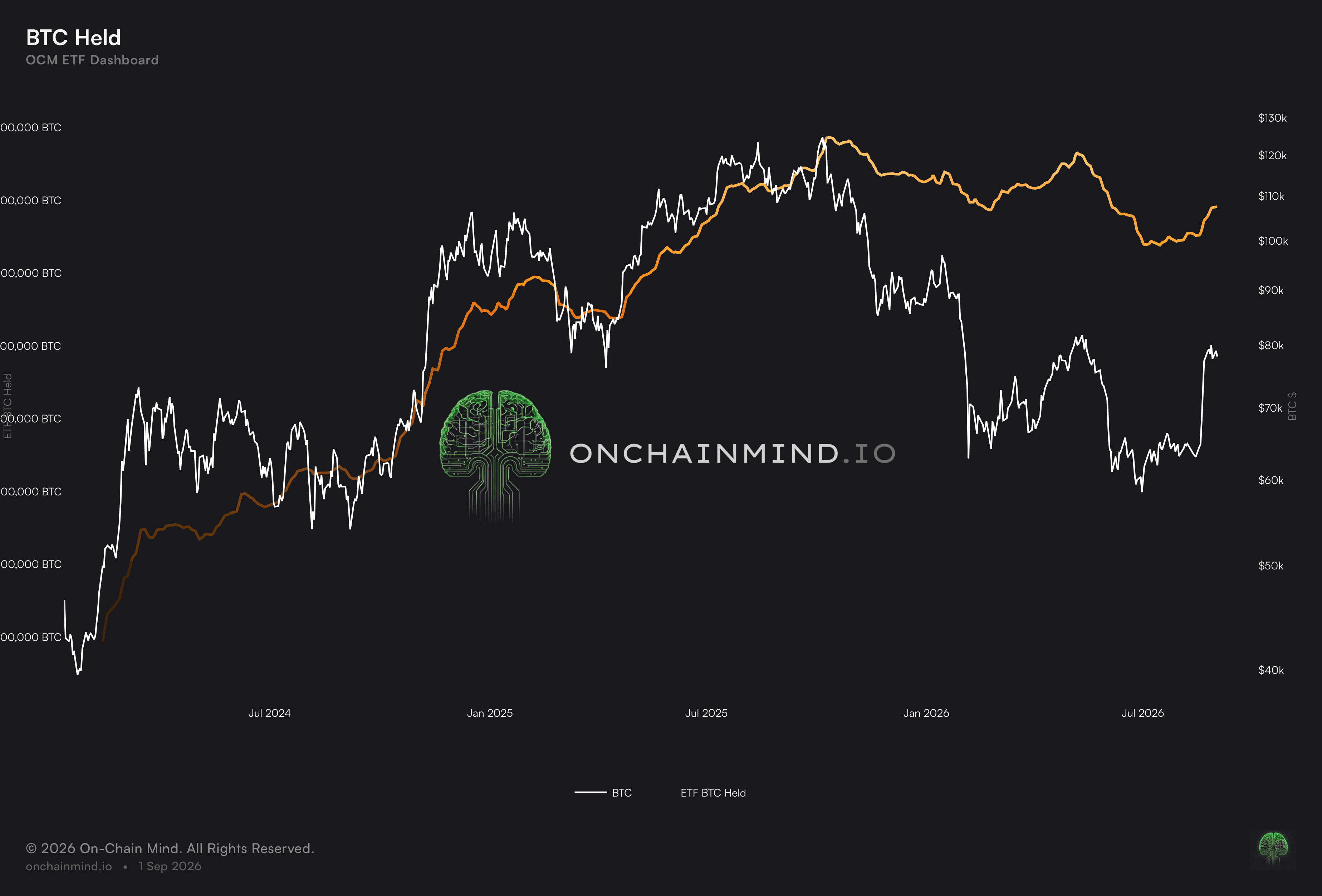
View live in OCM Studio: Total BTC Held by ETFs
Where The Selling Actually Came From
Cumulative flows are down about 12% from their all time high. Bitcoin’s price, at the time of writing, is down about 37% from its own. The price has given back more than a third of its peak. The money committed to these vehicles has given back roughly an eighth.
That comparison is fairer than it first looks. Cumulative net flow does not mark to market. It is a running total of creations and redemptions in dollars, so it only falls when somebody actually redeems.
The 12% is real money walking out of the door, not the same money being marked down by a lower spot price. Price and flow are falling for genuinely different reasons, which is exactly what makes the gap between them worth reading.
And that gap tells you something specific: the marginal seller from the bear market has not primarily been the ETF holder.
Were these investors the ones panicking, you would expect that cumulative flow line to collapse in something close to lockstep with spot, and it plainly hasn’t. The pressure came from elsewhere: leverage being unwound, and coins bought near the high by holders with far less patience.
The holder base inside these products has been stickier than the market as a whole. That is one of the few things in this space you can measure directly rather than infer, and it is worth remembering the next time somebody tells you the ETF bid was only ever tourists.
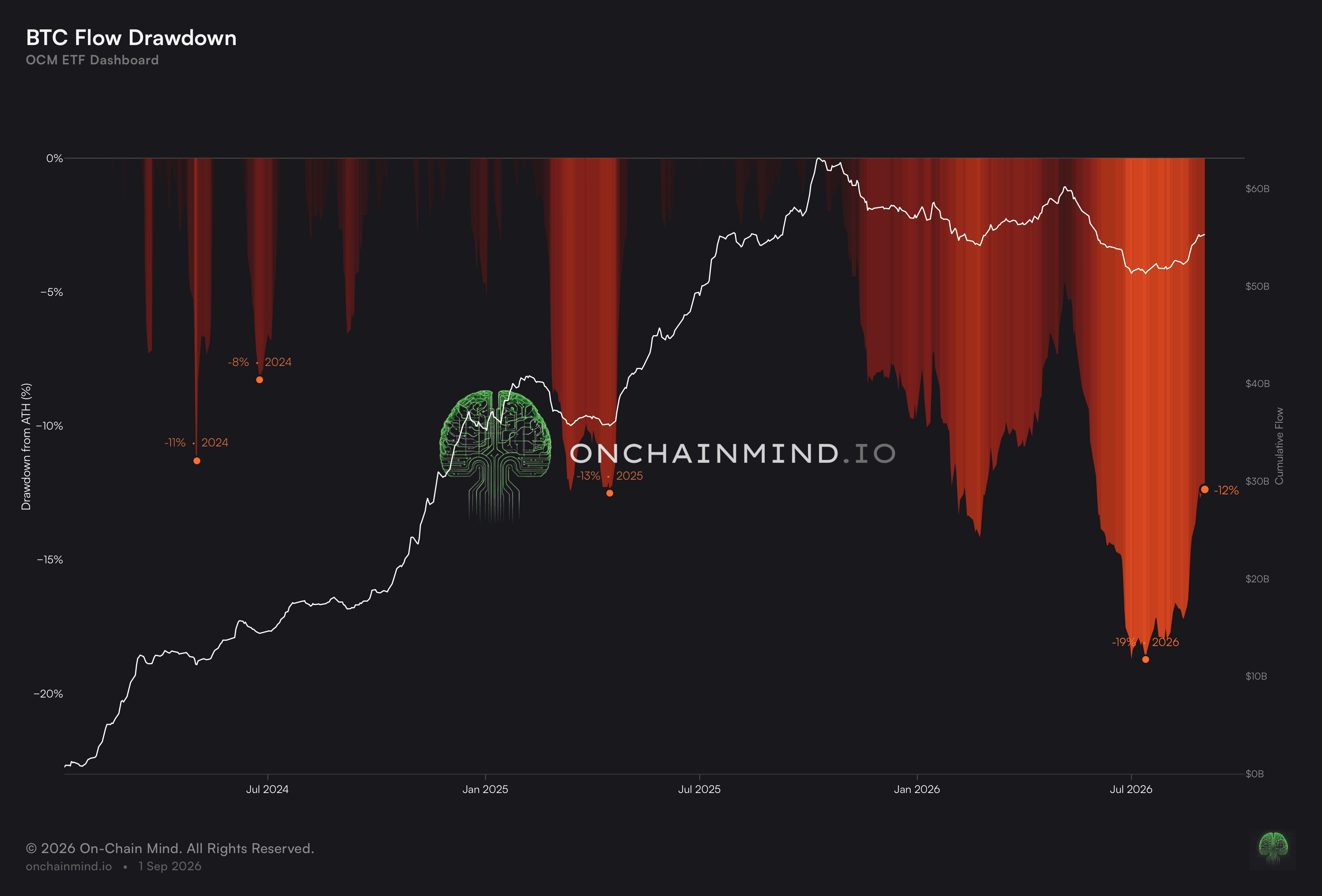
View live in OCM Studio: ETF Flow Drawdown
The Issuance Trap
Here comes the argument you have likely heard a hundred times.
Miners receive 450 new Bitcoin per day. That is the entire post-halving issuance, the whole supply the world gets. At current rates, the ETF complex is absorbing roughly 3.6x that figure every single day.
Mechanically, that is a striking thing. For every one coin created and handed to a miner, this single channel is soaking up three and a half. The other two and a half have to come from somewhere, and the only place available is existing holders. Someone has to be persuaded to part with coins they already own, and the thing that does the most persuading is price.
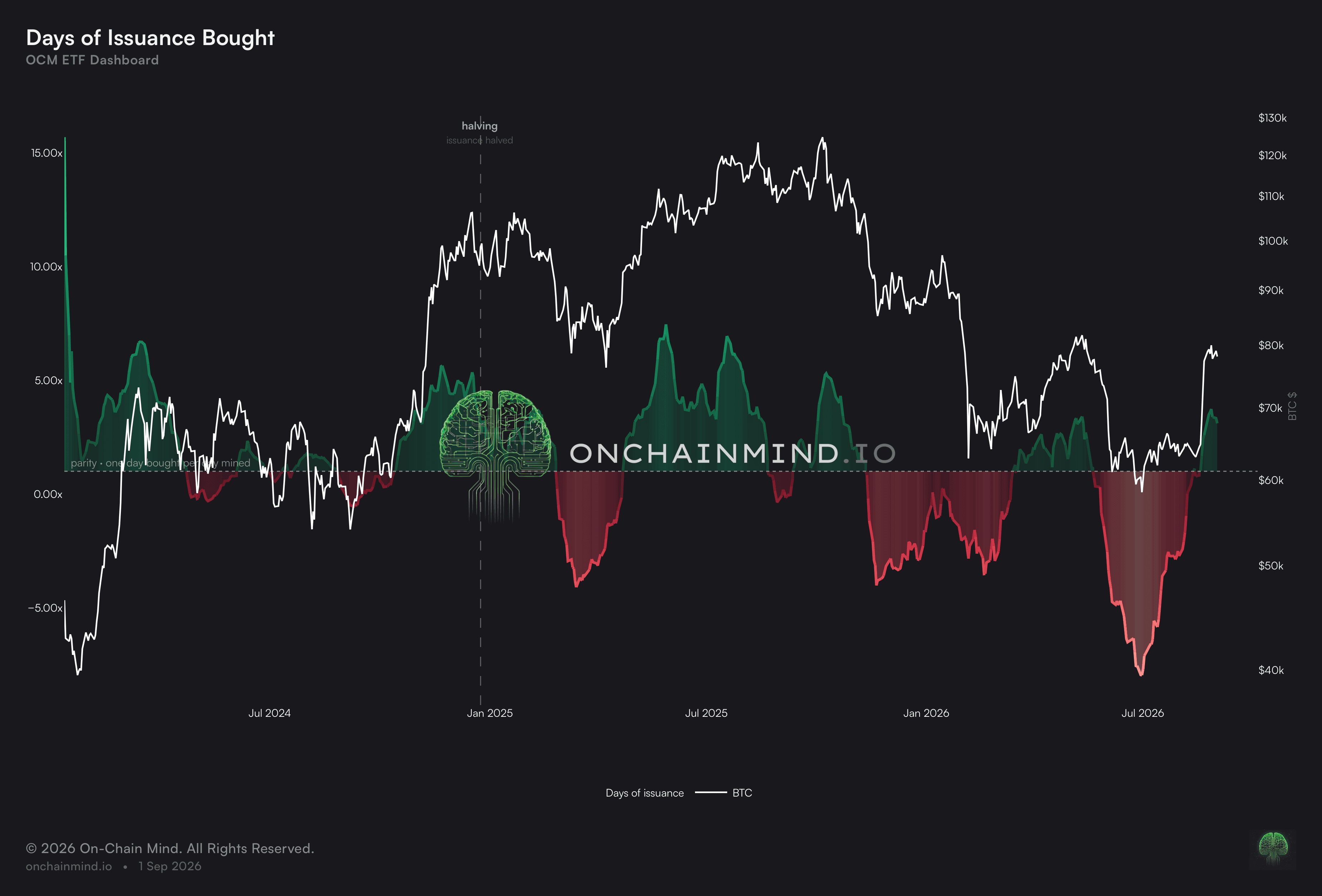
View live in OCM Studio: Days of Issuance Bought
On record days these products have pulled over a billion dollars off the market in a single session. Last week, they took $924 million.
So the squeeze is real. But this is exactly where people run away with themselves, and the correction comes from the realised cap.
The Realised Cap values every coin at the price it last moved on-chain rather than at spot. When it rises, real dollars have entered and locked in at a higher cost basis. When it falls, coins are moving at a loss and capital is leaving. It is the closest thing Bitcoin has to a cash flow statement.
Below we’re plotting the 30 day change in realised cap (green/red) against ETF flows (blue) and, for most of their history, the ETF contribution is genuinely small. A rounding error against total network capital.
That has changed over the past year. The blue line has grown into a real component of the total. But it is a component, not the engine, and treating it as the entire market has been one of the most persistent myths in this space.
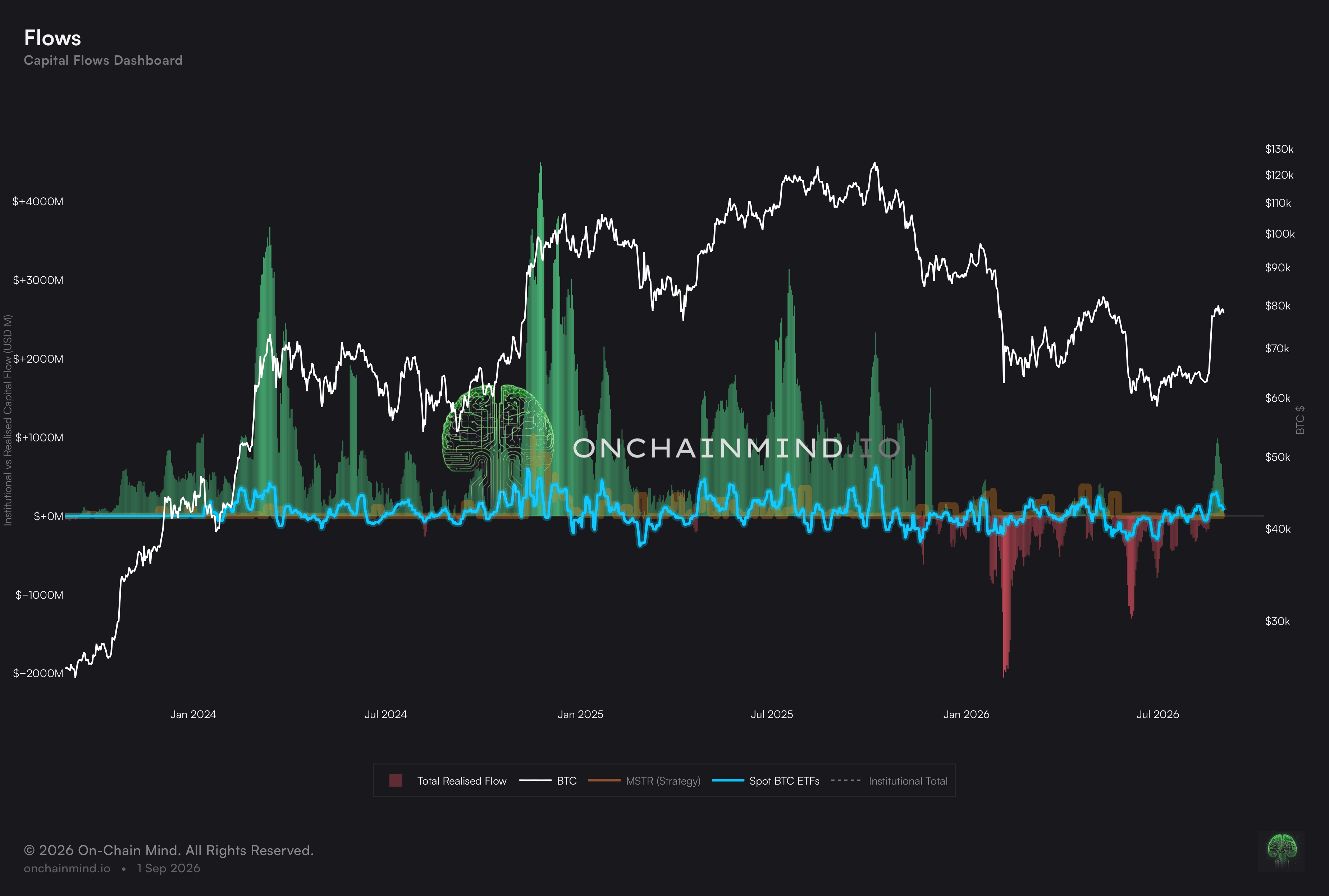
View live in OCM Studio: Realised Capital Flows
Pricing A Dollar Of Flow
This is the part I find most useful, and it is what I've been calling the Impact Curve. It answers a narrow question: how much net ETF money has a move of a given size historically come with?
Note the wording. Come with, not caused.
The numbers themselves are clean:
A 3% increase in price came alongside roughly $989 million of net inflow
A 5% increase came alongside $1.65 billion
A 3% decrease required about $650 million in net outflows
A 5% decrease required about $1 billion

View live in OCM Studio: Impact Curve
Read those two halves against each other and the asymmetry jumps out. It takes noticeably more capital to push this market up than it does to push it down by the same distance.
If you have traded anything for any length of time, that won't surprise you. Selling is impatient. Buying is patient. Fear simply moves faster than greed.
If you want a single number to carry around, it's roughly $300 million per 1% move up and roughly $200 million per 1% move down, give or take some rounding errors, will serve you fine.
The flow return scatter confirms the fit. Every dot is one trading session, net flow plotted against what Bitcoin did that day, and the correlation is genuinely striking.
But a scatter chart cannot tell you direction. It tells you two things move together and nothing more. It can't say which moved first, and it can't rule out a third variable, a macro shock or a liquidity event, shoving both at once.
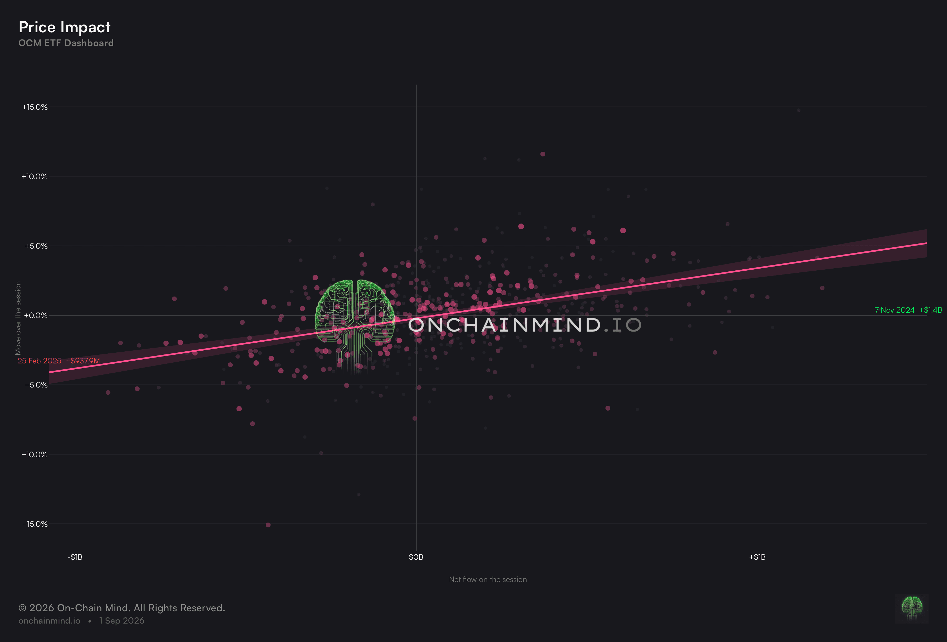
View live in OCM Studio: Price Impact Scatter
So Which One Leads?
Does price follow the ETFs, or do the ETFs follow price? My honest answer is both, at different times.
I’ve found clear instances of flows trailing a pump, and equally clear instances of flows appearing to deliver the entire move. Forced to pick, I lean towards flows following price, and the reason is plumbing.
Someone sees a green candle, logs into a brokerage, the order settles the next day, the authorised participant creates the shares, and only then do coins get bought. Lag is baked into every link of that chain.
Then add the reporting delay on top. Today’s flow number lands tomorrow, so you are holding a series that arrives late against a price that arrives instantly. Part of the relationship you think you are measuring is just the calendar.
There is a second problem. Most of the time neither series is driving the other, because both are responding to the same thing. A macro print moves spot and moves allocation intent at once, and daily data has no way of separating the two.
Where flows genuinely do lead is at the other end of the size distribution. The scheduled advisor allocation, the model portfolio rebalance, the desk that has decided to build over a fortnight. That money arrives whatever the candle is doing, and it is the part of the bid worth caring about, precisely because it isn’t reacting to anything on the screen.
Where I Land On The ETF Question
I think the ETF debate has been dominated by two camps who are both slightly wrong.
One camp treats these products as the only thing that matters, quoting daily flow prints like scripture. The other dismisses them entirely, points at the realised cap and calls the whole thing a rounding error. 18 months ago the second camp had the better of the argument. They don’t anymore, and I don't think they've updated.
I was closer to that camp than I would like to admit. When these launched I said the ETF bid would be the first to run, that it was tourist money in a nicer wrapper and it would evaporate the moment the chart turned, just like their spot holder equivalents.
Then the chart turned. Price gave back 37% and the flows gave back 12%. The cohort I wrote off has sat through this drawdown better than the average BTC holder, and I have had to change my mind about it.
What I'd rather you take away is the framework, not the figures. Our Impact Curve model outputs of $300 million per 1% up and the $200 million per 1% down will move as the sample grows, and they should. Anyone handing you a fixed constant for dollars per percent and calling it settled is selling you a certainty they do not have.
What survives is the shape of the thing. The ETFs do not drive Bitcoin. They amplify whatever Bitcoin is already doing, at a roughly measurable rate, with more force needed upwards than down. Everything else in the headline is noise dressed as insight.
Analysing the ETF dynamics is an evolving science. The sample grows every week, the model gets a little better fed, and our read on how this cohort actually behaves sharpens with it. There will be a lot more of this from us, because the ETF bid is only going to matter more from here, not less.