
It’s remarkable how quickly the narrative flips in this asset.
3 weeks ago, my timeline was a funeral. Price was grinding into the late March lows, everyone had a chart showing $30,000-$40,000, and the prevailing mood was that the cycle had quietly ended without anyone getting the top they were promised.
Fast forward to today, after a perfectly respectable rally off those lows, and the exact same accounts are confidently declaring the bull run is back on.
Same people, same confidence, opposite conclusions, roughly 20 days apart.
This is genuinely one of the more entertaining features of this market, and also one of the most dangerous if you’re trying to invest in this thing over a multi-year timeframe.
What is useful is stepping away from the weekly emotional cycle and asking a much simpler question: where does Bitcoin actually sit relative to the structural adoption curve that has governed it for 15 years?
For that, you need to look somewhere entirely different than 𝕏.
Let’s get into it.
Key insights
The Logarithmic Growth Line: A fundamental fair value baseline derived from adoption dynamics, log scaling, and time decay, spanning Bitcoin’s full history.
The Power Law Framing: A dual-log transformation of the same curve that turns exponential growth into a straight, analysable line.
Where Fair Value Sits: The model puts long-term fair value around $100,000, placing current price roughly 22% below trend.
Risk Oscillator Positioning: The logarithmic risk model currently reads 33%, still firmly in accumulation territory without being historically extreme.
The Line Most People Forget About
Open up a log-scaled Bitcoin chart, drop a single thin white line through the whole thing, and see what you notice.
If you’re only looking at a shorter window, it’s easy to dismiss it as a casual trend line I’ve slapped over some recent candles. But stretch the timeframe back to 2010 and that interpretation falls apart quickly. This line traces every single cycle, every mania, every bear, every consolidation, cleanly through the middle.
This logarithmic growth line is arguably the most useful mental model you can carry around if you want to think about Bitcoin seriously. It functions as a structural fair value baseline for the asset that comes out of pure mathematics, born from a handful of forces that have never stopped pulling on price.
The first of those forces is adoption itself, expressed as a power curve. Each new user, each new institution, each new lightning node, each new miner, each new bit of infrastructure adds something to the network.
These contributions compound on one another over time, which is how you get the aggressive long-run uptrend in the first place. Plotted on a log chart, that compounding adoption shows up as a smooth, almost deceptively simple ascending structure.
As we know, the log price axis prevents the chart from becoming unreadable. A linear chart would hide the first half of Bitcoin’s history completely, because the early dollars-to-hundreds moves are mathematically invisible next to six-figure prices. Log scaling squeezes those early gains down to a readable size so we can actually compare cycles side by side.

View live in OCM Studio: Logarithmic Growth Model
Why is the Curve Slowing Down?
Most Bitcoiners have heard of the concept of “Diminishing Returns”, and it is thrown around quite a lot, usually in the context of each cycle producing smaller percentage gains than the one before.
Repeat something enough times in this space and it becomes folklore. Almost nobody stops to ask why it actually exists, which is a shame, because the reason sits right at the heart of the model.
Alongside the adoption curve and the log axis, there’s a third input working quietly in the background: a small daily decay factor compounding over time. That decay is the concept of diminishing returns expressed in code, and it’s there because finance, like physics, isn’t immune to the mathematics of large numbers. Once an asset gets big enough, the rules of how it moves change.
The mechanics make it obvious. When Bitcoin traded in pennies, then single digits, then tens of dollars, you could move the entire market with what today would be a rounding error. A handful of believers with modest capital could 5x the price across a weekend.
That era is gone, and it isn’t coming back. Bitcoin is a trillion-dollar network now, and shifting a trillion-dollar network takes something the early market never had: sustained institutional flow. Pension funds, sovereign treasuries, ETF creations, corporate balance sheets. A completely different universe of capital, moving at a completely different pace.
This is why the growth line gently loses steepness as you approach the present. And I need to be blunt about this next part, because it’s the single most misread feature of the whole model: that flattening isn’t the chart rolling over. It’s not a warning. It’s not bearish. It’s not a problem.
It’s what graduation looks like.
Bitcoin is still compounding. It is still humiliating the S&P 500 on any reasonable lookback. But expecting another 2013 or 2017 in percentage terms is, frankly, a bit like expecting internet stocks to return what they did in 1999.
The underlying physics have changed, and pretending they haven’t is how people end up disappointed instead of enriched.
The Same Story, Just Straightened Out
You’ve almost certainly seen a Power Law chart somewhere online, probably being brandished by someone who is very confident about it.
At a glance it looks structurally different from the logarithmic growth line, because instead of a curve you get a crisp diagonal line slicing through 15 years of price history.
Same asset, same dynamics, different coat of paint.
What’s actually different is the axes. The Power Law takes the logarithmic price axis we already had and adds a logarithmic time axis too. Dual-log scaling does something mathematically elegant: it converts the curved growth line into a straight one.
That makes it easier to eyeball deviations across cycles, because your brain is much better at measuring distance from a straight line than from an accelerating curve.
The whole thing only works because two forces line up:
Declining volatility over time as the asset matures, and
Compounding adoption on the other side
When you put those together, you get a Power Law Distribution, which is a pattern you see everywhere in nature once you start looking. Earthquake magnitudes follow one. So do the patterns of rivers. So does the distribution of stars in a galaxy.
Complex self-organising systems tend to settle into these shapes, and the fact that Bitcoin fits the same structure is, I think, one of the genuinely interesting things about it as an asset class.
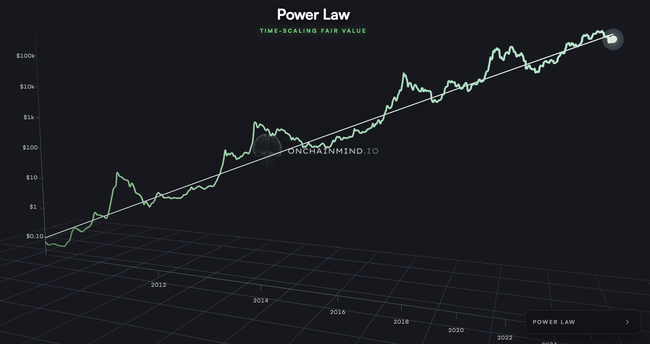
View live in OCM Studio: Bitcoin's Power Law
So Where Are We Now?
If I’m being totally honest, I’m not a Power Law evangelist. I don’t think it’s a destiny machine, and I’m somewhat Power Law agnostic, if that’s even an allowed position.
What it is, though, is a useful lens for framing whether you’re probably being offered a good deal or a bad one at any given moment. That’s how I use it, and that’s how I think it works best.
So what is it saying right now? Well, fair value according to the model sits right around $100,000. Which is its projection fitted on 15 years of data. Bitcoin trades closer to $78,000 at the time of writing this, which puts us roughly 22% below where the long-run adoption structure says we should be.
Is that historically extreme? No. But is it expensive? Also no. It falls into that specific middle region where the asset is objectively cheap relative to its own trend line, while stopping short of the generational-opportunity territory that has people mortgaging everything they own.
Knowing the difference between those two states is what separates sensible accumulation from portfolio-destroying conviction trades.
A variation of this chart I come back to constantly is the Power Law Drawdown view, which reduces the entire idea to a single question: how far below trend are we right now?
Whenever price slips beneath the line, yellow and red bands fill the chart, showing the magnitude of the discount being offered.
The pattern is clean.
The worst bear markets, 2015 and 2022 being the obvious cases, pushed about 40-50% beneath trend at their darkest moments. In hindsight, those were some of the best risk-adjusted entry points Bitcoin has ever handed out.
Living through them felt nothing like that, of course. Most Bitcoiners had either capitulated or stopped paying attention altogether. The value was real, but almost nobody was emotionally positioned to capture it.
Today, a 22% deviation reading puts us in yellow-into-orange territory. Not nothing, but not screaming either.
In plain English, a zone where steadily stacking sats through DCA is a defensible strategy, while going max-leverage all-in is probably getting ahead of what the data actually supports.

View live in OCM Studio: Power Law Drawdown
My Honest Take Right Now
Most of the time, this newsletter lives in the weeds. Cost bases, realised price bands, capital flows, profit-and-loss ratios, the stuff that actually moves price week to week. I enjoy that work and I think it has a genuine edge. But occasionally it’s worth climbing out of the tactical layer and doing something almost embarrassingly simple: taking a step back.
From up there, the picture is reasonably clear. Bitcoin trades below its long-term adoption structure, but the discount isn’t extreme.
This is, for me personally, still squarely a dollar-cost-averaging environment. Will the next few weeks be pleasant? Well, we’ve rallied decently off the lows, and it would be totally consistent with how this asset behaves to roll back over at a meeting with the STH Realised Price and retest something lower again.
None of which particularly alters my thinking.
Right now, the structure hasn’t fractured in any way that matters. The adoption curve is still intact. The Power Law is still intact. And the drawdown model has us in DCA accumulation territory. That’s a boring conclusion and it’s supposed to be.
If one idea makes it into your week from this piece, let it be this one: zoom out earlier and more often than feels necessary.
Put more weight on the framework than on the tape. The people who have quietly compounded wealth in Bitcoin over the last decade mostly weren’t the ones calling perfect tops and bottoms. They were the ones who understood the structure, trusted the mathematics, and showed up whether the market was comfortable or not.