
Markets always feel unpredictable, but the current uncertainty stands out. Bitcoin looks stable on the surface, yet the on-chain flows tell a more complex story.
Capital is moving efficiently, but the network’s core value is quietly slipping. The system can still handle shocks, but the foundation beneath it is showing signs of strain. That’s the tension I want to break down for you today.
So let’s get into it.
Key insights
The Multiplier Illusion: High capital efficiency supercharges gains in bullish cycles. But the same mechanism can silently magnify downside risk when flows reverse.
Shrinking the Core: Persistent net outflows are quietly eroding Bitcoin’s structural value, a reality masked by the towering Market Cap.
Leverage Divergence Warning: Price is racing ahead of structural support, creating a spread that has historically preceded sharp corrections.
The $7.1 Billion Trigger: Only a modest verified inflow is needed to ignite the next leg up. But until that capital appears, the market remains suspended and fragile.
Surface Reality vs. The Hidden Drain
To understand what’s really happening in the market cycle, we need to separate the illusion of the Market Cap from the reality of the Realised Cap.
Right now, Bitcoin’s Market Cap sits at $1.4 trillion.
This number is the ultimate vanity metric that retail investors fixate on. It’s the figure most quoted on crypto platforms and drives broader sentiment. But Market Cap is highly elastic, easily swayed by small trading volumes, and rarely tells the full story.
The Realised Cap, on the other hand, is the ultimate truth teller in the on-chain world. It shows the actual cost basis of all coins historically held, valuing each coin at the price it last moved on the blockchain.
Currently, Realised Cap sits at $1.1 trillion, giving a Market Cap to Realised Cap ratio of 1.31x.
On paper, that looks healthy. A 1.31x ratio suggests the market values the network above historical cost without reaching the extreme multiples we typically see at overstretched portions of the cycle.
But raw numbers only tell part of the story. What really matters is the flow of capital. Are new dollars coming in to build a solid floor, or is existing capital quietly leaking out while the price stays artificially high?
The data suggests it’s the latter.
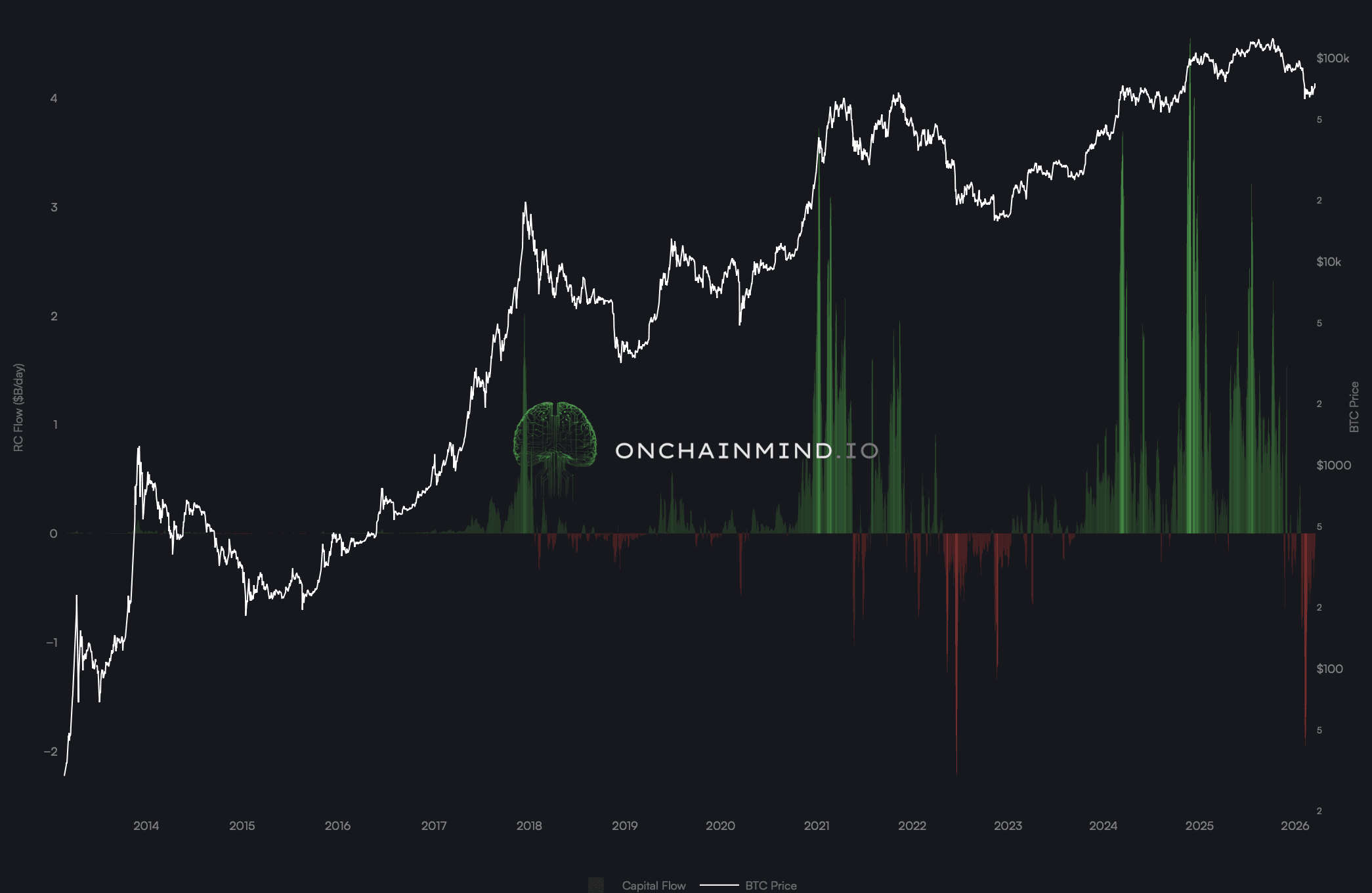
Net capital is leaving at roughly $60 million per day, and over the past 30 days, the average daily outflow is $319 million. The Realised Capital Flow chart shows persistent red spikes dominating the lower half of the oscillator. We’re not seeing the strong green inflows that fueled the aggressive, price-driving rallies of late 2023 and early 2024.
This isn’t a sudden panic or a liquidation cascade. It’s subtle, steady, and revealing for anyone paying attention. Long-term holders were quietly taking chips off the table last year, but now even the average investor is exiting near their cost basis faster than new capital is coming in.
It’s a fascinating dynamic, and one that highlights just how delicate the market foundation has become.
The Double-Edged Sword of Dollar Efficiency
A natural question arises from these observations: why does Bitcoin stay stubbornly at its current levels if hundreds of millions in real capital are leaving the network every week? The answer lies in Dollar Efficiency.
Continue reading with OCM Premium
You have been reading the free preview of this article. The rest of it (about 750 more words and 3 more charts) is for OCM Premium members. See OCM Premium plans.