
You have seen the pattern by now. Saylor announces another billion-dollar buy, the headlines light up, and the price does precisely nothing. It is infuriating. But it is not a mystery.
For the first time in Bitcoin’s history, the ETFs are now leading the selling, the long-term holders are sitting on their hands, and capital is draining out of the network faster than Saylor can shovel it back in.
But buried in that same data, one of my favourite on-chain signals is flashing its second-largest reading of the entire cycle, and the reason behind it is more interesting than the reading itself.
Let’s get into it.
Key insights
Capital Is Bleeding Out: Net capital is exiting the Bitcoin network at an average of $500 million per day for the past month.
Institutional Paper Hands: Spot exchange traded funds represent a massive 25% percent of the monthly realised cap drop.
Short-Term Holders Are Folding: Recent market entrants are responsible for 78% of the current negative capital flow dynamics.
A Signal Worth Watching: A potent DCA signal is flashing its second-largest reading of the cycle, which has historically been a gift for patient accumulators.
The Metric That Cannot Lie
Price is useful, of course it is. But with most markets, price is roughly where the analysis ends. Bitcoin is different, because the blockchain lets us see the actual capital entering and leaving the system.
The backbone of all of this is the Realised Cap. Rather than simply multiplying the latest price by supply, like market cap does, it values every single coin at the price it last moved on-chain. That gives us the total cost basis of the entire network, or in plain English, how much real capital has ever been entrusted to Bitcoin, and that cannot be faked.
Right now that figure sits north of a trillion dollars.
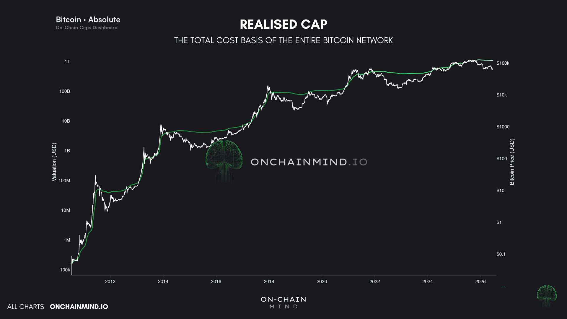
View live in OCM Studio: Realised Cap
The real power, though, comes from what you build on top of it. My favourite view is the Realised Capital Flows, which tracks the actual dollar amount moving into or out of the network.
What it shows today is textbook: capital is leaving. Around $94 million is exiting the network daily, down from nearly $1 billion a day only a few weeks ago. The bleeding is slowing, but make no mistake, it is still very much bleeding.
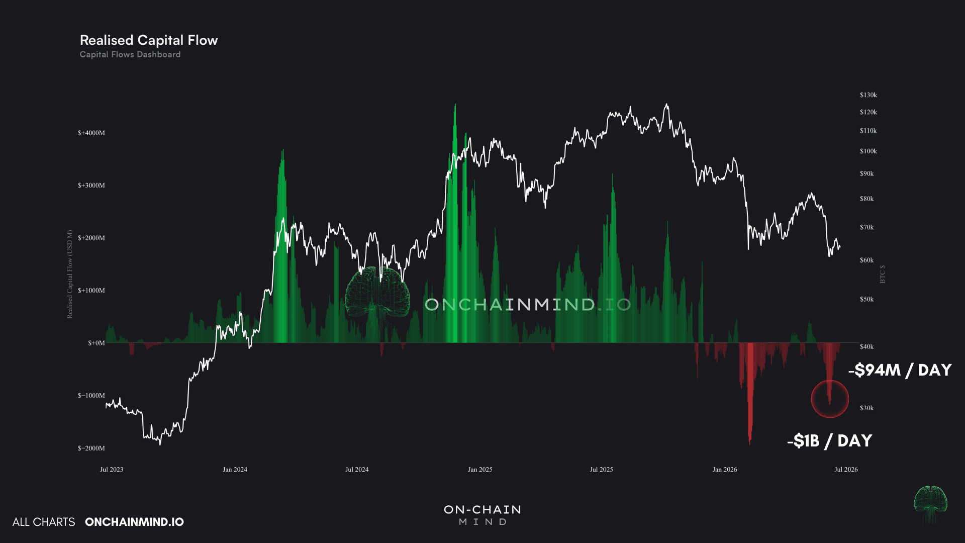
View live in OCM Studio: Realised Capital Flows
One of My Favourite DCA Signals
Two signals turn this raw data into something actually tradable. The first is the Flow Momentum, which pits the 30-day average flow against the 90-day baseline.
When it is positive and accelerating, the trend is robust and the market is often locally overheated. When it tips into the red, the structural demand underpinning the market has weakened, and that is precisely when I start considering scaling in.

View live in OCM Studio: Flow Momentum
The second, and a long-time favourite tool of mine for dollar-cost-averaging, is what I call Capital Bleeding. It measures the 30-day % change in the Realised Cap, and when it turns negative, coins are being sold at a loss or moved at lower valuations. The longer those red streaks run, the more discounted the network's underlying value becomes, and the harder I lean into my regular buying.
Here is something I want to be crystal clear about, because I am asked it quite a lot. I believe this particular signal will never become redundant.
Most indicators have a natural shelf life; they get front-run, gamed, or quietly lose meaning as the market matures. Capital Bleeding is different because it is a first-principles accounting measure of the real, settled dollars in the system.
As long as coins keep settling on-chain, it keeps working. And right now it is printing its second-largest reading of the entire bear market, with the realised cap down around 1.3% in a single month. That is a lot for this behemoth.
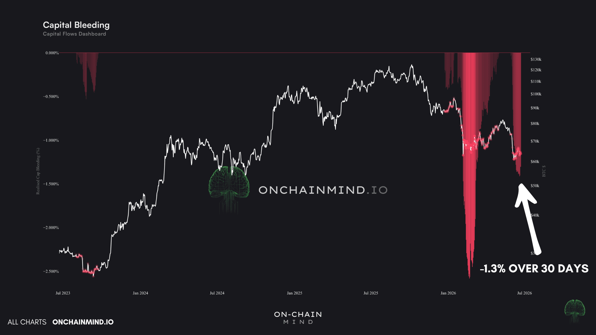
View live in OCM Studio: Capital Bleeding
Following The Money
This is where on-chain analysis really earns its keep, because we do not have to stop at the total market. We can break every dollar of that outflow down into the exact cohort responsible for it.
Split the holders into short-term and long-term, and one thing leaps off the chart immediately: it is the recent buyers doing almost all of the damage. Short-term holders are responsible for roughly 78% of the entire negative capital flow.
Think about what that actually means. New market entrants are flipping supply back and forth between themselves, while the conviction holders sit dormant and barely move a coin. To me, that is the signature of a market lacking structural guidance, one with no firm price anchor, and one that will stay highly volatile until that conviction capital takes back control.
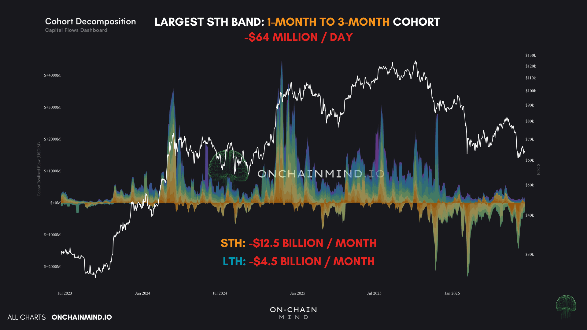
View live in OCM Studio: Cohort Decomposition
Dig in a little further and the largest culprit is the 1-month to 3-month band, offloading something like $64 million a day. Over the past month alone, short-term holders have pulled $12.5 billion out of the network. Whilst long-term holders have been much less at $4.5 billion.
That is almost a three-fold difference between the two cohorts, and it is a deeply telling split. The people who bought recently and got nervous are capitulating, while the seasoned hands are largely staying put.
That is textbook late-bear behaviour.
The Institutional Twist Nobody Saw Coming
Here is the part I find genuinely fascinating, and it is something we have never witnessed in Bitcoin before.
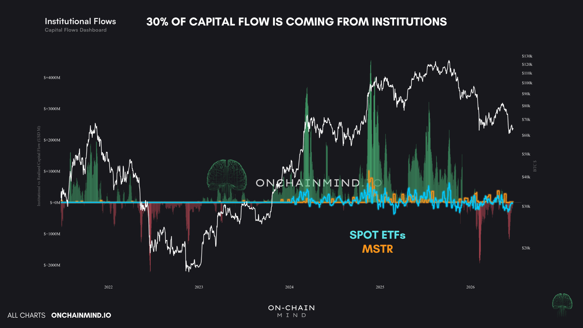
Around 30% of the entire gross capital flow this week is now coming from institutions. That is a historically high figure.
Overlay the spot ETF flows and Strategy's (MSTR) buying onto the realised flows chart and the historical picture is clear: despite the ETFs being the most successful launch in financial history, their flows have always been dwarfed by what happens on-chain.
View live in OCM Studio: Institutional Flows
So no, the ETFs are not masking the on-chain data, not even close. The same goes for Saylor. He has built the single biggest Bitcoin bag in history, yet MSTR has never been a major driver of network-wide flows. That, right there, is why people get so upset when he buys a billion dollars' worth and the price goes absolutely nowhere. There are far bigger forces at play beneath the surface.
But the past month tells a newer story. The spot ETFs have shed roughly $3.75 billion in net outflows, against a total Realised Cap change of about $14 billion.
Do the maths and the ETFs alone account for almost exactly a quarter of the entire sell-off. MSTR, by contrast, actually added around $232 million, which is nice, but nowhere near enough to stem the tide.
For the very first time, institutions are a meaningful part of the flow. The so-called “diamond hands” might be no more.
How I’m Playing These Signals
Watch the video walkthrough on YouTube
Continue reading with OCM Premium
You have been reading the free preview of this article. The rest of it (about 300 more words) is for OCM Premium members. See OCM Premium plans.