
For all its volatility, Strategy (MSTR) has just endured a sell-off so profound, so aggressive, that it has left many diehard MSTR investors reeling, blinded by the sheer scale of the percentage drop.
But it’s time to disregard the visceral feeling of panic and ground our analysis in the cold, hard logic of the data.
In this article, we’ll dissect the current state of MSTR to map out the underlying health of the trend, the mechanics of momentum, and the critical cost-basis levels that will define the path to potentially higher targets.
Key insights
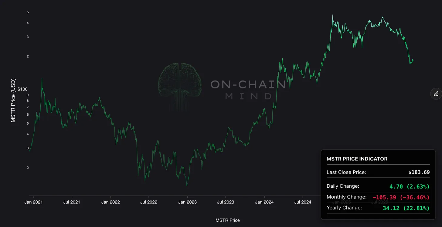
Price Performance Reality Check: Despite a 36% monthly drop, MSTR remains up 22% year-on-year, framing the correction as volatile but not catastrophic.
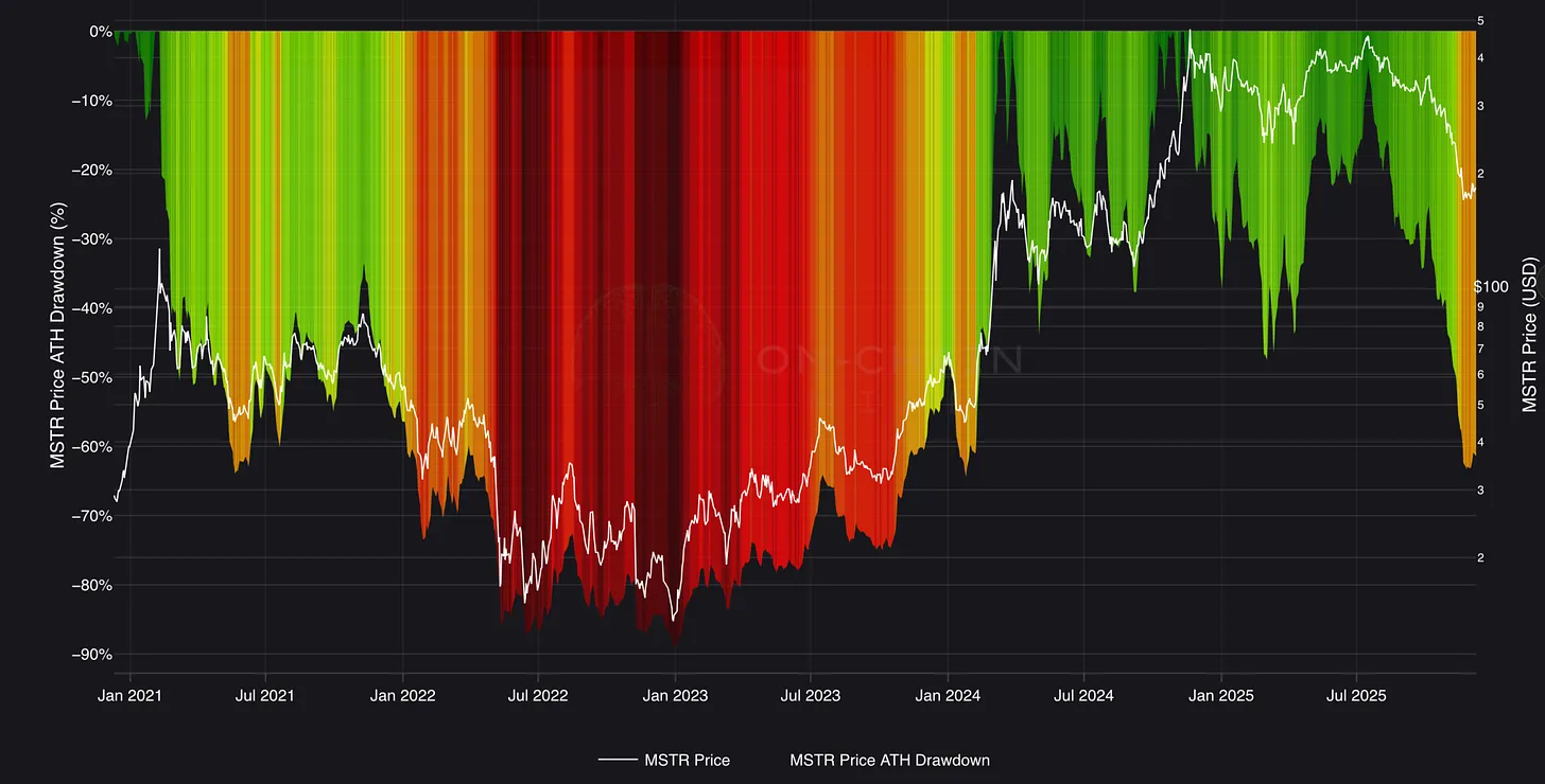
Drawdown in Perspective: At -63% from all-time highs, this dip mirrors past cycles but pales against the previous -89% bear market plunge.
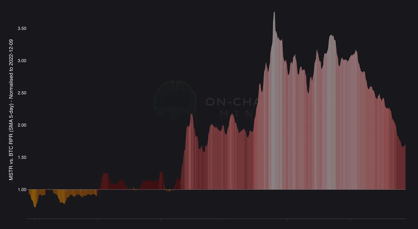
Relative Bitcoin Edge: Short-term underperformance hides cycle-long outperformance, with MSTR still yielding a 70% excess return during this bull.
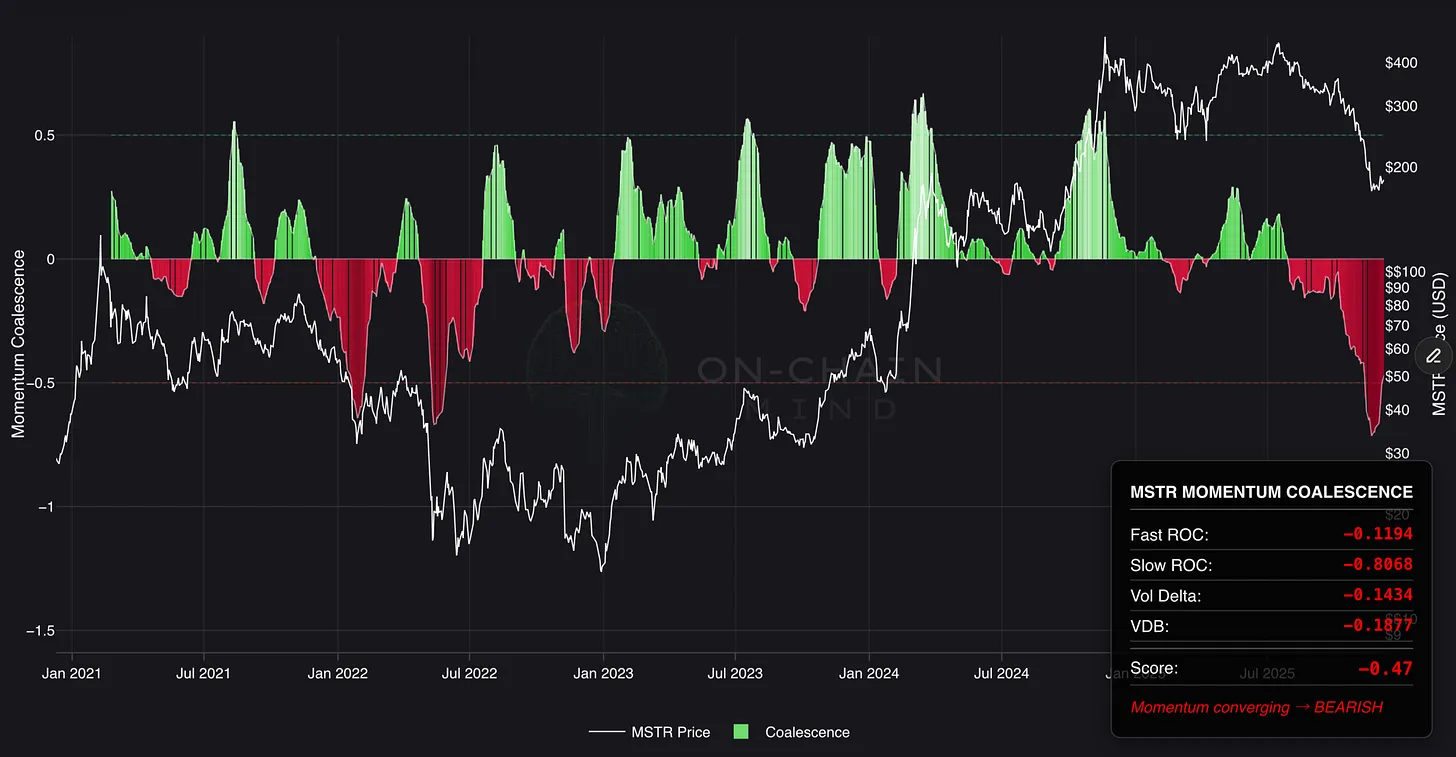
Momentum Reversal Signals: Multiple oversold momentum indicators are curling upwards, hinting at exhaustion and potential structural bottoms.
Contextualising the Carnage
There is no way to dress up the recent price action: it has been nothing short of savage. Measured in US dollars, MSTR has experienced a monthly change of approximately –36%.
For a traditional blue-chip equity, a move of this magnitude would be catastrophic, often requiring a multi-year recovery timeframe. You can gauge online how much it has shaken out even the most “irresponsibly long” MSTR holders. Yet, context is always paramount when assessing high-beta assets like this one.
The Drawdown Lens
To truly quantify the damage, let’s take a look at the All-Time-High Drawdown metric, which standardises all corrections by measuring the percentage decline from the previous peak.
The current drawdown sits at roughly 63%. For those still anchored to TradFi, this is an alarming figure. However, a comparison to the previous cycle, where MSTR drew down approximately 89% from its prior all-time high, and remained there for a sustained period, brings immediate perspective.
This 60-odd per cent correction is, statistically speaking, entirely within the bounds of “normal volatility” for an asset that acts as a leveraged proxy for Bitcoin. Those who have navigated the cyclical nature of the broader crypto markets have lived through far worse, making this violent move unfortunately familiar.
Interestingly, the shape of this drawdown mirrors the May 2021 selloff, the infamous precursor to the 2022 bear market. But one crucial difference exists: Bitcoin itself hasn’t mirrored that trajectory this cycle. That divergence forces us to look at the next crucial element: relative performance.
Everything Is Relative
When you measure MSTR against Bitcoin, the short-term view looks sobering: around –16% year-on-year. This short-term underperformance often leads to a quick, shallow conclusion: the leveraged strategy has failed. This is a classic example of recency bias.
Relative performance is a dynamic metric, entirely dependent on your starting point.
Looking at the Relative Performance Ratio chart, which compares the two assets over the full cycle, we observe a much more compelling truth. Even after this latest, violent correction, an investor who bought MSTR at the cycle start point would still be approximately 70% better off today than if they had simply held Bitcoin. At the peak of last November, this excess return was an astonishing 370% in favour of MSTR.
This is an absurd level of outperformance for any equity relative to its underlying asset, especially when considering that Bitcoin itself had rallied over 6x in that same timeframe.
Therefore, while the short-term remains negative, the broader, more important takeaway is undeniable: MSTR has structurally been the more profitable vehicle to hold throughout this current cycle than Bitcoin alone.
Quantifying Trend Health
To truly move beyond price and understand the underlying health of the trend, we must rigorously quantify momentum.
Momentum Coalescence
The most powerful tool for this is the Momentum Coalescence metric. This indicator is designed to reveal when multiple, independent layers of momentum are aligning behind a move, by blending 4 completely separate components (fast rate-of-change, slow rate-of-change, volume-delta engine, volatility directional bias) into a single, unified score to provide one of the most reliable snapshots of true momentum.
Currently, this metric has printed the largest negative reading since the strategy’s inception in 2020, worse even than the deepest point of the last bear market. This is a potent signal of the violence under the hood.
However, this is precisely where the inflection point lies: the structure is turning. The coalescence score is visibly curling and forming a bottom. Historically, this structural transition, where all 4 engines begin to flip from deeply oversold levels, only occurs near durable cyclical lows.
Velocity RSI
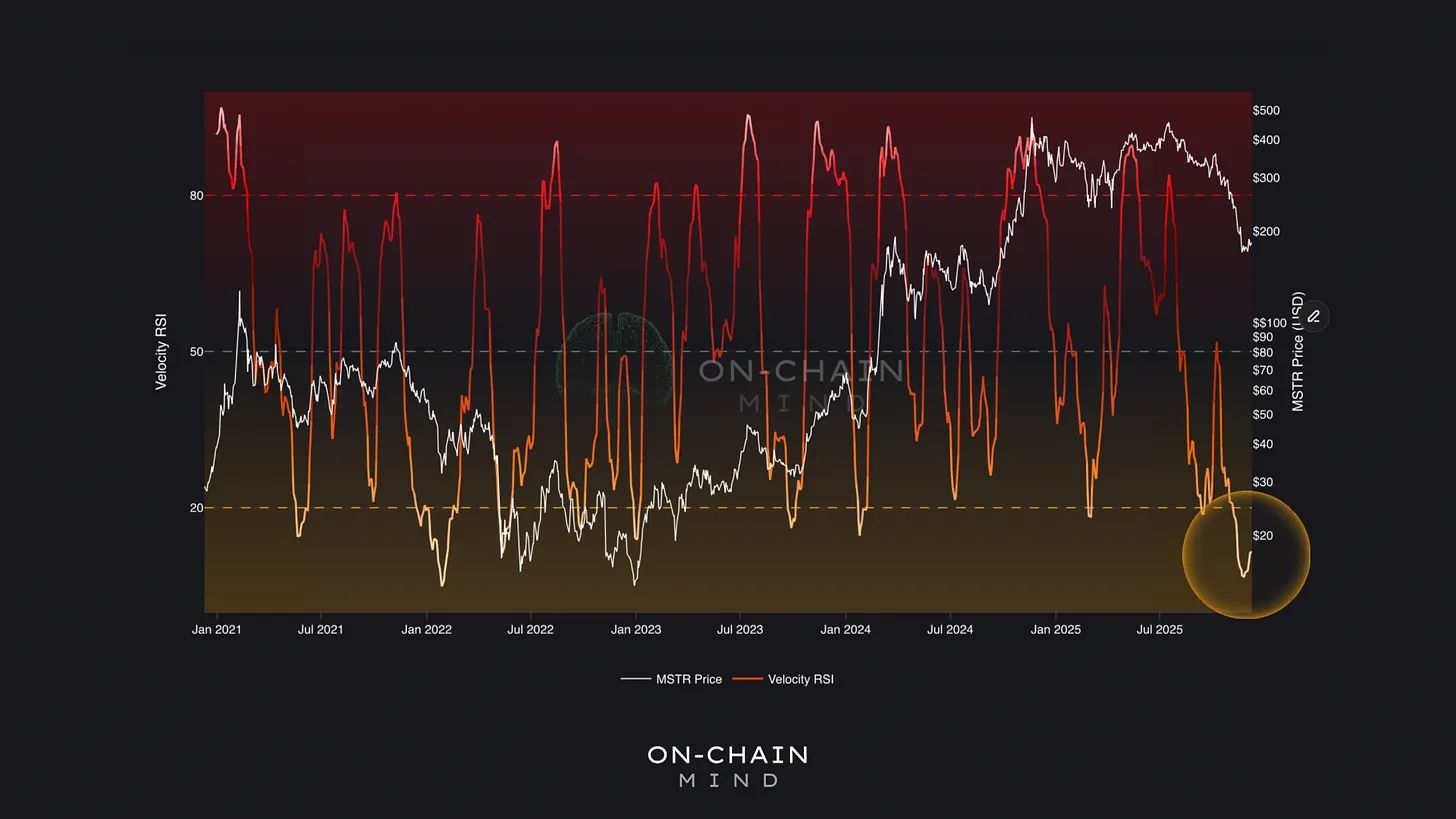
For those seeking simpler confirmation, the Velocity RSI shows a similar story. By incorporating price velocity alongside traditional RSI principles, it captures sharp reversals with far greater accuracy, which is key for volatile assets like MSTR.
On the daily chart, this indicator has just registered the second-lowest reading ever. Readings this deep suggest exhaustion territory to the point at which selling pressure has simply run out of steam.
The fact that it is now curling upwards provides powerful corroboration to the Coalescence metric, indicating that momentum is rebuilding from a foundation of historical oversold pressure.
The Footprint of Accumulation
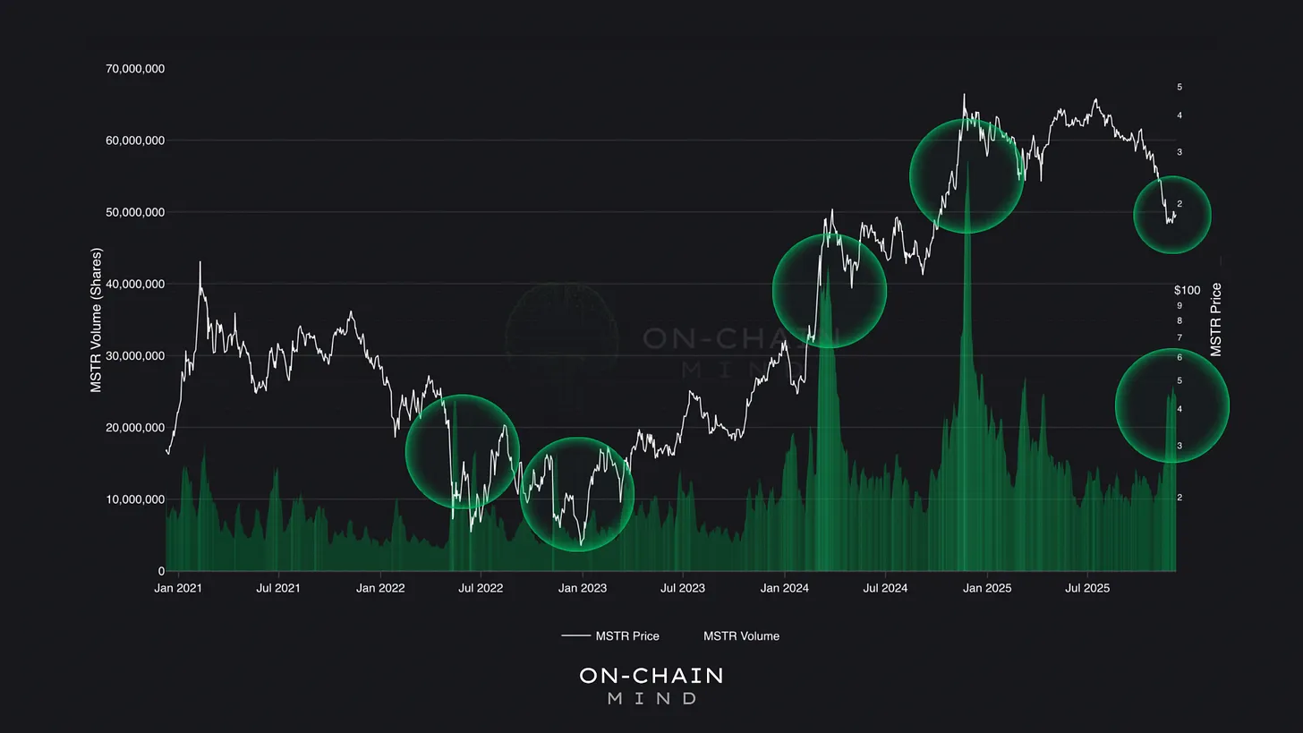
Momentum can signal exhaustion, but volume confirms action. Trading volume measures how many shares are changing hands on a daily basis and exhibits a distinct pattern in high-beta assets. It spikes either at:
Euphoric peaks (FOMO buying).
Durable bottoms (aggressive accumulation).
What we are seeing now is a clear, sustained uptick in traded shares, nearly doubling the daily volume compared to just a couple of months ago. Crucially, this surge in activity did not occur during the slide down; it appeared precisely at the low of the recent sell-off.
This suggests that instead of capitulating further, buyers stepped in aggressively, absorbing the supply being dumped by the weak hands. When volume expands into a low, it is one of the most reliable signatures of real accumulation, marking the early stages of a structural reversal rather than a mere dead-cat bounce.
Applying On-Chain Logic to Equity
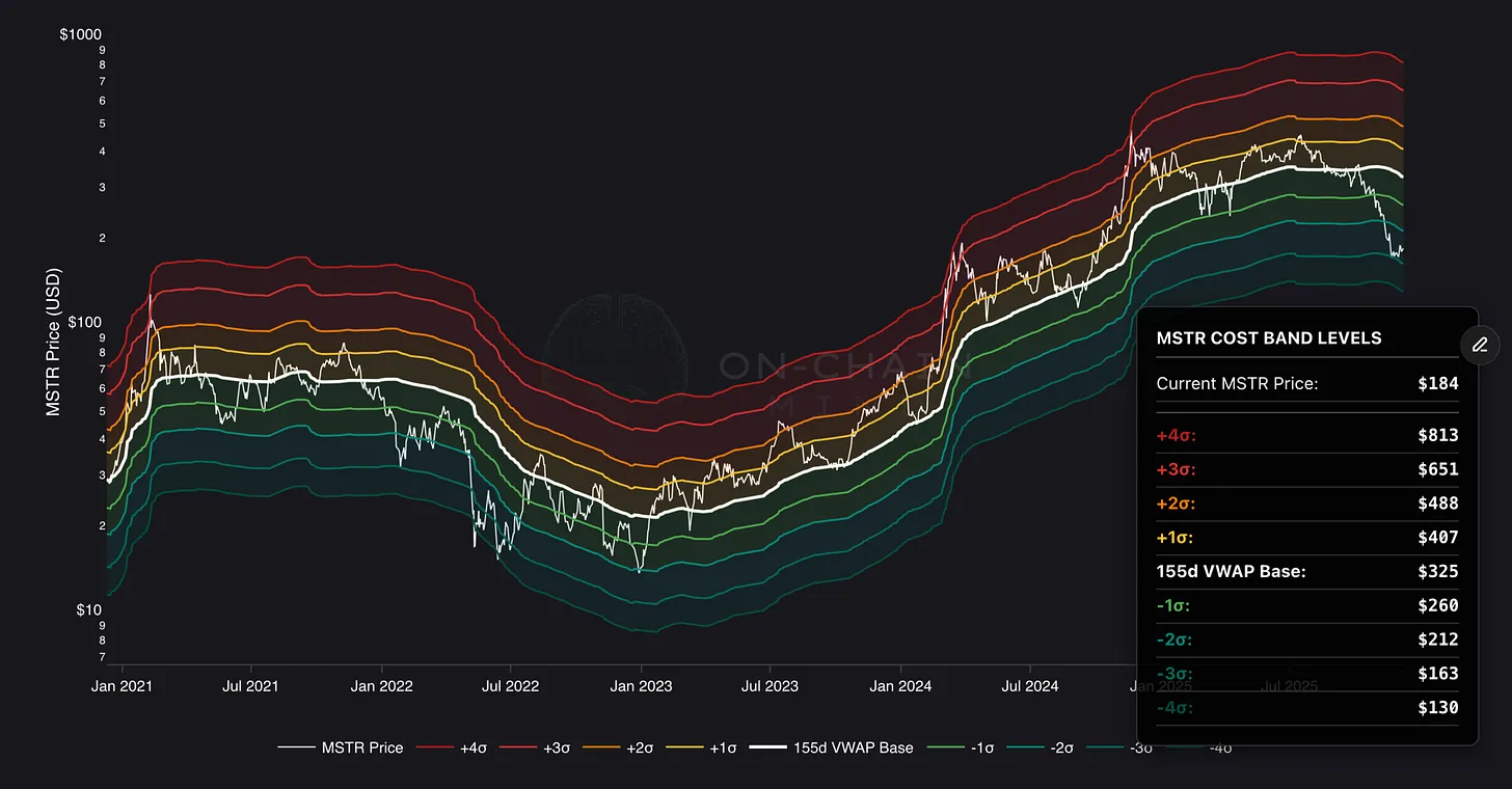
To determine the key levels for the next leg, we turn to the Cost-Bands indicator. While MSTR is an equity and lacks a true on-chain ledger, we can apply the same logic using price-weighted volume distributions. This methodology allows us to estimate the average cost basis for the most recent investors, the price the “new money” likely paid.
This critical level currently sits at approximately $325. It represents the break-even point for anyone who bought over the last 5-6 months.
The recent price drop saw MSTR enter the second-lowest cost band, a zone historically reached only during deep bear markets. After falling into such a zone, price almost always gravitates back toward the average cost basis.
I’d expect a two-stage recovery:
Phase 1: Chopping between $212–$260 as the market digests the selloff.
Phase 2: A move back toward $325, where prior investors break even and capitulated sellers may re-enter, creating upward pressure.
If the structural momentum metrics continue their upward trajectory when price hits the $325 zone, it will likely serve as the launchpad for a push towards the upper Cost Band levels and the next major cycle high.
The Price of Conviction
Watch the video walkthrough on YouTube
Continue reading with OCM Premium
You have been reading the free preview of this article. The rest of it (about 200 more words) is for OCM Premium members. See OCM Premium plans.