
Every coin on the Bitcoin network leaves a footprint. And when you know how to read that footprint, you can see exactly where the pressure is building beneath the surface.
In this article, we’re going to explore one of the most underappreciated on-chain metrics in Bitcoin: the Active Supply.
This metric doesn’t just tell us about the coins moving right now, it reveals the phases of accumulation, distribution, and even the final capitulation points that have defined Bitcoin’s entire history.
Key insights
Active Supply Framework: Tracks how much Bitcoin is “alive” and participating in the market, adjusted by liveliness, revealing true circulation versus dormant holdings.
Liveliness as a Spent-Output Pulse: Tracks the destruction of "coin days" to determine if long-term holders are distributing or accumulating.
The 100,000 BTC Threshold: A historical line in the sand where monthly Active Supply surges signal major market inflection points.
Capitulation Signalling: Paradoxical spikes in Active Supply during price crashes often mark the absolute final flush of the "smart money".
Moving Beyond "Who" to "What"
In the world of on-chain analysis, we often obsess over the "who".
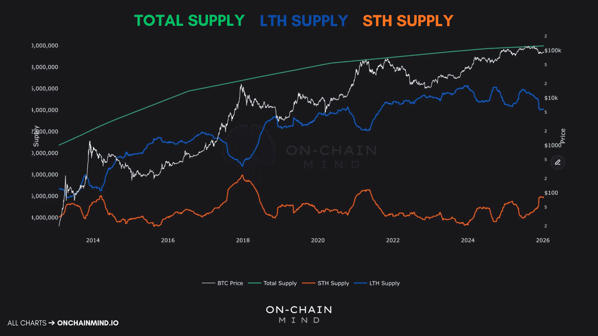
Most people start with the total Bitcoin supply, which is simple enough. From there, we often categorise entities into Long-Term Holders (LTHs) and Short-Term Holders (STHs), typically using the 155-day threshold to distinguish between"smart money" and "tourists".
This framework is undeniably powerful, and has been a powerful way to analyse market structure for years. But it misses a vital nuance: the distinction between possession and participation.
The Active Supply shifts the focus. It doesn't just ask who holds the coins; it asks which coins are actually "alive" and actually participating in the economy right now.
Introducing Liveliness
To truly grasp the Active Supply, we need to introduce a critical concept: liveliness. Liveliness tracks whether Bitcoin is being spent or held, and it does so through a metric called the coin days destroyed.
Here’s how it works. Coins accumulate “days” while sitting idle:
If you hold 1 Bitcoin for 10 days without moving it, you have 10 coin days.
If 10 Bitcoin coin hasn’t moved in 5 years, that’s 18,250 coin days.
When that coin finally moves, all those accumulated days are “destroyed”. That destruction is significant because it reflects the behaviour of long-term holders and can indicate major shifts in market psychology.
When liveliness rises → older coins are moving, and long-term holders are spending. This is usually a distribution phase.
When liveliness falls → coins stay dormant, and accumulation is happening.
Active Supply essentially applies liveliness across the entire Bitcoin supply, measuring how much of the network is “alive” and circulating versus how much is locked away in the vaults of the conviction-rich.

Identifying our Line in the Sand
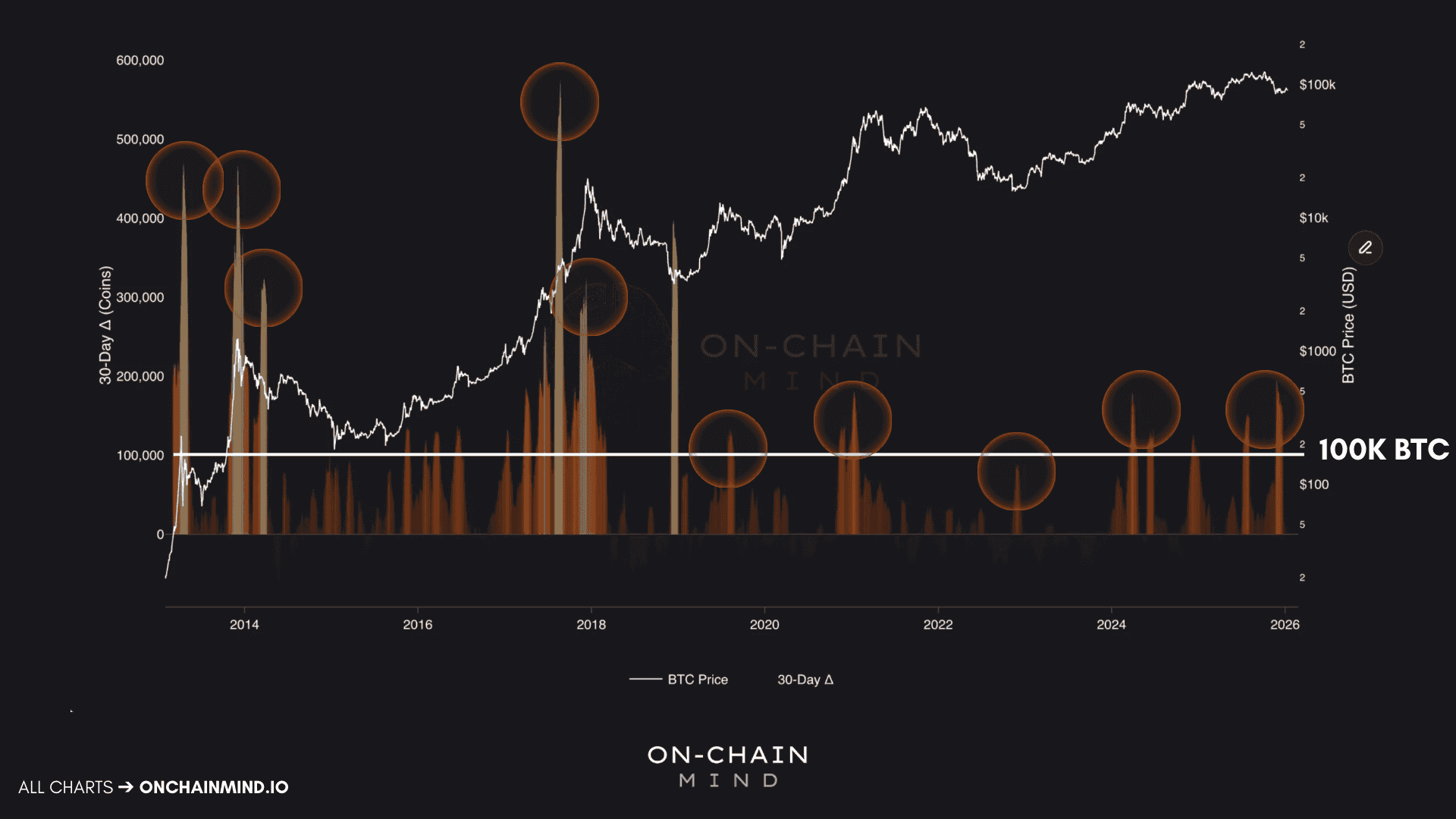
One of the most effective ways to use the Active Supply is by tracking its 30-Day Delta (Δ), which is the change in active supply over the past month. This metric measures momentum in coin activity.
Positive values → coins waking up, being sold, or redistributed.
Negative values → coins going dormant, absorbed by holders who aren’t selling.
What makes this metric so compelling is its ability to identify extremes in the market. It doesn’t just highlight tops; it highlights bottoms too.
Looking back through Bitcoin’s history, Active Supply surges around market peaks make sense. As prices rally, older coins are tempted back into circulation, long-term holders take profits, and supply floods the market. But the behaviour at bottoms is even more fascinating.
2018 Bear Market: During the cycle low, one of the largest-ever spikes in Active Supply occurred. Long-term holders capitulated, selling at the worst possible moment.
2022 Bear Market: A similar spike marked the final capitulation before Bitcoin structurally bottomed and began to recover.
A critical reference point emerges from these historical observations: when the Active Supply increases by more than 100,000 Bitcoin in a month, it frequently aligns with major inflection points. Drawing a horizontal line at this threshold across historical data reveals remarkable consistency.
What the Past 4 Years Show
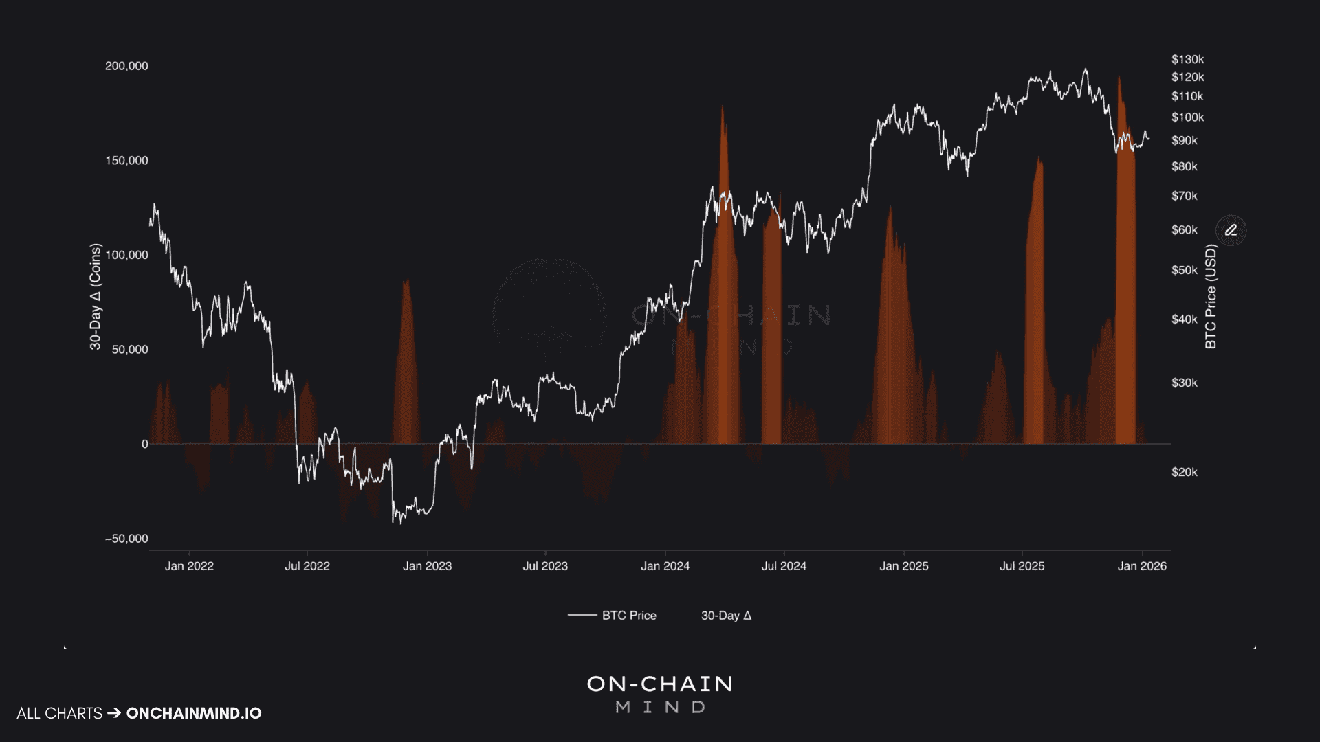
Zooming in on the past 4 years, the signal becomes crystal clear. The bear market bottom in late 2022 coincided with a massive surge in Active Supply, followed by a period of dormancy as prices recovered. Then, as we pushed into the post-ETF euphoria of 2024, Active Supply revived. Older coins began taking profits as prices approached new all-time highs, spiking again as Bitcoin breached $100,000, and once more around $120,000.
The most extreme reading of this cycle, however, came during the massive price crash at the end of last year. Active Supply exploded, surpassing 200,000 Bitcoin revived per month, which is the largest spike of the cycle. This mirrored historical full-scale capitulations: emotional selling, weak hands giving up, and even the longest-term holders participating in panic sales.
Since then, the delta has collapsed, hovering around neutral and dipping slightly negative. Coins are going dormant again. Supply is being absorbed quietly. This has historically been a favourable environment for accumulation.
Institutionalisation and the New Playbook
There is a growing narrative that Bitcoin has changed; that the influx of ETFs and institutional players has "muted" the old retail-driven cycles. My stance is simple: if the game changes, we adapt.
The data suggests that despite institutionalisation, the Active Supply dynamics remain incredibly consistent. This leads us to a very clear, data-driven playbook:
Watch the video walkthrough on YouTube
Continue reading with OCM Premium
You have been reading the free preview of this article. The rest of it (about 350 more words and 1 more chart) is for OCM Premium members. See OCM Premium plans.