
The quietest markets always make the loudest moves. And right now, the Bitcoin network has never been quieter.
Every time in Bitcoin’s history that the fast money has drained out of the market this completely, something remarkable has happened next. The network goes quiet, the supply goes to sleep, and patient money quietly takes control.
It is happening again right now, and almost nobody is watching.
So let me show you exactly who holds Bitcoin today, what they paid for it, and why this silence is the loudest signal on my entire platform.
Let’s get into it.
Key insights
The Realised Cap Rules: Weighting holders by the dollars they actually committed, rather than by raw supply, is what reveals true conviction.
The Speculators Have Exited: Reactive speculators now hold just 26% of the realised cap, which has historically been a deep bottoming zone.
The Age Pyramid: Comparing each cohort's supply share against its invested capital shows you who overpaid and who is sitting cheap.
The Network Is Falling Asleep: The average coin last moved four years ago, which is the classic fingerprint of quiet accumulation.
Where the Money Really Sits
We are starting with the Realised Cap HODL Waves, and if you’ve been reading this newsletter for a while, it should look familiar.
The beautiful coloured bands on the chart each represent a different age of coin. The warm oranges and reds down at the bottom are your short-term holders, coins that last moved anywhere from a day to 6 months ago. The cool greens, yellows and blues sitting above them are your long-term holders, stretching from 6 months all the way out to coins that have not budged in over a decade.

View live in OCM Studio: Realised Cap HODL Waves
Here is the part most people miss. The more common chart you see floating around is the supply-based version, and it simply counts how many coins sit in each age band.
Look at it that way and you see something remarkable: ~17% of all Bitcoin has not moved in over 10 years. An enormous hoard. But on its own, that number is almost useless for reading cycles.
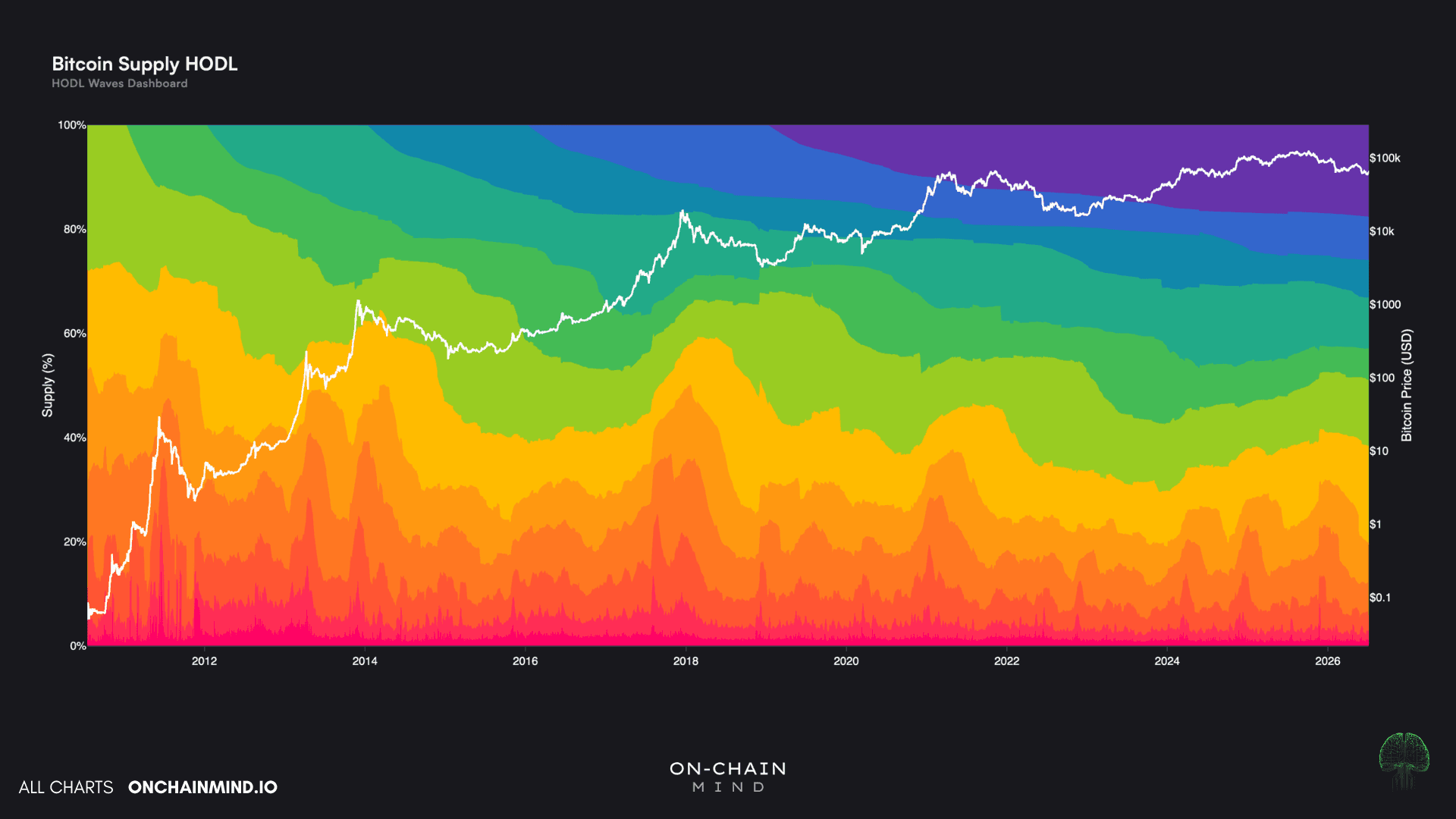
View live in OCM Studio: Supply HODL Waves
The Realised Cap is what fixes it. Instead of valuing every coin at today's price, it values each coin at the price it last moved, which makes it a brilliant proxy for the network's aggregate cost basis, the real dollars committed rather than the paper value.
On the Realised Cap view and that same 10-year band collapses to just 0.04%, because those ancient coins last moved when Bitcoin was worth pennies.
Now apply that same lens to the other end of the spectrum. The recently moved money, account for just 26% of the Realised Cap today. Flip it around and the message is stark: long-term, patient holders now command roughly three-quarters of every dollar ever committed to Bitcoin.
When this figure is this low, it tells you the speculators have capitulated and handed their coins to steadier hands. And it matters, because any time it has fallen below 40%, it has lined up with almost every major bottom we have ever had.
We are sitting right in that zone today.
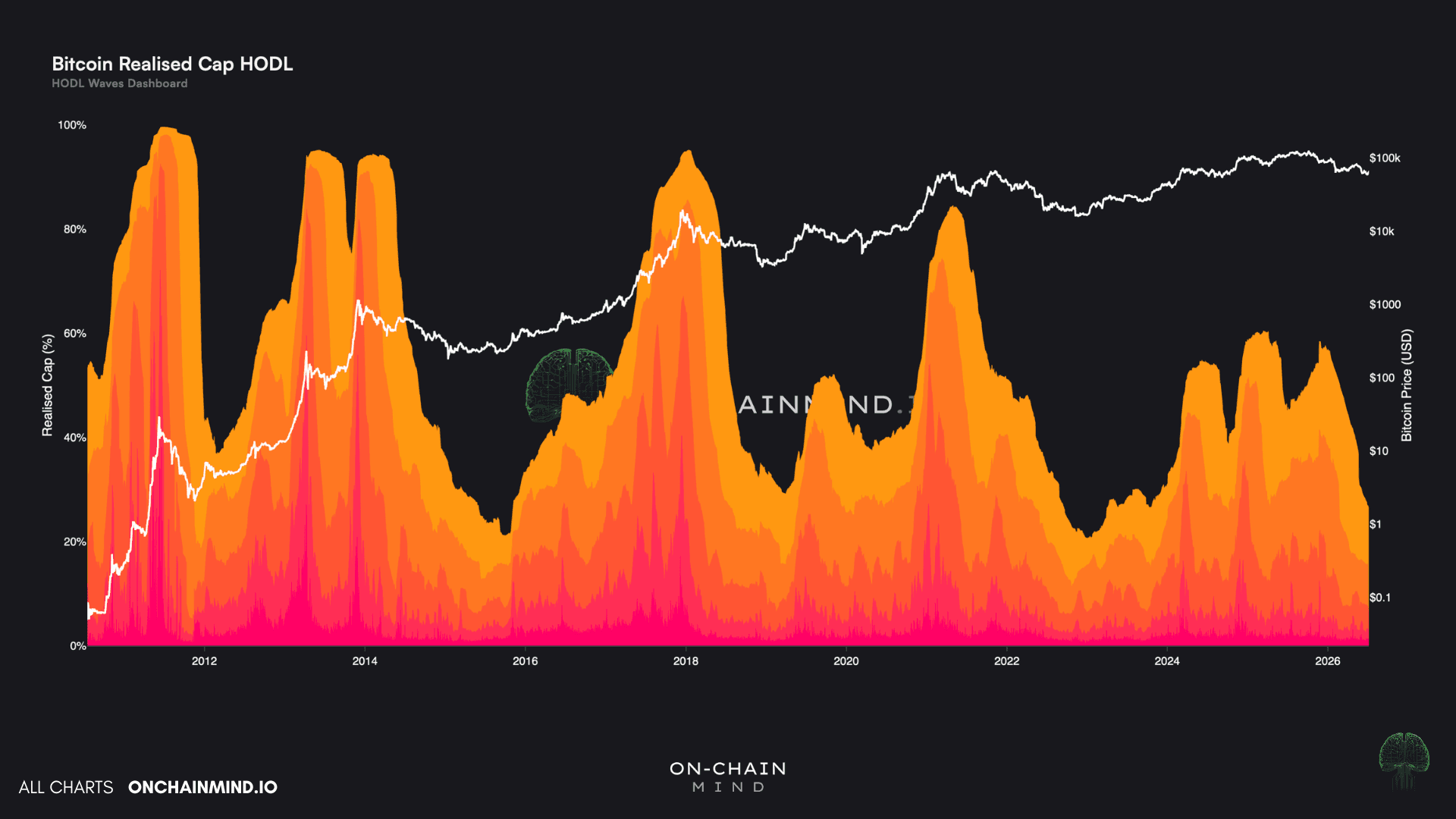
View live in OCM Studio: STH HODL Waves
Vintages, Pyramids and the Shape of a Cycle
Next comes one of my favourite views, supply by vintage year, which answers a deceptively simple question: for every coin in existence, what year did it last move?
I like to think of it like wine. A coin that last changed hands in 2013 and has slept ever since is a 2013 vintage.
Stack the whole supply up that way and you can see that the single largest cohort is the 2025 vintage at roughly 25%, meaning a full quarter of all Bitcoin changed hands last year and is now quietly ageing into maturity.
Not a tradable signal as such, but interesting nonetheless.

View live in OCM Studio: Supply Vintages
Then there is The Age Pyramid, and this is where cost basis gets exposed.
Supply share sits on the left, capital invested on the right, and the whole trick is watching which side sticks out further.
Wherever the right overhangs the left, that cohort has paid a premium: they committed more dollars than their share of coins alone would suggest, which means their average cost basis sits well above the crowd.
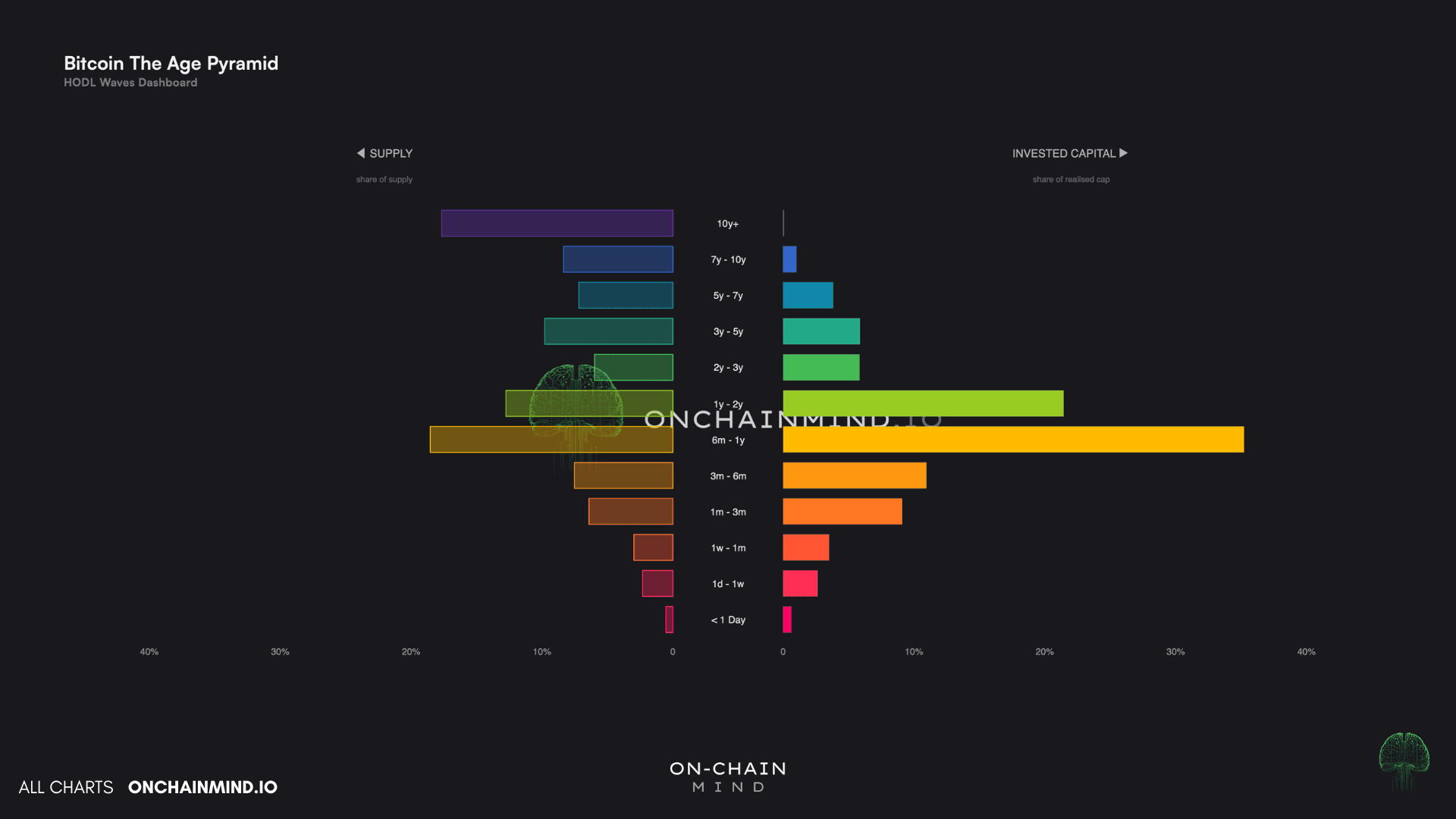
View live in OCM Studio: Age Pyramid
Two cohorts leap out, at opposite extremes.
The 6-month to 1-year group has poured in roughly 35% of all the capital on the network while owning just 18% of the coins. That is a badly lopsided trade. Their cost basis is stretched and elevated, they bought high and late last cycle, and they tend to be the first to fold when price rolls over, which is precisely what turns them into overhead supply on the way back up.
At the other end sits that ancient 10-year cohort, holding 17% of all coins for a mere 0.04% of the capital. This is the cheapest, most immovable float on the entire network, resting on a gain so vast that nothing short of a generational event would shake it loose (if it’s not lost already).
And the shape of the pyramid tells you where you are in the cycle without a single price on the chart. I’d urge you to go mess around with it on the Studio, as it will likely teach you more about investor psychology than I can in this piece.
At a bull top the base bulges, fat with fresh speculative supply that has just changed hands at the highs. As the bear grinds on, those young bands quietly thin out and the belly of the pyramid swells, because the people who bought the top did not sell. They simply held, and their coins aged one cohort at a time into stronger, longer-term hands.
Right now it is the middle that is thickening, and that is about as textbook a mid-to-late bear cycle fingerprint as you could ask for.
The Dormancy Clock
Finally, the Dormancy Clock takes the entire network and boils it down to one simple question: how long ago did the average coin last move?
When the metric climbs, coins are sitting still, holders are refusing to sell, and supply is quietly ageing. When it flattens or falls, old coins are waking up and moving, which is exactly what you see at bull market peaks.
Right now the average coin last moved 4 years ago. At the last cycle top it dipped to around 3.7 years as old money stirred and took profit, the unmistakable fingerprint of distribution.
We are seeing the exact inverse of that today. The clock is not stalling, it is climbing, and it is doing so with real momentum.
Coin by coin, the network is going back to sleep, supply is being locked away rather than mobilised, and the average holder is becoming more patient by the week, not less. This is not the texture of a market getting ready to hand its coins to someone else.
It is the texture of a market ageing back into accumulation.
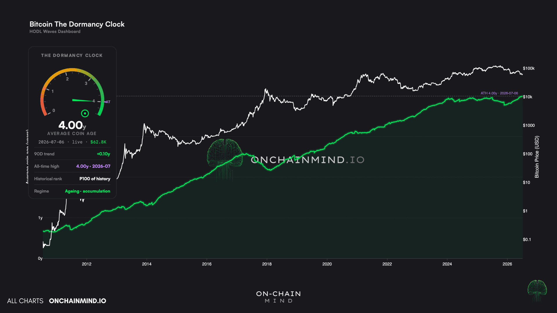
View live in OCM Studio: Dormancy Clock
The Part That Matters
For the most part, I think most people are simply looking in the wrong place. They watch price, funding and sentiment, all of which are loud, fast and lagging, and they mistake that noise for information.
The real story sits one layer beneath, and it is far quieter: the slow, unglamorous transfer of coins from the people who will eventually sell to the people who simply will not.
And that is the part I care most about. A network where patient hands own three-quarters of the committed capital, and where the float is tightening week after week, is stored potential. Plain and simple.
Remember, the loudest moves are always made in the quietest markets, and by every measure I track, the network has rarely been this quiet.
This HODL Waves dashboard will not tell you when the turn will happen. But it will tell you that when a catalyst does arrive, there is almost no loose supply standing in its way.