

ON-CHAIN METRIC
Cointime Conviction
A cointime valuation reading that runs opposite to the rest of the dormancy suite.
Open the Dormancy dashboard
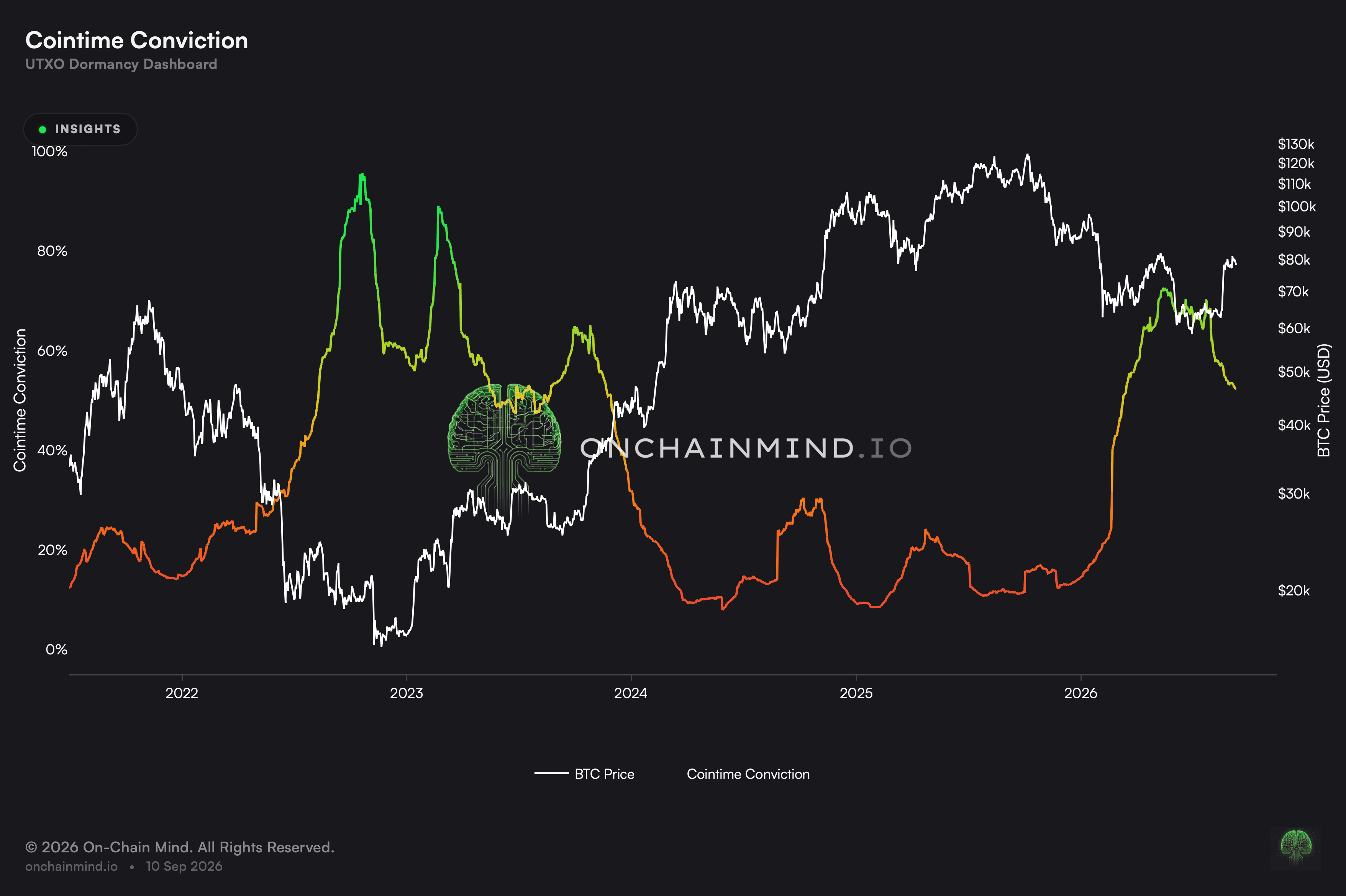
Cointime Conviction is a pricing dial assembled out of the cointime framework rather than from price by itself. It sets the economic heft carried by coin that has slept a long time against what the market is currently prepared to pay.
It runs backwards against everything else on this dashboard, and that single fact causes more misreadings than any other feature of the suite. Rich readings have clustered around cycle lows. Cheap readings have clustered around highs.
What it actually measures
The reading compares two views of what the supply is worth: the value implied by how long coin has sat still, and the value the market is placing on it now. When the first runs well ahead of the second, the market is cheap on this framework.
It is normalised across the whole history, so a reading is a position within its own range, not a level with independent meaning. That is what makes readings from different cycles comparable at all.
It also means the extremes are defined by the history behind them. A market that spends years in a new range will slowly redefine what counts as rich or cheap here, which is true of every historically ranked measure and worth remembering at the edges.
High is the value end, the opposite of everything beside it
On the rest of these views, a high figure means ancient coins are on the move and that spells danger. Here a high figure means underlying worth has outrun the asking price, and that has historically turned up at floors rather than ceilings. Anybody importing the habit from the neighbouring views will get this one precisely upside down.
The inversion is not a quirk of presentation. It follows from this being a valuation measure and not a spending one, and the dashboard colours it accordingly. Check which kind of view you are looking at before acting on where the line sits.
What it does not tell you
Readings at either edge have stayed there for months at a stretch. Moving on the first one to appear has been early by an embarrassing margin, and what is on screen locates the market without dating anything.
This is a model, not an observation. The cointime framework makes assumptions about what dormant coin is worth, and a reading is only as good as those assumptions. Treat it as one valuation view among several.
How to read it
Elevated. Rich against everything on record. On this particular dial, figures up here have bracketed floors rather than ceilings.
Mid-range. Neither extreme, with no strong valuation signal from the premium.
Subdued. Cheap against everything on record, which has historically gathered around giddy conditions rather than bargains.
Cointime Conviction updates on the Dormancy dashboard, and so do Reserve Risk, HODL Bank and Vaultedness.
Common questions
Why is high the favourable end here?
Because a high figure means underlying worth has outrun the asking price, and that has historically gathered at floors rather than ceilings.
Why does this one run the opposite way round?
Because this is a pricing dial and not a spending gauge. On the neighbouring views a high figure means ancient coins are on the move, which spells danger. Here it means the market is inexpensive.
How long have extremes persisted?
Months on end, at either edge. What is on screen locates the market without dating anything.
Is it any good for timing?
Poorly. Acting on the first extreme print has been early by a wide margin in every cycle it covers.
What else belongs on screen with it?
Reserve Risk and Dormancy Flow, which weigh price against holder behaviour from different angles, and a spending measure to see whether supply is actually moving.
ON-CHAIN METRIC
Cointime Conviction
A cointime valuation reading that runs opposite to the rest of the dormancy suite.
Open the Dormancy dashboard
Cointime Conviction is a pricing dial assembled out of the cointime framework rather than from price by itself. It sets the economic heft carried by coin that has slept a long time against what the market is currently prepared to pay.
It runs backwards against everything else on this dashboard, and that single fact causes more misreadings than any other feature of the suite. Rich readings have clustered around cycle lows. Cheap readings have clustered around highs.
What it actually measures
The reading compares two views of what the supply is worth: the value implied by how long coin has sat still, and the value the market is placing on it now. When the first runs well ahead of the second, the market is cheap on this framework.
It is normalised across the whole history, so a reading is a position within its own range, not a level with independent meaning. That is what makes readings from different cycles comparable at all.
It also means the extremes are defined by the history behind them. A market that spends years in a new range will slowly redefine what counts as rich or cheap here, which is true of every historically ranked measure and worth remembering at the edges.
High is the value end, the opposite of everything beside it
On the rest of these views, a high figure means ancient coins are on the move and that spells danger. Here a high figure means underlying worth has outrun the asking price, and that has historically turned up at floors rather than ceilings. Anybody importing the habit from the neighbouring views will get this one precisely upside down.
The inversion is not a quirk of presentation. It follows from this being a valuation measure and not a spending one, and the dashboard colours it accordingly. Check which kind of view you are looking at before acting on where the line sits.
What it does not tell you
Readings at either edge have stayed there for months at a stretch. Moving on the first one to appear has been early by an embarrassing margin, and what is on screen locates the market without dating anything.
This is a model, not an observation. The cointime framework makes assumptions about what dormant coin is worth, and a reading is only as good as those assumptions. Treat it as one valuation view among several.
How to read it
Elevated. Rich against everything on record. On this particular dial, figures up here have bracketed floors rather than ceilings.
Mid-range. Neither extreme, with no strong valuation signal from the premium.
Subdued. Cheap against everything on record, which has historically gathered around giddy conditions rather than bargains.
Cointime Conviction updates on the Dormancy dashboard, and so do Reserve Risk, HODL Bank and Vaultedness.
Common questions
Why is high the favourable end here?
Because a high figure means underlying worth has outrun the asking price, and that has historically gathered at floors rather than ceilings.
Why does this one run the opposite way round?
Because this is a pricing dial and not a spending gauge. On the neighbouring views a high figure means ancient coins are on the move, which spells danger. Here it means the market is inexpensive.
How long have extremes persisted?
Months on end, at either edge. What is on screen locates the market without dating anything.
Is it any good for timing?
Poorly. Acting on the first extreme print has been early by a wide margin in every cycle it covers.
What else belongs on screen with it?
Reserve Risk and Dormancy Flow, which weigh price against holder behaviour from different angles, and a spending measure to see whether supply is actually moving.