

ON-CHAIN METRIC
Power Law Drawdown
How far beneath the long-run model the market is trading, and nothing else.
Open the Market Cycles dashboard
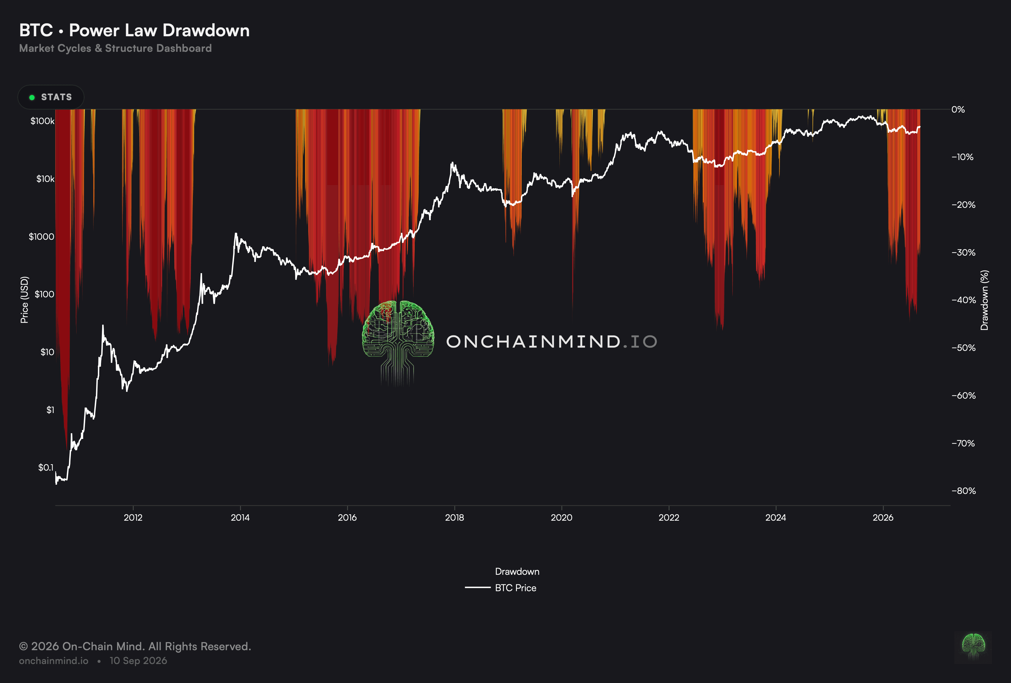
Power Law Drawdown keeps only the gap that opens up underneath the slow model, darkening as the market sinks further beneath fair value. Its neighbour shows both sides of that line; this one cares exclusively about the distance below.
Isolating one side is what makes the deep excursions legible. On a chart showing both, a discount competes for scale with every premium the market has ever printed, and the extremes flatten out.
What it actually measures
The view measures the gap between spot and the modelled fair value, and reports only the negative side. At or above the model there is nothing to draw, and beneath it the reading deepens with the discount.
Long spells far below the model have been uncommon and have gathered near the great lows. The load-bearing word is spells, since brushing a level once and living beneath it for months are not the same event at all.
The depth is measured against the model, not against price
A deepening reading does not require price to be falling. If modelled fair value is rising faster than spot, the discount widens while the chart goes up, and the two can move in opposite directions for a long time.
This is the case a plain price chart cannot show you, and it remains the reason the view exists. A market grinding sideways through a period when the model is climbing is falling behind, and only a reading taken against the model makes that visible.
Log Risk: zero to one hundred is not a probability
It works from the identical gap its neighbour measures, then squeezes that gap onto a capped dial. Folding both halves into one range is precisely what allows an overheated reading to be set beside a knocked-down one.
Anything scored out of a hundred tempts a reader into hearing odds, and there are no odds here. What the dial reports is a placement inside the range this gap has previously occupied, so a high figure says the market has run far by its own past standards and nothing more.
It does not mean a 90% chance of anything at all. The distinction matters because the two readings would lead to completely different decisions, and the scale gives no hint on its face about which one it is.
What it does not tell you
What this identifies is a pricing extreme, not a starting gun. Big gaps have gathered near the great lows, and the market is perfectly capable of sitting in one for a very long time, so depth locates the market without dating anything.
For most of its existence it has nothing to say. Once the market reaches fair value there is no gap left to shade, so the whole of every advance passes here in silence and the neighbouring view takes over. A chart sitting empty for years is behaving correctly, and it is also one people forget how to read by the time it fills again.
How to read it
Deep Discount. The market is asking under half what the slow model says. Long spells this far down have been uncommon and have gathered near the great lows.
Under the Model. The everyday state of a market grinding through a decline, and nothing remarkable in itself.
No Drawdown. The market has reached fair value or passed it, leaving no gap here to shade.
Power Law Drawdown updates on the Market Cycles dashboard, and so do Power Law, Log Risk and Log Growth Model.
Common questions
Why show only the half beneath the line?
Because the two halves ask different things. Overhead, what matters is how far the market has run; underneath, how much has been knocked off, and giving that its own scale is what makes the big gaps readable.
Is the depth measured against price or the model?
Against the slow model. A widening gap can sit alongside a climbing price if fair value is climbing faster still, and an ordinary price chart has no way of revealing that.
Does a deep reading mean it is time to buy?
A pricing extreme, not a starting gun. Big gaps have gathered near the great lows, and the market can sit in one for a very long time.
What is happening when it flatlines at the top?
That the market has reached fair value or passed it, leaving no gap to shade. It is the single condition this view has nothing further to add about.
How does it relate to Log Risk?
Both work from the same gap. This one keeps the underside alone and renders it as depth; Log Risk squeezes both halves into a single capped range.
Is the scale telling me any odds?
No. What is reported is a placement inside the range this gap has previously occupied, so a high figure says the market has run far by its own past standards. No odds are being quoted.
What does it add over the drawdown view?
A single capped dial covering both halves, which lets an overheated reading be set directly beside a knocked-down one.
ON-CHAIN METRIC
Power Law Drawdown
How far beneath the long-run model the market is trading, and nothing else.
Open the Market Cycles dashboard
Power Law Drawdown keeps only the gap that opens up underneath the slow model, darkening as the market sinks further beneath fair value. Its neighbour shows both sides of that line; this one cares exclusively about the distance below.
Isolating one side is what makes the deep excursions legible. On a chart showing both, a discount competes for scale with every premium the market has ever printed, and the extremes flatten out.
What it actually measures
The view measures the gap between spot and the modelled fair value, and reports only the negative side. At or above the model there is nothing to draw, and beneath it the reading deepens with the discount.
Long spells far below the model have been uncommon and have gathered near the great lows. The load-bearing word is spells, since brushing a level once and living beneath it for months are not the same event at all.
The depth is measured against the model, not against price
A deepening reading does not require price to be falling. If modelled fair value is rising faster than spot, the discount widens while the chart goes up, and the two can move in opposite directions for a long time.
This is the case a plain price chart cannot show you, and it remains the reason the view exists. A market grinding sideways through a period when the model is climbing is falling behind, and only a reading taken against the model makes that visible.
Log Risk: zero to one hundred is not a probability
It works from the identical gap its neighbour measures, then squeezes that gap onto a capped dial. Folding both halves into one range is precisely what allows an overheated reading to be set beside a knocked-down one.
Anything scored out of a hundred tempts a reader into hearing odds, and there are no odds here. What the dial reports is a placement inside the range this gap has previously occupied, so a high figure says the market has run far by its own past standards and nothing more.
It does not mean a 90% chance of anything at all. The distinction matters because the two readings would lead to completely different decisions, and the scale gives no hint on its face about which one it is.
What it does not tell you
What this identifies is a pricing extreme, not a starting gun. Big gaps have gathered near the great lows, and the market is perfectly capable of sitting in one for a very long time, so depth locates the market without dating anything.
For most of its existence it has nothing to say. Once the market reaches fair value there is no gap left to shade, so the whole of every advance passes here in silence and the neighbouring view takes over. A chart sitting empty for years is behaving correctly, and it is also one people forget how to read by the time it fills again.
How to read it
Deep Discount. The market is asking under half what the slow model says. Long spells this far down have been uncommon and have gathered near the great lows.
Under the Model. The everyday state of a market grinding through a decline, and nothing remarkable in itself.
No Drawdown. The market has reached fair value or passed it, leaving no gap here to shade.
Power Law Drawdown updates on the Market Cycles dashboard, and so do Power Law, Log Risk and Log Growth Model.
Common questions
Why show only the half beneath the line?
Because the two halves ask different things. Overhead, what matters is how far the market has run; underneath, how much has been knocked off, and giving that its own scale is what makes the big gaps readable.
Is the depth measured against price or the model?
Against the slow model. A widening gap can sit alongside a climbing price if fair value is climbing faster still, and an ordinary price chart has no way of revealing that.
Does a deep reading mean it is time to buy?
A pricing extreme, not a starting gun. Big gaps have gathered near the great lows, and the market can sit in one for a very long time.
What is happening when it flatlines at the top?
That the market has reached fair value or passed it, leaving no gap to shade. It is the single condition this view has nothing further to add about.
How does it relate to Log Risk?
Both work from the same gap. This one keeps the underside alone and renders it as depth; Log Risk squeezes both halves into a single capped range.
Is the scale telling me any odds?
No. What is reported is a placement inside the range this gap has previously occupied, so a high figure says the market has run far by its own past standards. No odds are being quoted.
What does it add over the drawdown view?
A single capped dial covering both halves, which lets an overheated reading be set directly beside a knocked-down one.