

ON-CHAIN METRIC
URPD Support / Resistance
Where cost basis bunches tightly enough to have mattered, and how it sits around spot.
Open the URPD dashboard
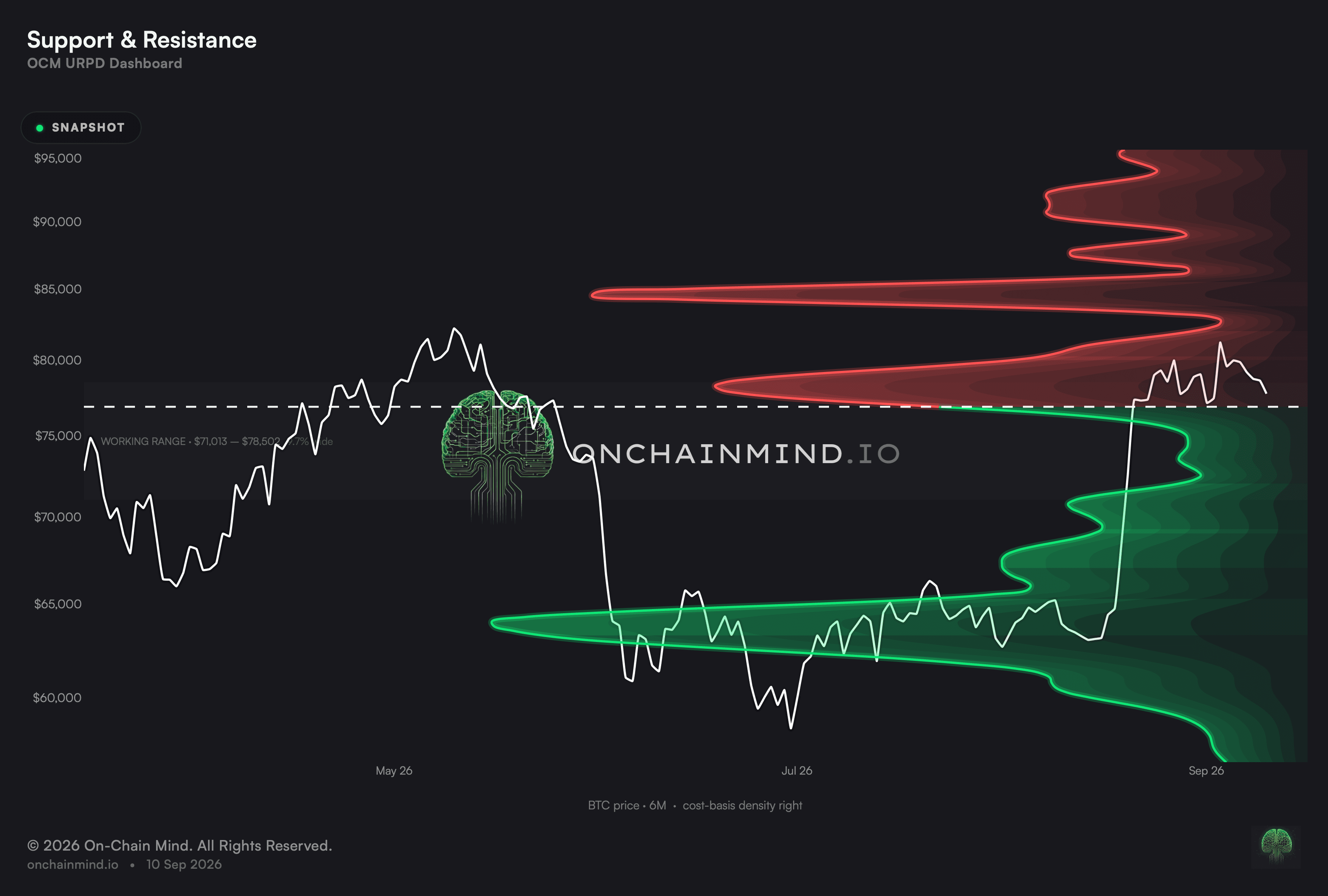
This turns the distribution on its side and sets it beside price history, then picks out the clusters that rise clear of everything near them. Those are the prices where enough supply gathered for it to have made a difference.
The structural reading is the balance. How much cost basis sits beneath spot against how much sits above it says whether the terrain ahead is supportive or obstructive, before any individual level is considered.
What it actually measures
A level is chosen by standing out, not by being large in isolation. A cluster is ranked on how much supply it holds and how tightly that supply is packed, and only the strongest survive to be drawn.
The density is drawn sideways so that it and the chart run off one price axis. A wall is a price and nothing else, so the two have to share a scale before anyone can judge whether spot did anything on reaching one.
The corridor between the nearest wall on each side is the room available before the next serious cluster is reached. That gap is often more useful than either wall on its own.
A level is a concentration of people, not a line on a chart
Drawn levels usually come from geometry: a previous high, a round number, a line connecting two points. Those work when enough people are watching them, which is a claim about attention rather than about the market.
These come from settled transactions. A cluster is a group of holders who paid roughly the same and who all face the same decision when price returns, which is a mechanism rather than a convention.
Air Above: clean air is a condition, not a forecast
A column read upward is the staircase an advance would have to climb through. A row read across shows whether the coin waiting at one fixed price has been building up or draining away.
Advances have moved fastest through stretches where almost nothing was held above. That is not mysterious: there is nobody waiting to get their money back, so each step up meets less supply than it otherwise would.
It says nothing of whether an advance starts. Clean air describes how little resistance a move would meet, and a market can sit under an empty ceiling for a very long time without going anywhere.
What it does not tell you
They hold often enough to be worth knowing about and far too erratically to lean on. Concentration raises the odds of a reaction; it does not manufacture one.
The set of levels depends on the window. A shorter view surfaces clusters near recent trading and discards distant ones, so the picture changes with a control rather than with the market.
A wall that breaks reverses its role. The same cluster that held as support becomes overhead supply once price is below it, and nothing in the chart marks the moment that switch happens.
How to read it
Support Heavy. Far more cost basis sits beneath spot than above it, so the structure leans supportive.
Balanced Structure. Cost basis is spread fairly evenly on both sides of spot.
Resistance Heavy. Cost basis is stacked above spot rather than below, putting a queue of recovering holders in the way of any advance.
Open the URPD dashboard and Support / Resistance sits there with Profit / Loss, Break Level and Air Above.
Common questions
What gets a level onto the chart?
By rising clear of the supply on either side of it. Candidates are then ordered by size and by how tightly the coin is bunched, and only the top of that order reaches the chart.
Why is the density sideways?
So that it and the price chart run off one axis. A level is a price, and unless both sit on the same scale there is no way to check whether spot ever reacted to it.
Does the timeframe change the levels?
Yes, and that surprises people. It sets both the history drawn and the window clusters are searched within, so a shorter view drops levels that sit far from recent trading.
Can these walls be relied on?
Often enough to be worth knowing and never reliably enough to trade blindly. A shelf tells you a lot of coins changed hands there, so a pause is more likely than it would be at an empty price, and no more than that.
What is the corridor between them?
The space price can cross without meeting a major cluster. It is frequently the more useful reading, because it says how far a move could travel before it met anything.
What does a single cell show?
How much of the mapped coin was last bought at that level or higher, on that particular day. Columns give the staircase overhead; rows give the history of one fixed level.
Why do the shares not sum to the supply?
Because dust that never moves is excluded and each day is measured against its own mapped total. That is what puts a day from years ago and today on the same scale.
ON-CHAIN METRIC
URPD Support / Resistance
Where cost basis bunches tightly enough to have mattered, and how it sits around spot.
Open the URPD dashboard
This turns the distribution on its side and sets it beside price history, then picks out the clusters that rise clear of everything near them. Those are the prices where enough supply gathered for it to have made a difference.
The structural reading is the balance. How much cost basis sits beneath spot against how much sits above it says whether the terrain ahead is supportive or obstructive, before any individual level is considered.
What it actually measures
A level is chosen by standing out, not by being large in isolation. A cluster is ranked on how much supply it holds and how tightly that supply is packed, and only the strongest survive to be drawn.
The density is drawn sideways so that it and the chart run off one price axis. A wall is a price and nothing else, so the two have to share a scale before anyone can judge whether spot did anything on reaching one.
The corridor between the nearest wall on each side is the room available before the next serious cluster is reached. That gap is often more useful than either wall on its own.
A level is a concentration of people, not a line on a chart
Drawn levels usually come from geometry: a previous high, a round number, a line connecting two points. Those work when enough people are watching them, which is a claim about attention rather than about the market.
These come from settled transactions. A cluster is a group of holders who paid roughly the same and who all face the same decision when price returns, which is a mechanism rather than a convention.
Air Above: clean air is a condition, not a forecast
A column read upward is the staircase an advance would have to climb through. A row read across shows whether the coin waiting at one fixed price has been building up or draining away.
Advances have moved fastest through stretches where almost nothing was held above. That is not mysterious: there is nobody waiting to get their money back, so each step up meets less supply than it otherwise would.
It says nothing of whether an advance starts. Clean air describes how little resistance a move would meet, and a market can sit under an empty ceiling for a very long time without going anywhere.
What it does not tell you
They hold often enough to be worth knowing about and far too erratically to lean on. Concentration raises the odds of a reaction; it does not manufacture one.
The set of levels depends on the window. A shorter view surfaces clusters near recent trading and discards distant ones, so the picture changes with a control rather than with the market.
A wall that breaks reverses its role. The same cluster that held as support becomes overhead supply once price is below it, and nothing in the chart marks the moment that switch happens.
How to read it
Support Heavy. Far more cost basis sits beneath spot than above it, so the structure leans supportive.
Balanced Structure. Cost basis is spread fairly evenly on both sides of spot.
Resistance Heavy. Cost basis is stacked above spot rather than below, putting a queue of recovering holders in the way of any advance.
Open the URPD dashboard and Support / Resistance sits there with Profit / Loss, Break Level and Air Above.
Common questions
What gets a level onto the chart?
By rising clear of the supply on either side of it. Candidates are then ordered by size and by how tightly the coin is bunched, and only the top of that order reaches the chart.
Why is the density sideways?
So that it and the price chart run off one axis. A level is a price, and unless both sit on the same scale there is no way to check whether spot ever reacted to it.
Does the timeframe change the levels?
Yes, and that surprises people. It sets both the history drawn and the window clusters are searched within, so a shorter view drops levels that sit far from recent trading.
Can these walls be relied on?
Often enough to be worth knowing and never reliably enough to trade blindly. A shelf tells you a lot of coins changed hands there, so a pause is more likely than it would be at an empty price, and no more than that.
What is the corridor between them?
The space price can cross without meeting a major cluster. It is frequently the more useful reading, because it says how far a move could travel before it met anything.
What does a single cell show?
How much of the mapped coin was last bought at that level or higher, on that particular day. Columns give the staircase overhead; rows give the history of one fixed level.
Why do the shares not sum to the supply?
Because dust that never moves is excluded and each day is measured against its own mapped total. That is what puts a day from years ago and today on the same scale.