

Every cycle has a cohort that ends up holding the bag, and this one is no different.
They bought 6 to 12 months ago, which in this market means they bought the top. Over a third of the capital on this network went in during that window.
But now they are finally giving up on it.
Nobody eats a huge loss because they think the trade is done working. They eat it because they’re certain it’s about to get worse. That’s capitulation, and it only ever shows up in one part of the cycle.
So let me show you who these people are, what the shape of their selling tells us, and the date all of this is quietly pointing at.
Let’s get into it.
Key insights
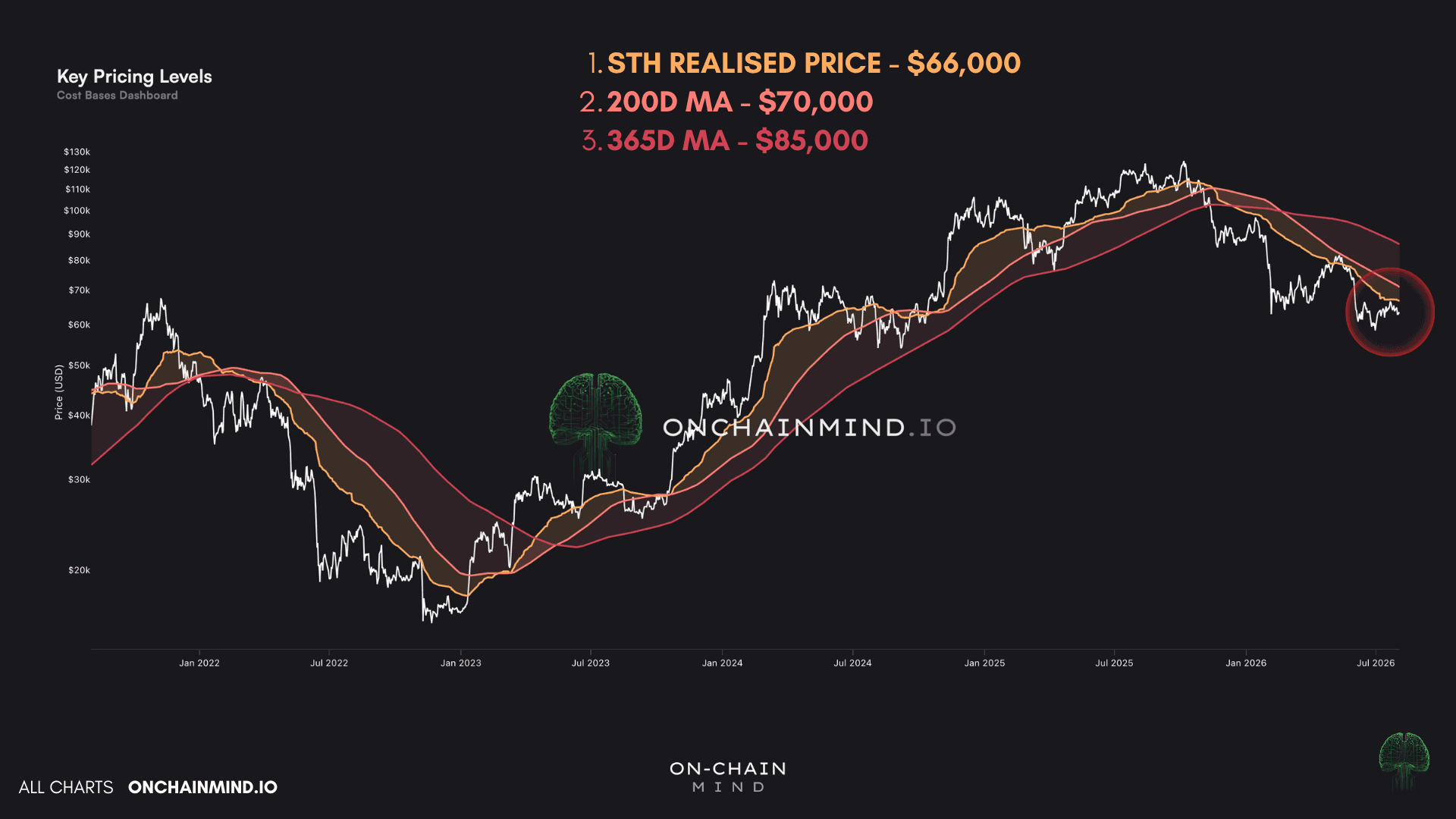
The Regime Is Not Ambiguous: Price sits below all three key levels, and only $66,000 then $85,000 change that.
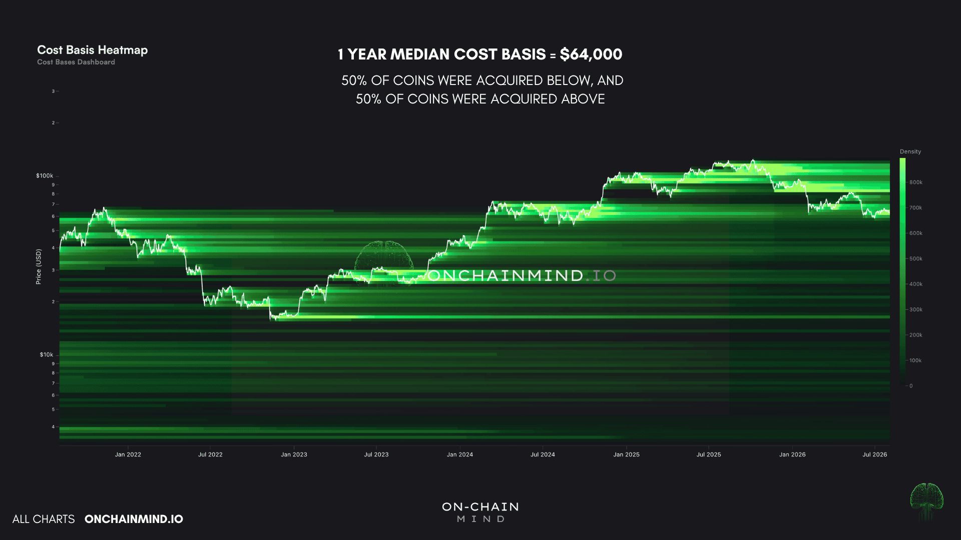
Pinned To The Median: $64,000 is the one year median cost basis, a level that fights price from both sides.
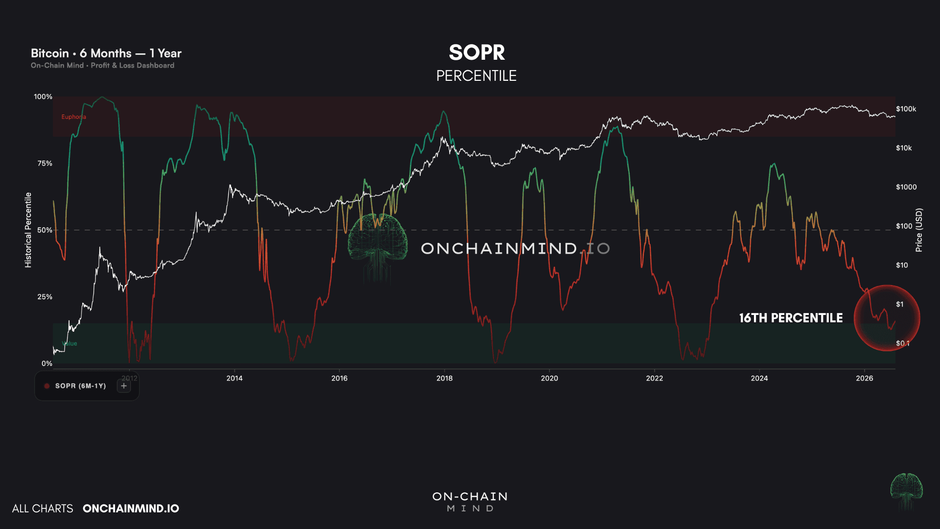
Capitulation By The Numbers: Top buyers are realising a 36% loss, sitting in the 16th percentile of their entire history.
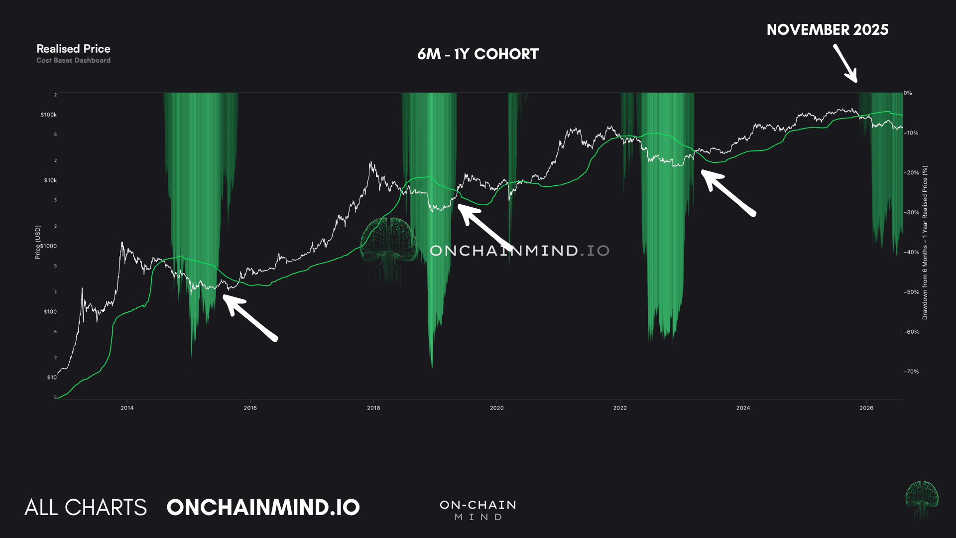
The 13 Month Clock: This cohort has historically stayed underwater around 13 months before the bull market resumed.
Three Lines and a Stubborn Median
I anchor market structure to three Key Pricing Levels:
The short-term holder realised price - $66,000
The 200 day moving average - $70,000
The yearly moving average - $85,000
View live in OCM Studio: Key Pricing Levels
Their job is beautifully simple. Above all three, the bull market is on. Below all three, the bear is back. That argument closed at roughly $102,000 in November, when price finally lost the yearly line.
Today, we sit just beneath the short-term holder realised price, which is the average cost basis of everyone who has bought within roughly the last 5 months.
Here is the part that catches people out. In a bear market this level tends to act as resistance rather than support. Recent buyers are underwater, and when price rallies back to what they paid, plenty of them take the exit at breakeven rather than sit through another leg down. Their relief becomes the supply that caps the rally.
The level that actually reconfirms a bull for me is the yearly moving average at $85,000. Everything between here and there is noise as far as the regime is concerned.
Which brings us to the number driving everybody mad.
On the Cost Basis Heatmap, where every coin carries a memory of the price it last moved at, the 1 year median sits at exactly $64,000. Which helps explain why this level feels so sticky.
View live in OCM Studio: Cost Basis Heatmap
The median is the precise midpoint of acquisition, half the coins bought this year acquired below it and half above, which means a few enormous transfers cannot drag it around the way they drag a mean.
A level like that fights you from both directions.
Below it, the typical holder from the past year is in the red, so rallies get sold into by people scrambling back to breakeven. Above it, the typical holder is green, so dips get defended. It is the fairest price in the market right now, and that is exactly why nothing seems to happen around it.
The Clock Nobody Is Watching
Now to the cohort of the day, the holders who have owned their coins for between 6 months and 1 year.
At this stage of the cycle, that band is populated almost entirely by the people who bought the top. They paid the high, watched the drawdown arrive, held through most of the misery without selling, and are now carrying the ugliest unrealised losses on the network.
These are not seasoned veterans of a cycle or three. But that is precisely what makes them useful.
In the past three bear markets, the group that bought the top spent an average of 13 months underwater before recovering back above their cost basis. And that recovery, the moment the top buyers finally stopped losing money, is what marked the resumption of the bull market each time.
It makes intuitive sense too. Once the most damaged holders on the network are whole again, the market has run out of obvious people left to hurt.
This cycle, that cohort slipped underwater in November at around $95,000. Run the same 13 months forward and you land in December, which really isn’t very far away at all.
View live in OCM Studio: 6M-1Y Realised Price Drawdown
What Giving Up Actually Looks Like
Every coin that moves carries two prices: what it cost when it was bought, and what it fetched when it was sold. Divide the second by the first and you have SOPR, the Spent Output Profit Ratio.
Above 1, sellers are banking profit. Below 1, they are locking in losses. Isolate it to coins bought 6 to 12 months ago and you are listening to the top buyers alone.
On a percentile basis, that cohort currently sits in its 16th percentile. They are capitulating fairly hard, though not quite at the deepest readings we have on record.
View live in OCM Studio: 6M-1Y SOPR Percentile
The raw view says the same thing in a different accent: the green stretches, where this group consistently banks profit, cover almost every bull and consolidation phase, while the deep red ones show where they bought the top and then sold into the fall.
This cycle has followed that script almost line for line.
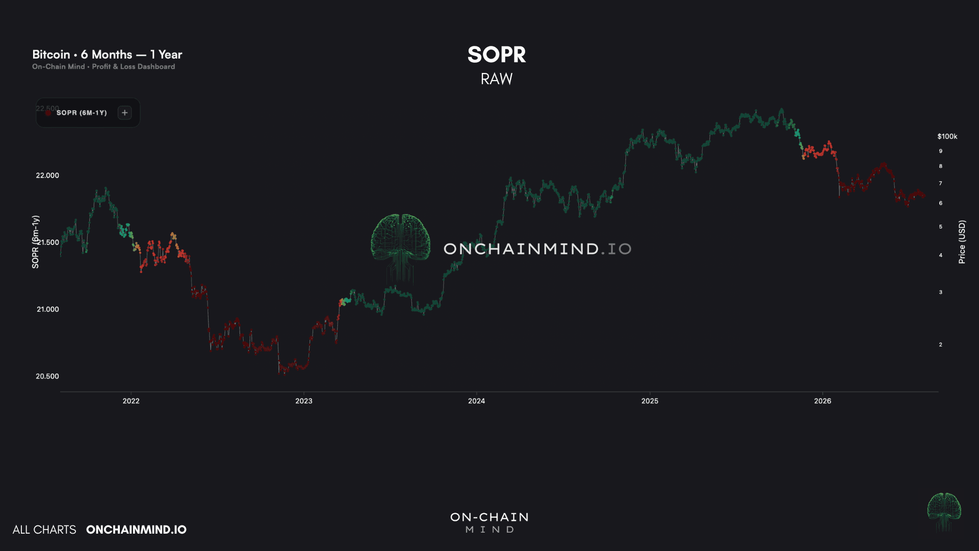
View live in OCM Studio: 6M-1Y SOPR Raw
The distribution is where it clicks into place. Today’s reading is 0.635, meaning these sellers are getting 63 cents back for every dollar they put in, or a realised loss of roughly 36%.
Nobody accepts a 36% loss because they think the trade has finished working. They accept it because they think it is about to get worse.
People only ever sell for one reason, in a bull or a bear. They think price is going lower. All that changes across a cycle is how many of them believe it at once.
The shape of the distribution matters as much as the number, because it isn’t one smooth hill. It is three lumps with gaps between them:
The capitulation zone where we sit today around 0.625, where top buyers are giving up on their positions they entered 6 to 12 months ago
A cluster around 0.90, largely from the $85,000 to $90,000 area, where the earliest top buyers bailed after that first 30% drop
A green pile above 1.15, the few who bought before the top and sold into it at a profit. A fantastic exit in hindsight
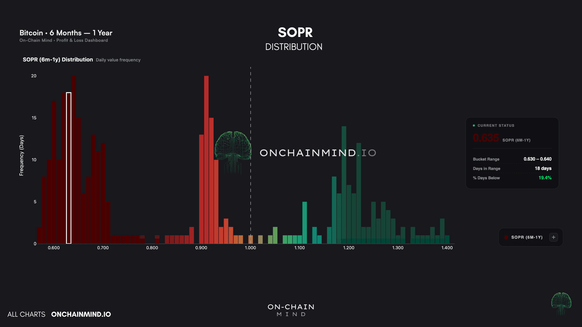
View live in OCM Studio: 6M-1Y SOPR Distribution (1)
Stack it as a running total and two numbers jump out. At breakeven the curve sits near 70%. This means that 7 of every 10 days this year saw this group selling at a loss.
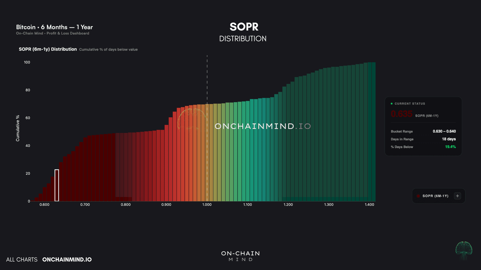
View live in OCM Studio: 6M-1Y SOPR Distribution (2)
Today’s level reads 19%, meaning 4 out of 5 days over the past year have been better than this one.
Brutal, but it’s a familiar kind of brutal.
Where This Leaves Me
First up, we are below all three of my Key Pricing Levels, the bear was confirmed at $102,000 in November, and nothing changes until we reclaim at least the STH cost basis and then hold above the yearly MA.
Until then, rallies are rallies and not reversals.
But underneath that, the top buyers are telling us where we sit in the story. They are realising an average 36% loss, sitting in the 16th percentile of their entire history, and they have spent 7 of every 10 days this year selling into the red. You cannot manufacture that. That is capitulation in its purest form, and it is exactly what I want to be seeing if I am the one buying.
My view has not shifted for months. Most of the price-based capitulation already looks done to me. What remains is time-based capitulation, the grinding, boring sort that tests patience rather than risk tolerance, and I suspect there is a little more of that left to run.
What I will not do is hand you a date and pretend it is gospel. The 13 month analogue points at December, and I think that is a sensible place to expect this to have run its course, but three cycles is a pattern, not a law of physics. Patterns bend.
So as always, I am watching for the holder behaviour, and I’m loving what I’m seeing: classic top buyer capitulation, widespread fear across the network, and a market so tedious that nobody can be bothered to look at it.
In my experience, that has always been the least comfortable and most profitable place to be standing.